
Bayal Ateliê
From hand-made pieces to an atelier with a signature: the knot became the symbol.
1. Context
Customers are women aged 20 to 40 who want to stand out in an authentic, luxurious, elegant way — at a party, a festival or the beach. They value the comfort and material of each piece, and reach the brand through Instagram.
2. Challenge
Macramé is hand-made by nature; the purchase, however, is driven by status. The brand had to be both at once — artisanal and luxurious, delicate and commanding — and work well on digital media, which is the atelier's shop window.
3. Solution
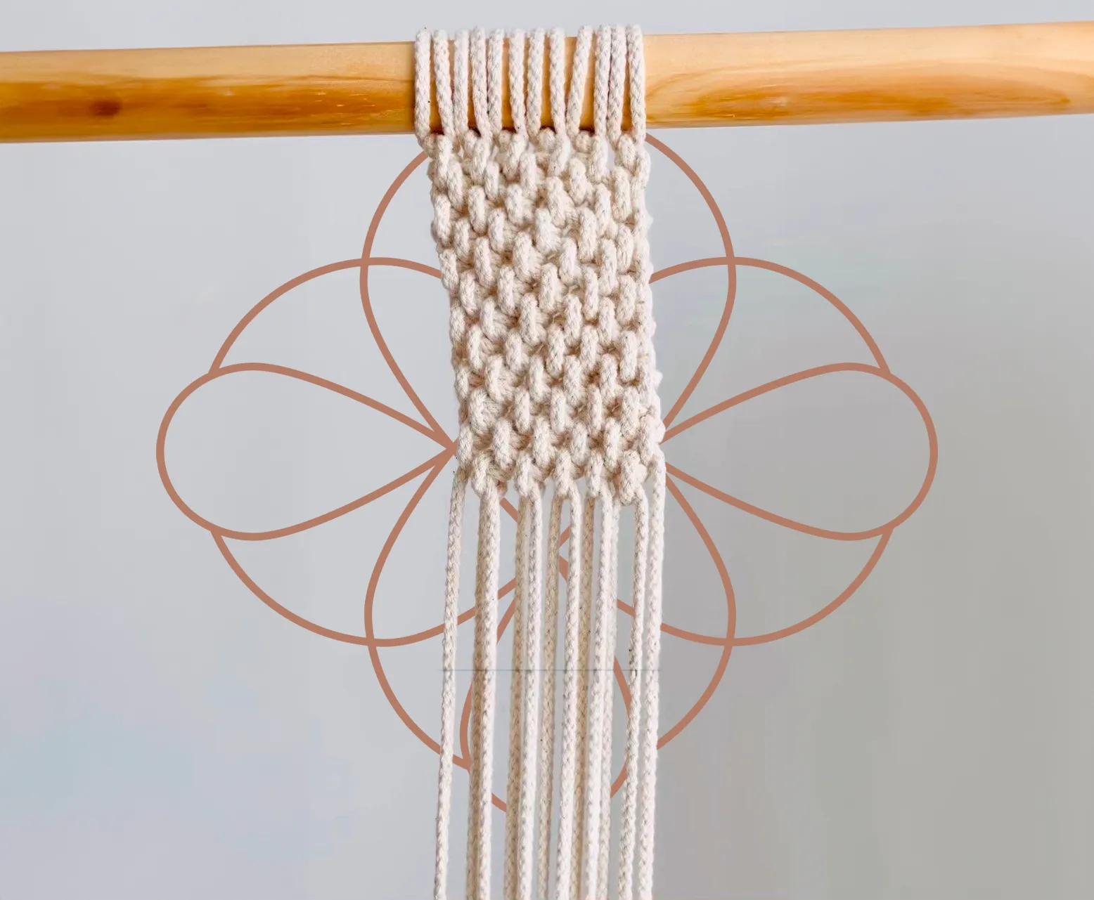
The symbol comes from the fusion of a knot and a mandala. Because a real knot passes over and under the same line — something impossible to draw without shading — the path was to link one simple loop to another until forming a cohesive drawing. The palette is earthy and pastel.
4. Result
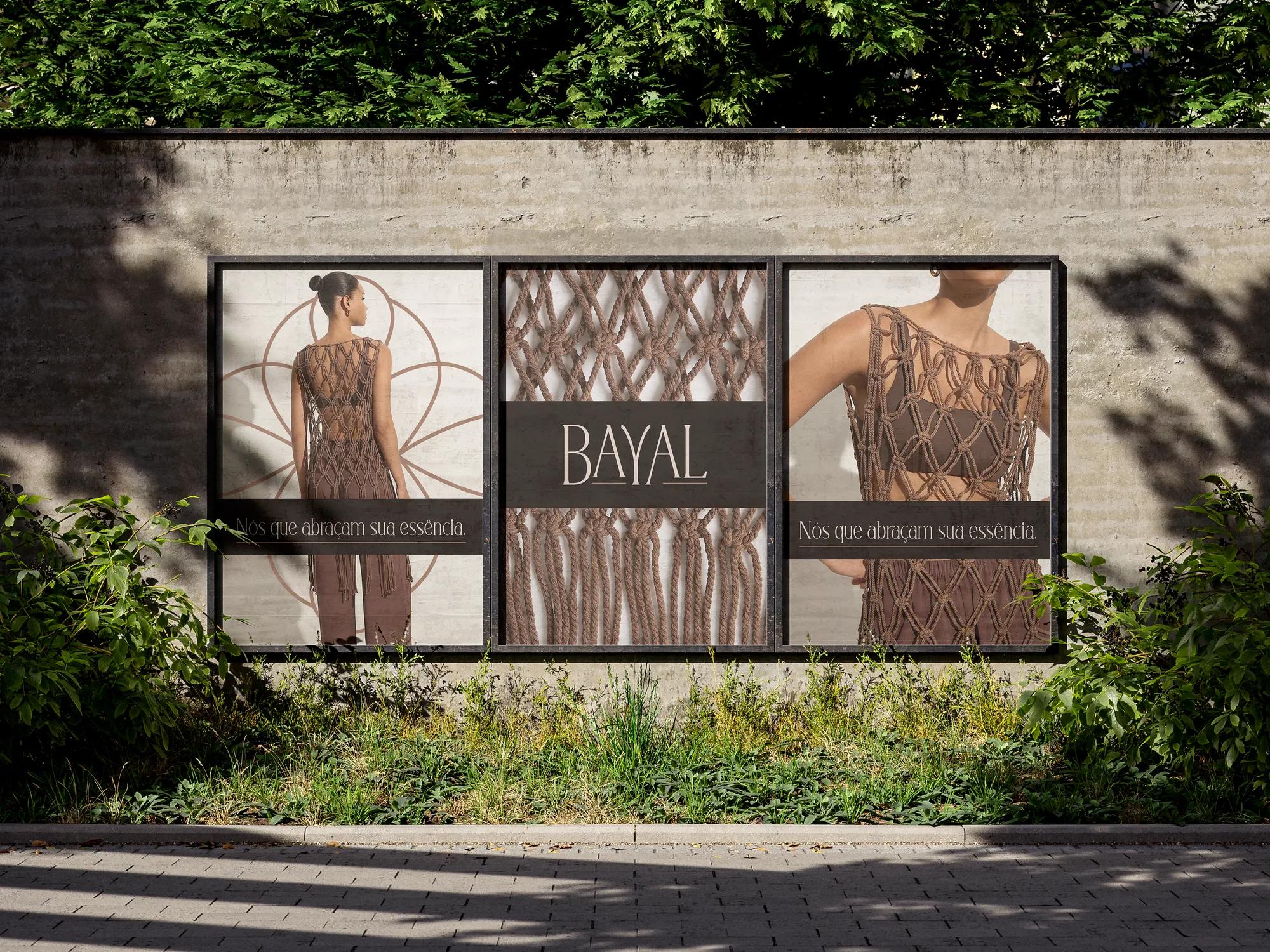
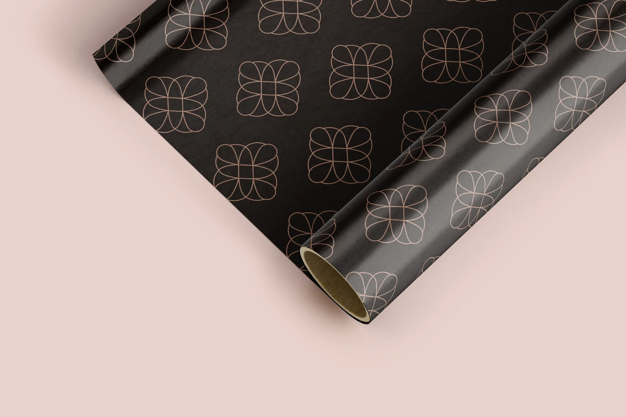
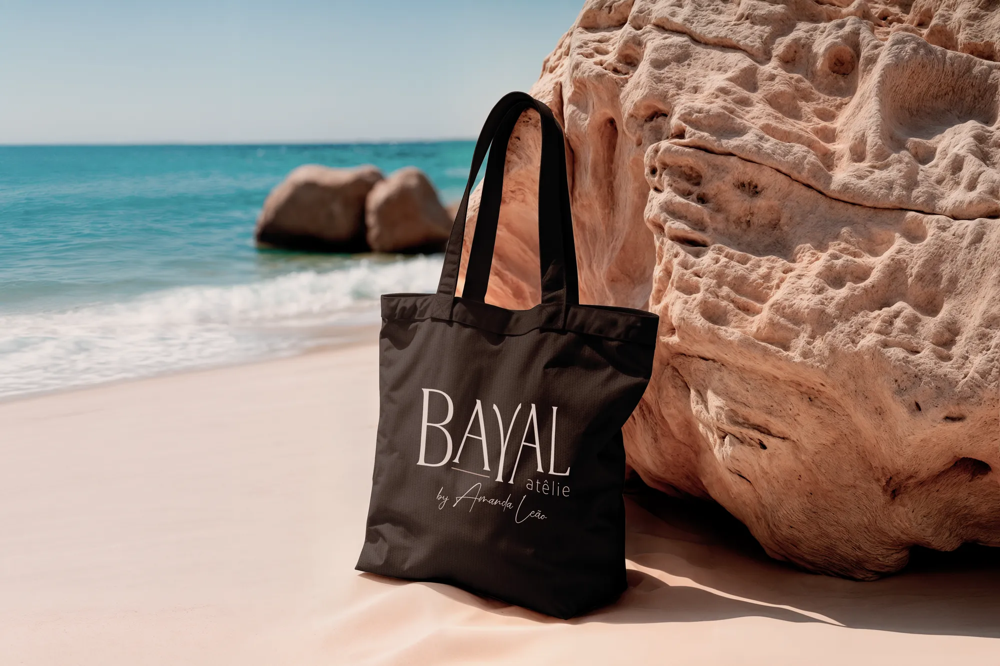
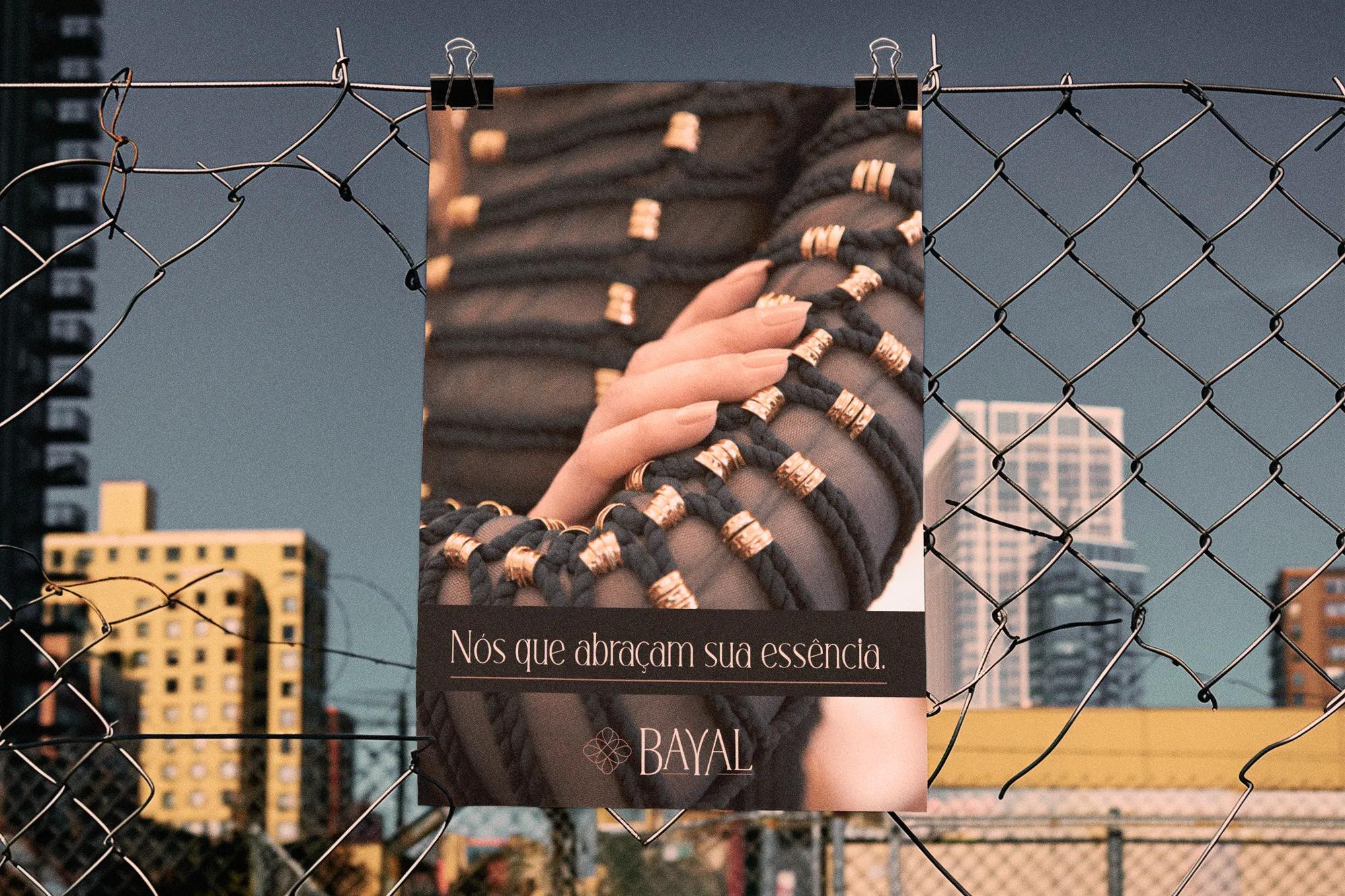
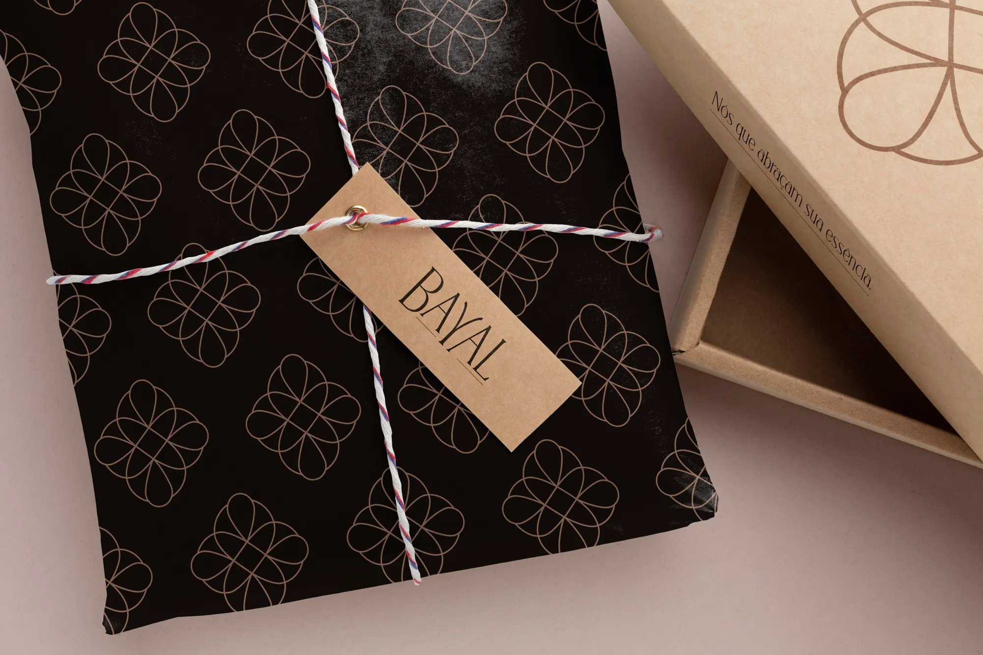
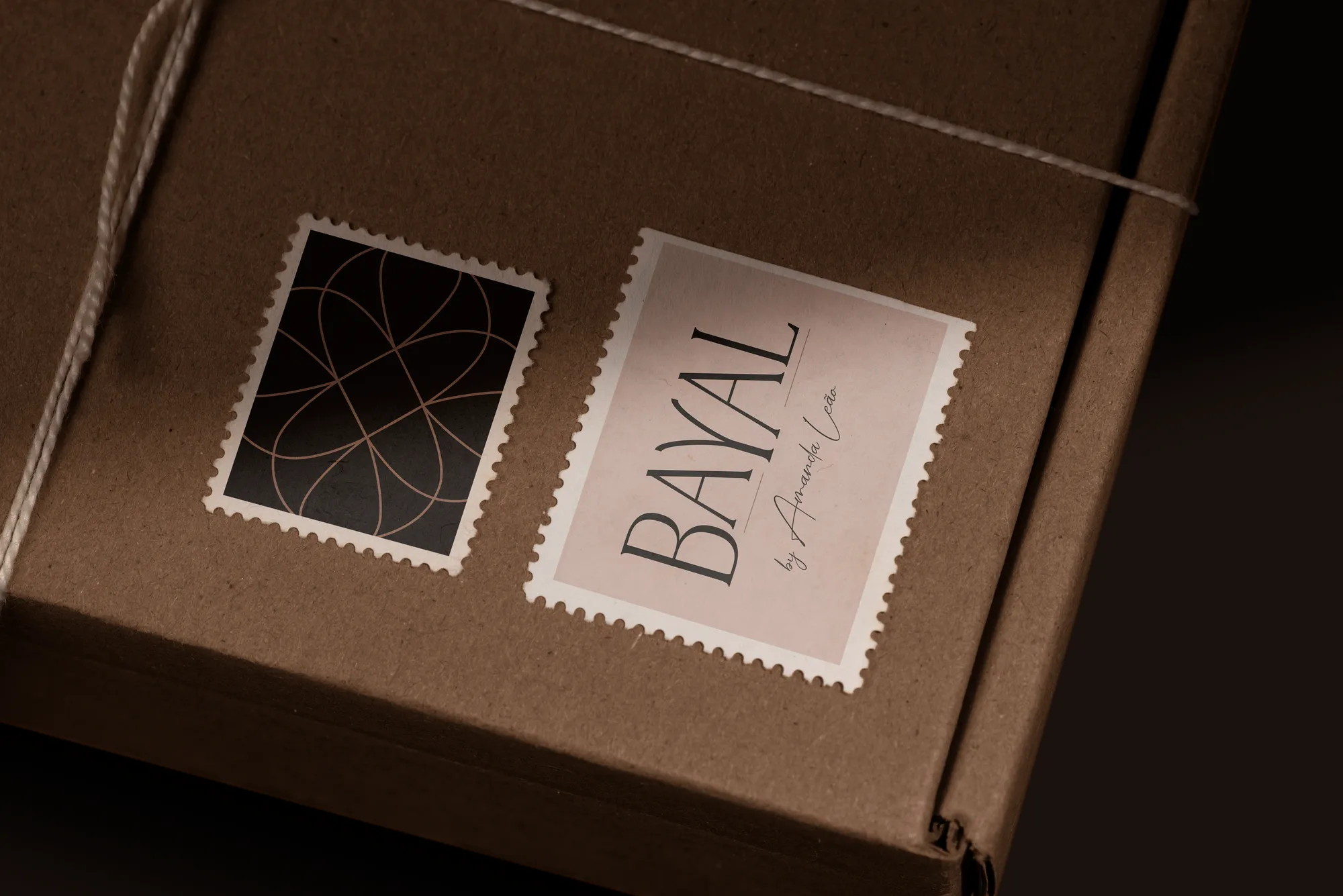
An exclusive pattern that dresses packaging, tissue paper, tape and stamps; a handwritten signature for collections; and communication pieces — posters, website, beach tote — with the same common thread.
Creative decisions
Symbol: knot + mandala
Simple loops linked until forming a cohesive, balanced symbol. The fine lines represent the thickness of a macramé thread.
Three typefaces, three jobs
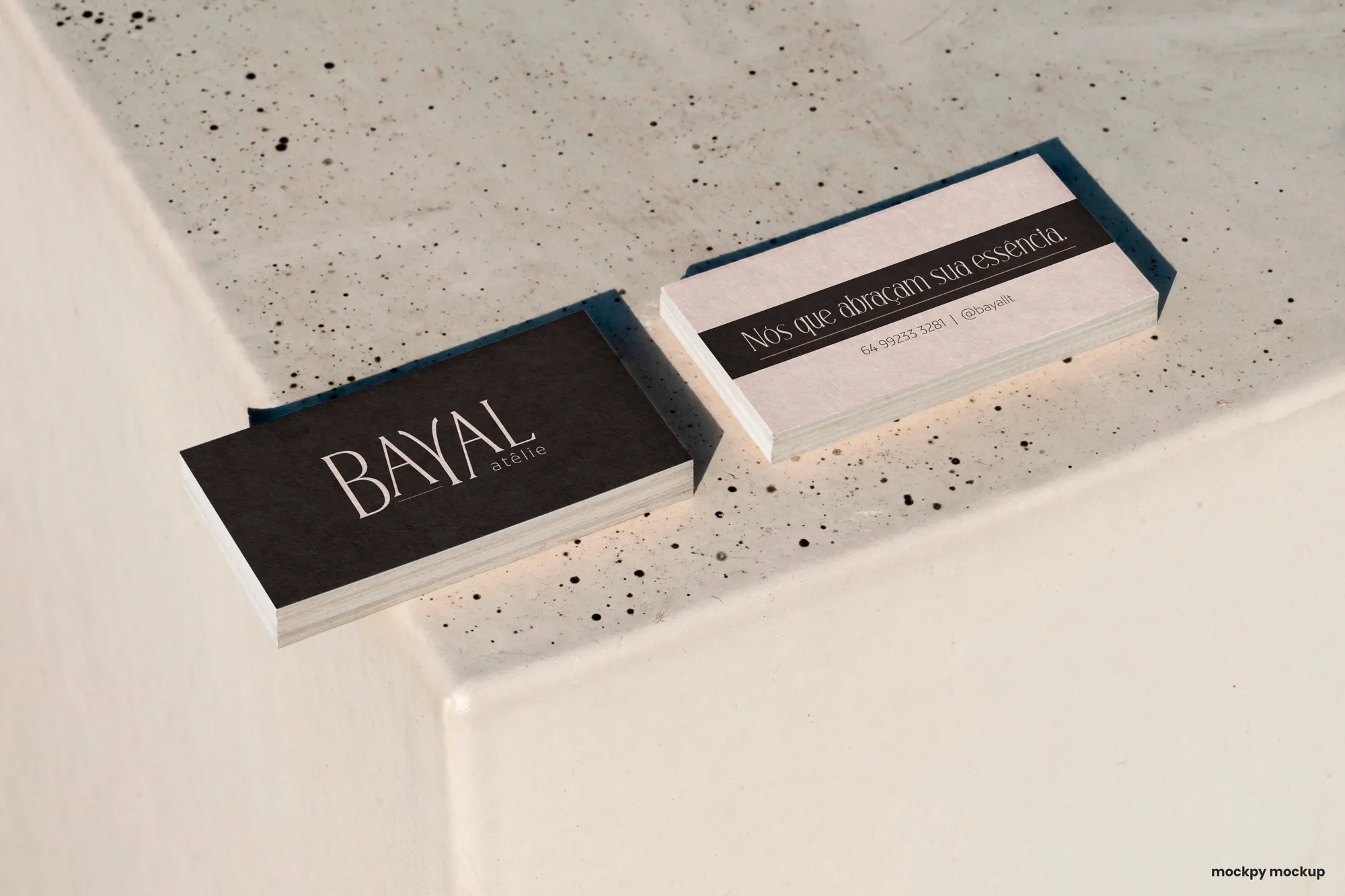
Decorya, a modern serif with generous terminals, conveys finesse and luxury. BW Mitga ensures seriousness and legibility in taglines and copy. Relation has a specific use: signing pieces and collections with Amanda's name.
Colours with a date
Cappuccine, close to the 2024 colour of the year, and Mocha Mousse, the 2025 colour of the year. Pastel tones recall luxury and sophistication; earthy ones, naturalness and craft. Coffee Black brings the seriousness of black at a warmer temperature.
Pattern
Exclusive and repeating, designed for packaging and for the tissue used when delivering pieces and gifts. Applied strategically, it fixes the symbol in customers' memory.
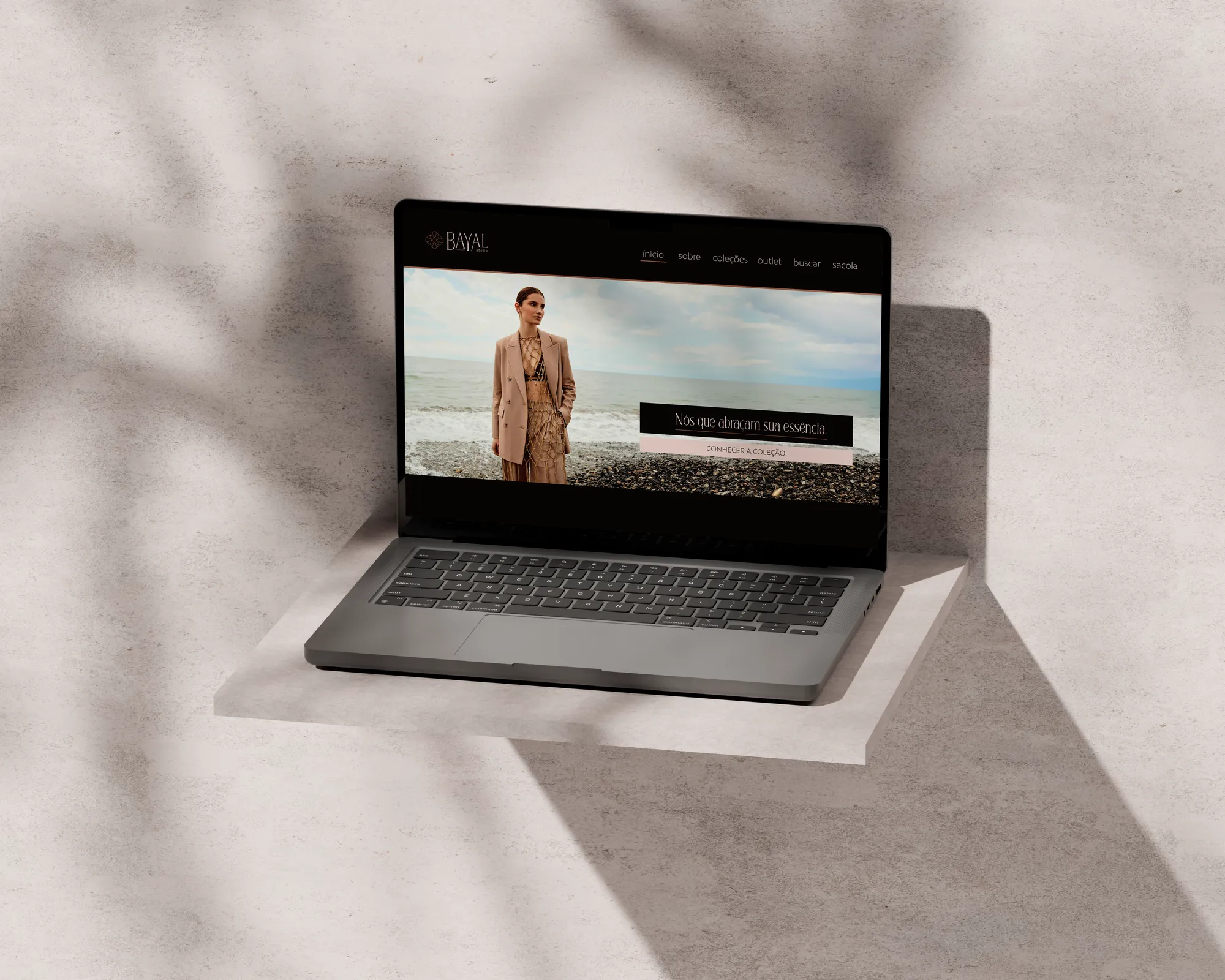
Knots that embrace your essence.