
Florindas
From flower shop to character: a brand with a name, a face and rollers in her hair.
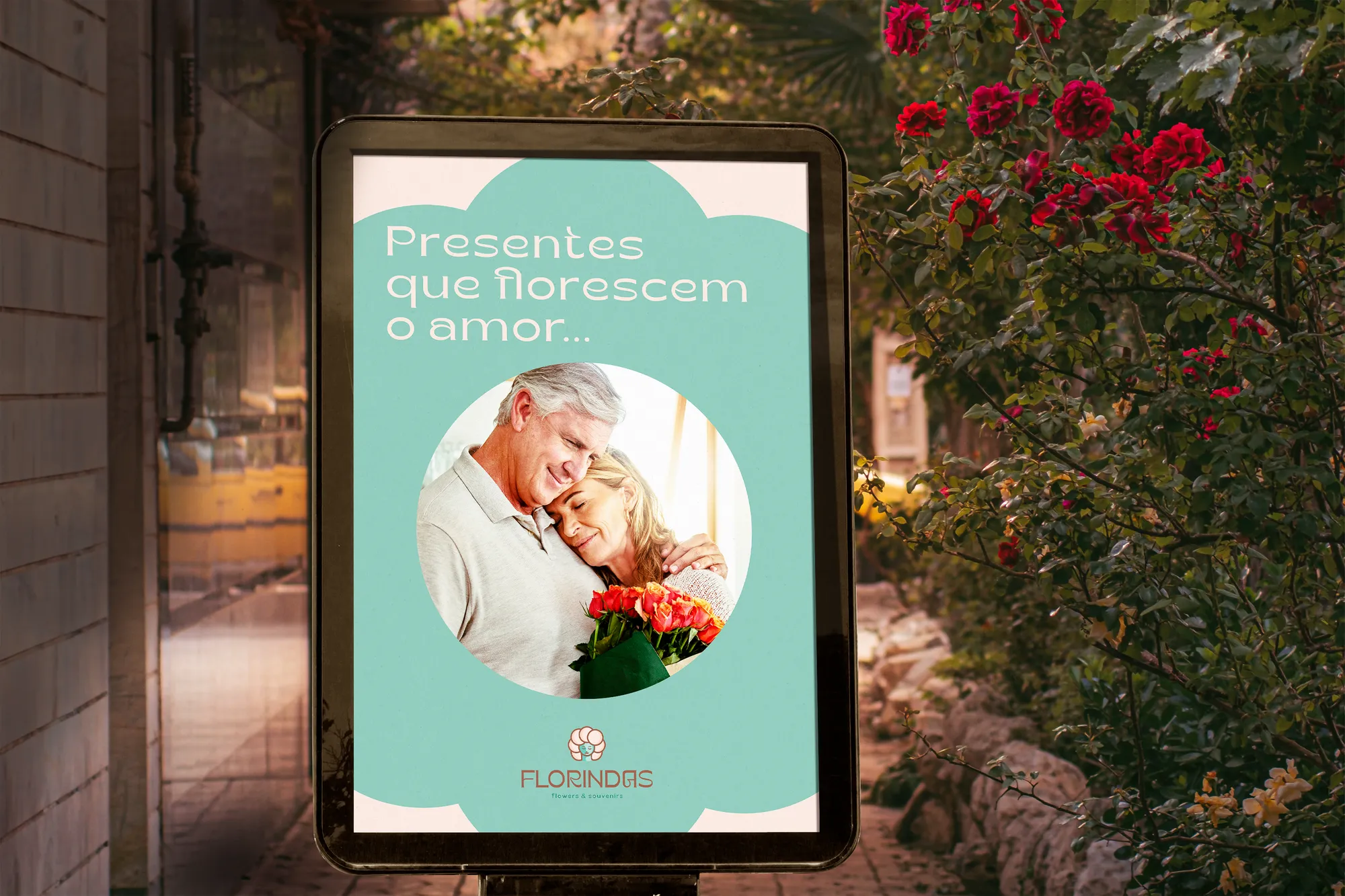
1. Context
The audience is aged 17 to 35, with refined taste and a willingness to invest in products that offer unique experiences on important occasions. People who find in the company a way to express love and affection while keeping a high standard.
2. Challenge
Flowers are a gift everyone sells. The brand needed a personality of its own — modern, fun and bold, yet luxurious and delicate — and a way to carry the hand-made quality of its kits into the drawing.
3. Solution
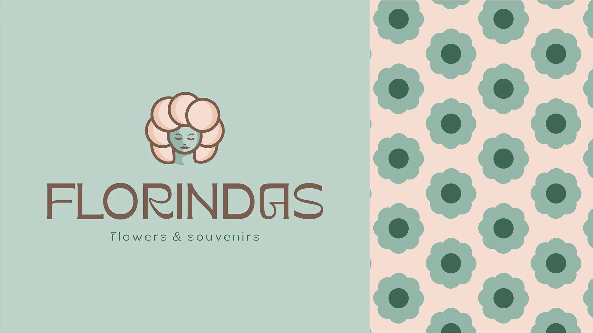
The Lover archetype, a retro typeface with a modern-vintage look, and a symbol mixing four ideas: the round-petalled flower, the allusion to hair rollers, the figure of a woman and shaded, hand-made strokes.
4. Result
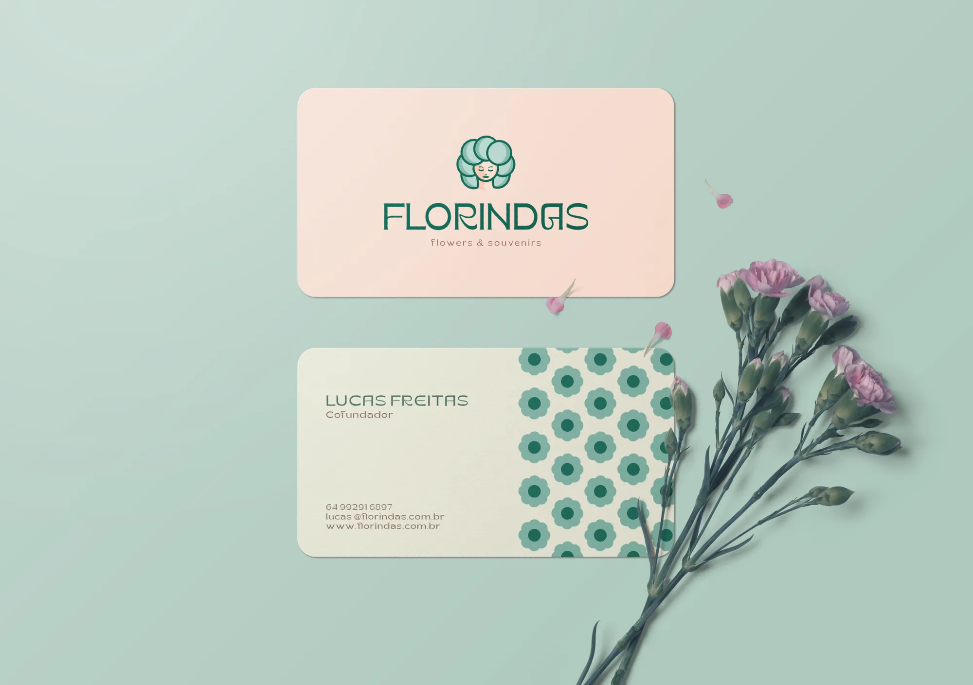
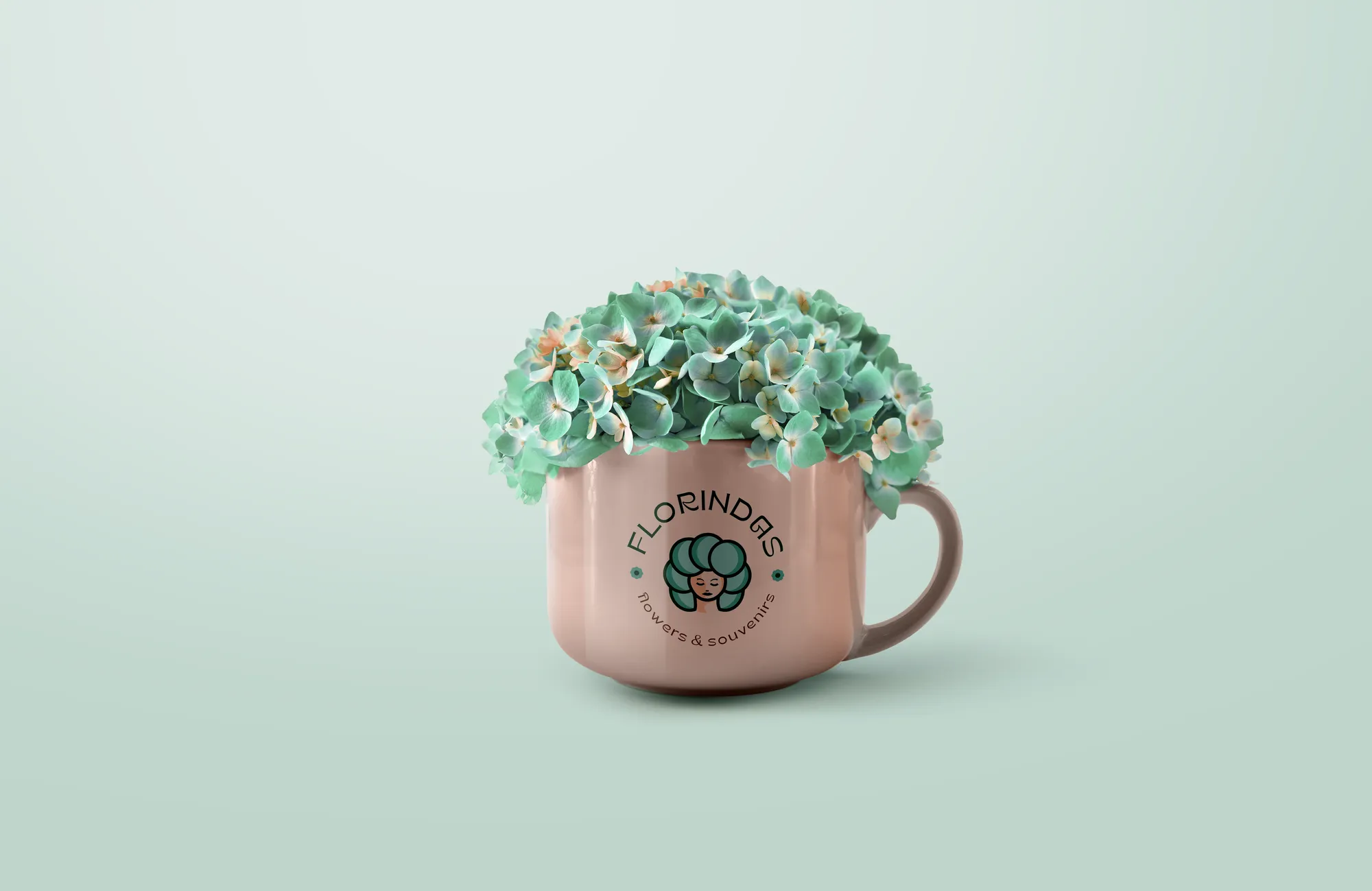
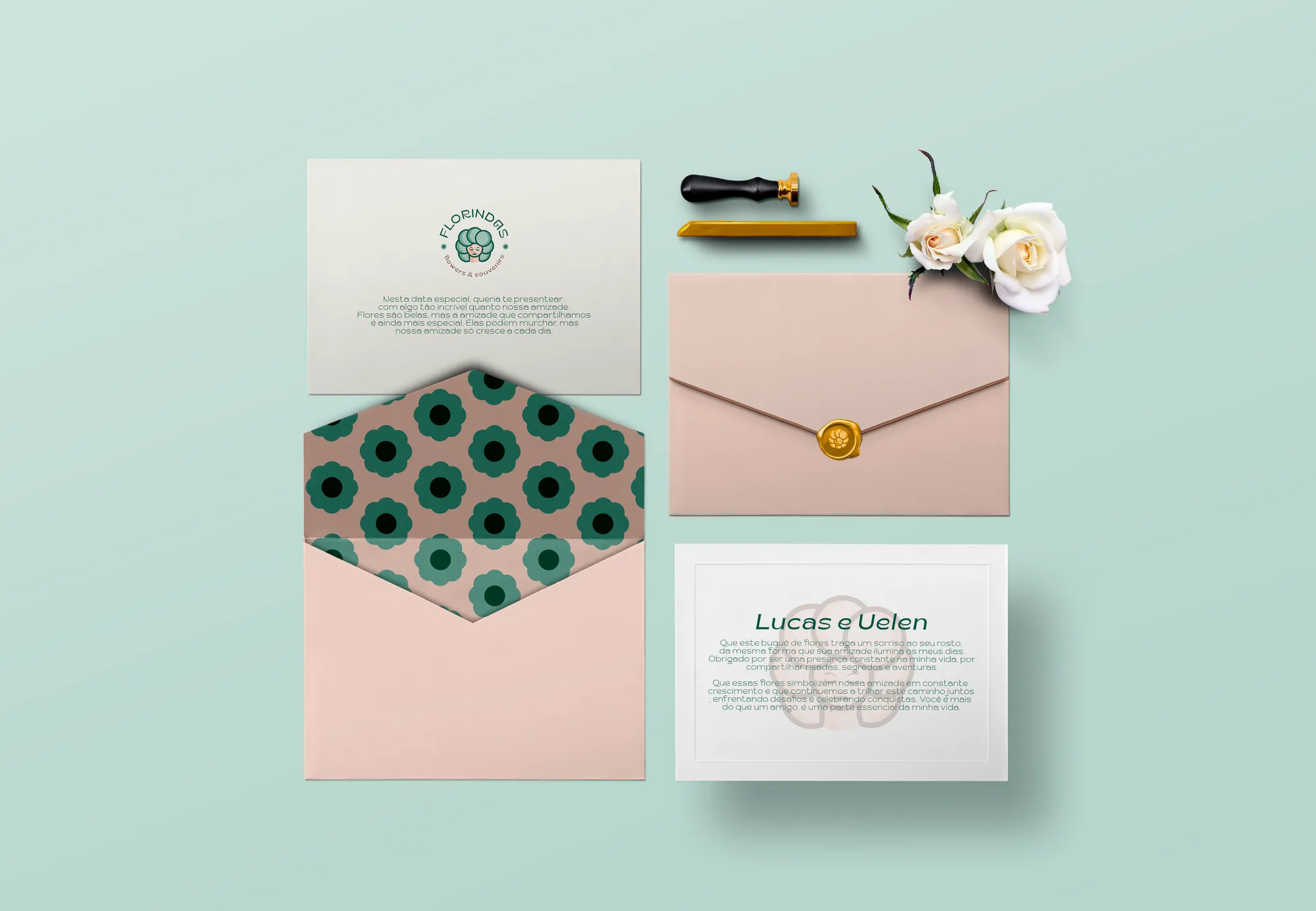
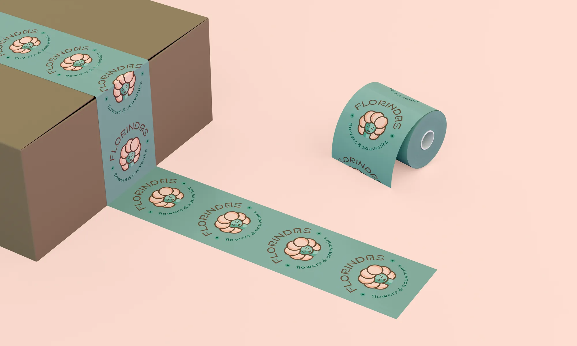
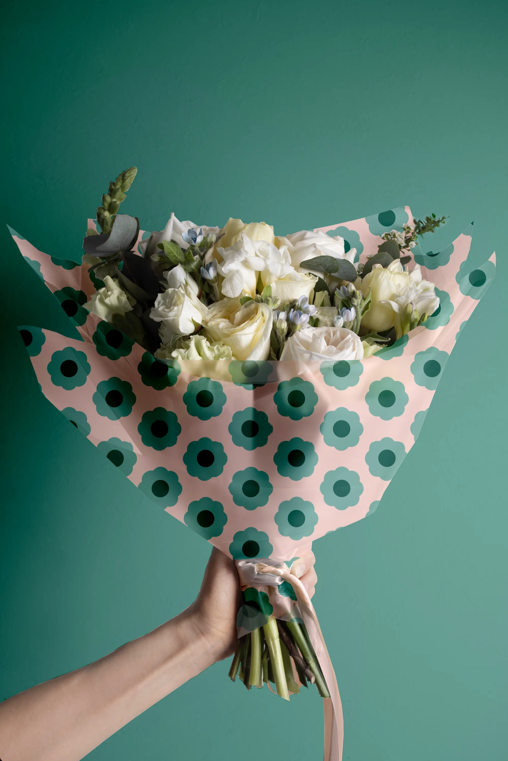
A logo with variations, slogan, texture and a palette in which every colour has a role — from stem to petal. In the applications, custom ribbons, packaging and tags take the brand inside the gift.
Creative decisions
Symbol: four ideas in one drawing
Flower and round petals; an allusion to hair rollers; a woman — Dona Florinda; and shaded, hand-made strokes. The brand gained a face.
Retro by strategy
Konde, a retro-style face, has a unique look, modern and vintage. Though classic, it fits the company's attributes because the style is a trend in building sophisticated, exclusive brands. Kreadon, a sans, provides the modern counterpoint.
From stem to petal
Stem Green ties the brand to nature and brings freshness. Earthy Brown adds the hand-made and the origin of the materials. Aqua Green brings softness and warmth. Salmon Pink is the final touch of femininity and romance.
The Lover archetype
Devotion to beauty and the celebration of romance — the natural territory of a brand that exists to help people express affection on special occasions.
Gifts that make love bloom.