
Grupo Água Rica
From farm logo to group brand: the crop field drew the initial.
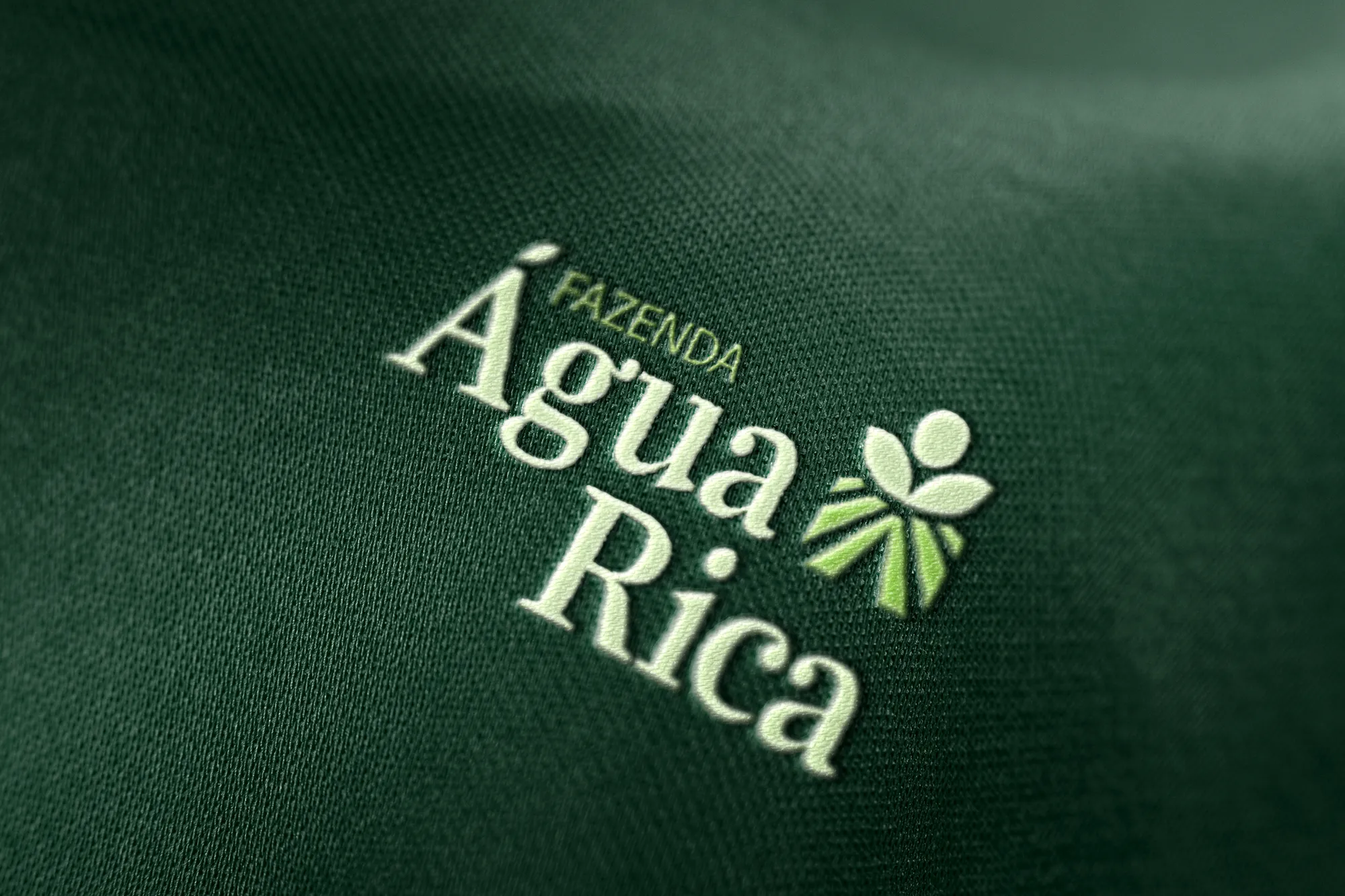
1. Context
The audience is mostly men aged 35 to 45: rural producers, farm managers, agronomists and agribusiness owners, dealing with decisions on crops, harvest, inputs and productivity.
2. Challenge
This audience values solid brands that communicate clarity, professionalism and practical results — and distrusts vague promises. The redesign had to modernise without erasing the essence of the original brand, and serve both the farm and the group.
3. Solution
A modern-natured serif for the authority and tradition agribusiness demands, balanced by a geometric sans. Green was kept, with new tones. In the symbol, furrows, a plant and a circle with a double meaning: soy pod or sun over the plantation.
4. Result
A system of lockups for the farm and for the group, with horizontal versions, seals and an alternation of light and dark greens that ensures legibility on any background.
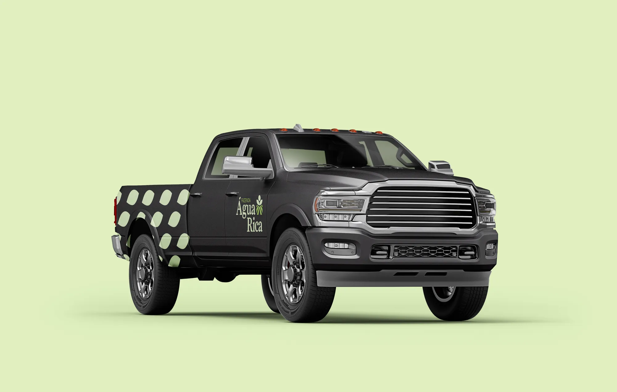
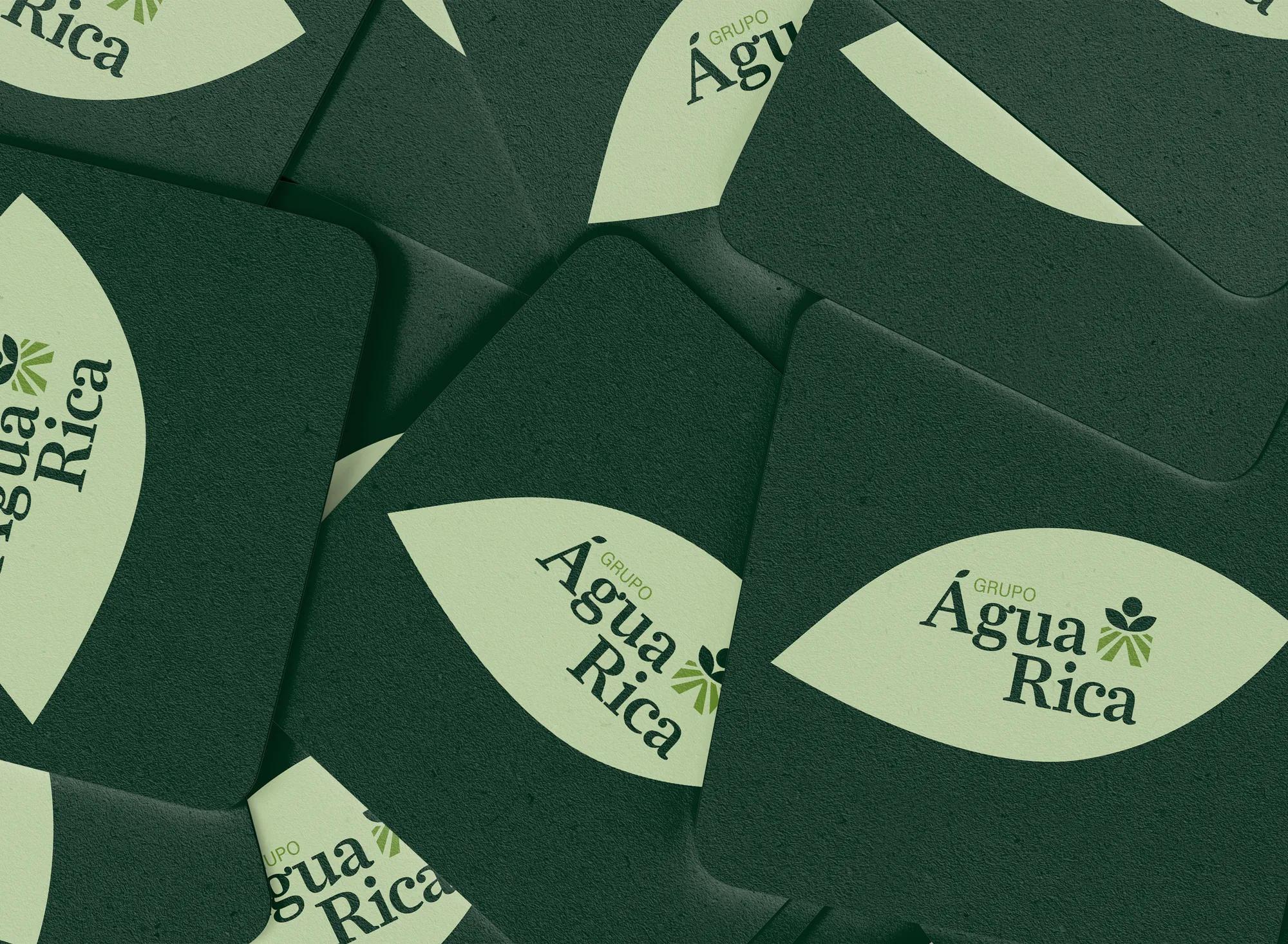
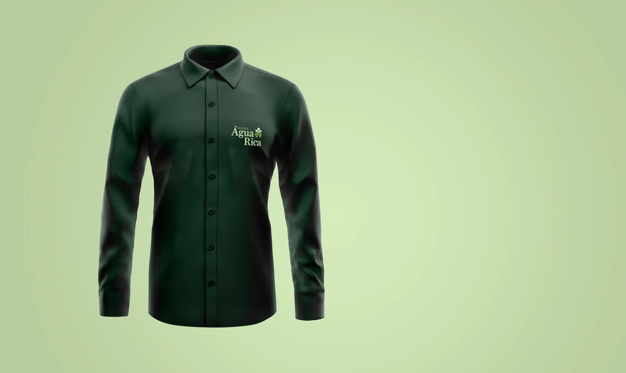
Creative decisions
Symbol: the field writes
In the lower part, thick lines represent the crop furrows. Between them, the letter A — the initial of Água — subtly takes shape.
Soy or sun
In the upper part, a plant's silhouette reinforces growth and fertility. The circle on top can be read as a soy pod or as the sun shining over the plantation: abundance, energy and natural cycle.
Typography of authority
Farnham Display, with pronounced serifs and square forms balanced by soft curves, confers authority, seriousness and tradition. Acumin Pro, geometric, provides the counterpoint — especially in the farm's descriptor.
Green stays, the tones change
The presence of green respects the essence of the original brand. New tones were added for an updated aesthetic, and the alternation of lights and darks ensures contrast between background and logo.
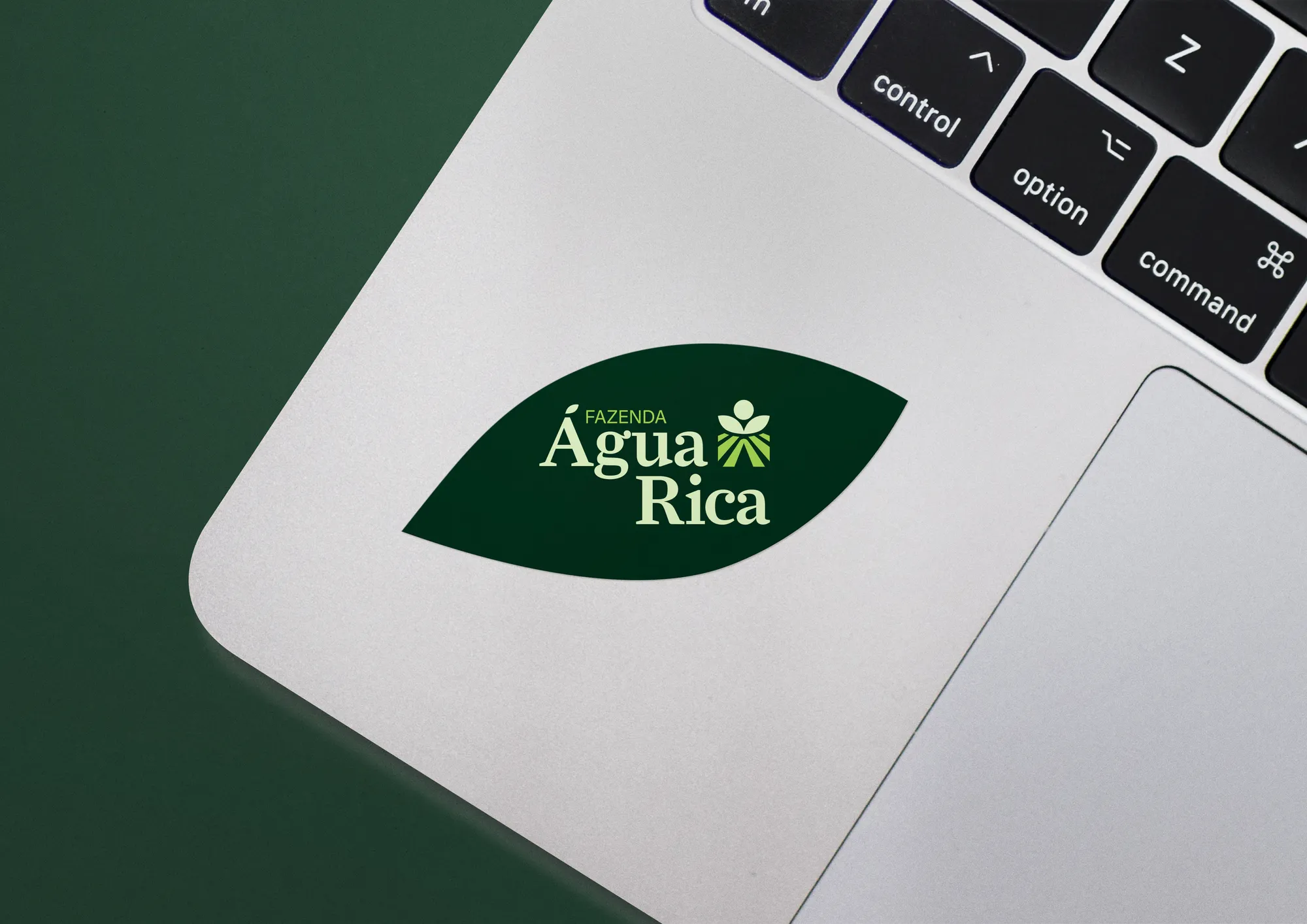
In the furrow of the field, the initial of the name.