
Luline Kids
From toy rental to a smart-consumption brand: sturdy as a building block.
1. Context
The audience is parents of babies and children up to 12 who seek practicality, safety and savings. They are modern, connected, conscious families who see renting instead of buying as a form of smart, sustainable consumption.
2. Challenge
Someone renting a product for their child wants to know it's safe, sanitised and good quality — before knowing if it's fun. The brand had to convey durability and trust without losing childlike delicacy, in a warm, light, reliable language.
3. Solution
The primary typeface works like typographic Lego: strong yet gentle. The secondary has a fine, continuous line, like chalk or felt-tip. The palette balances cool tones, for calm, with warm tones, for energy — and the illustrations set the scene.
4. Result
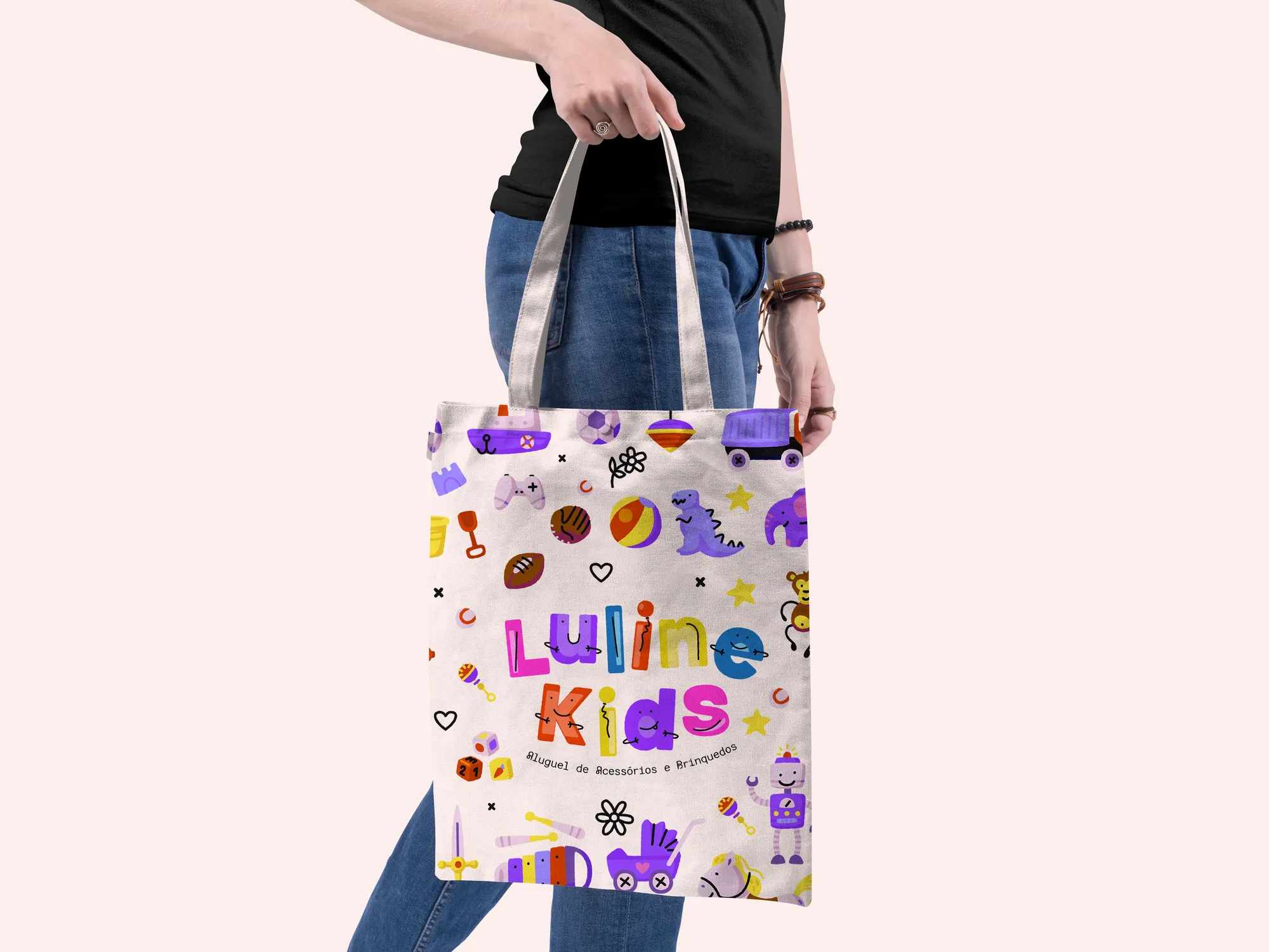
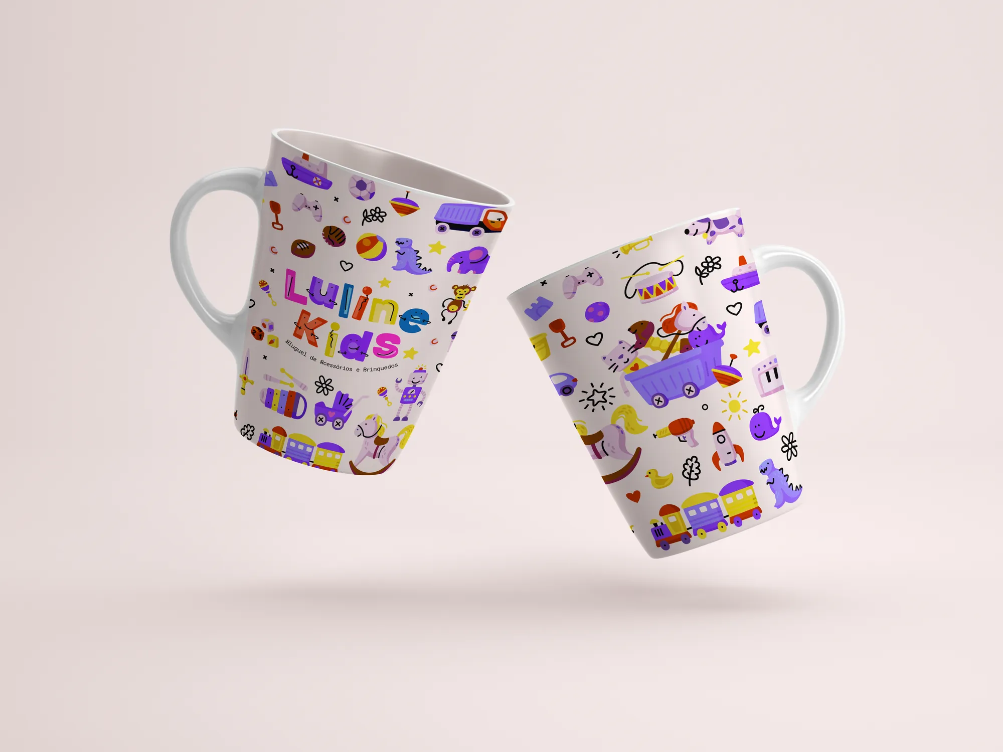
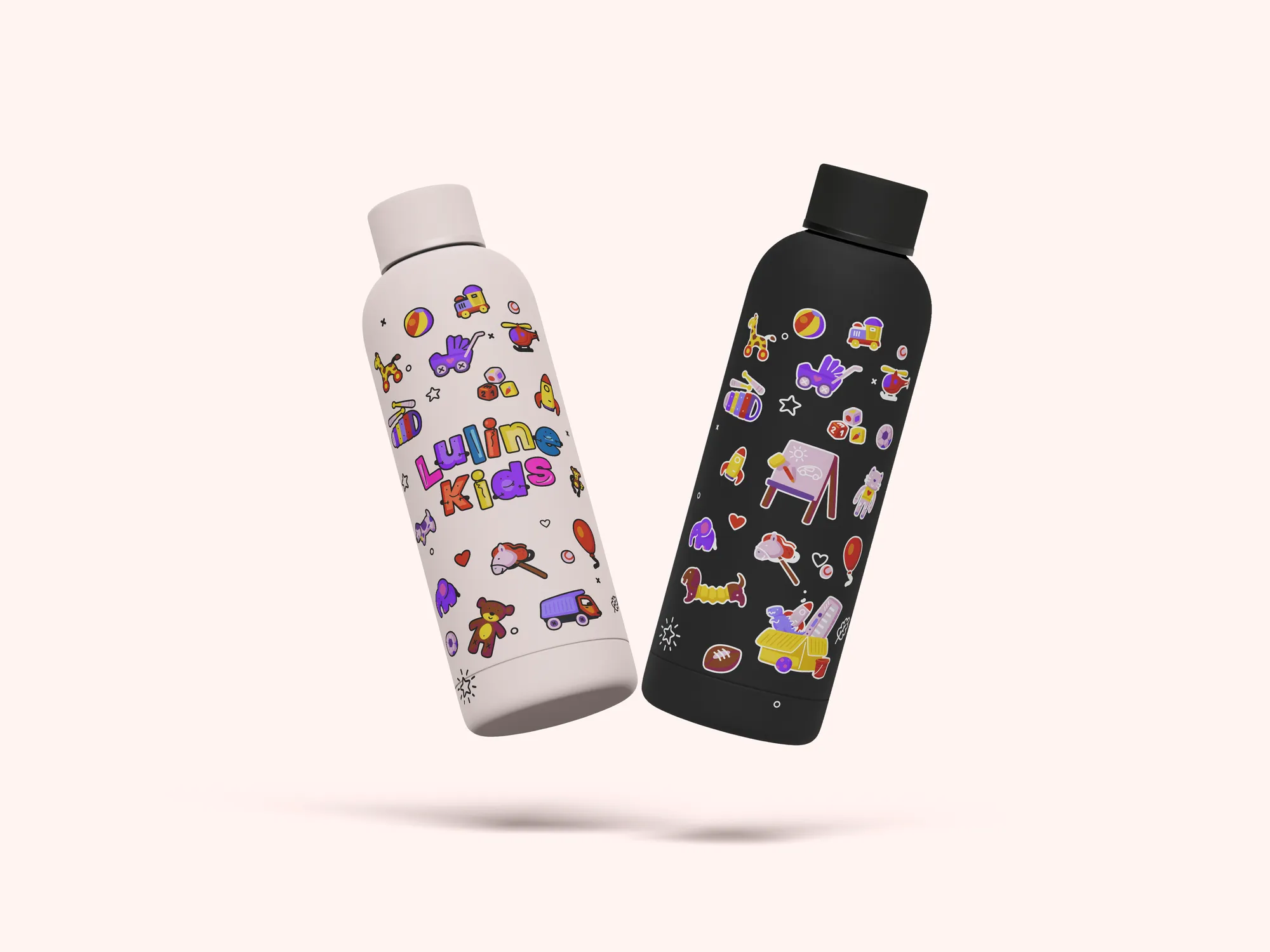
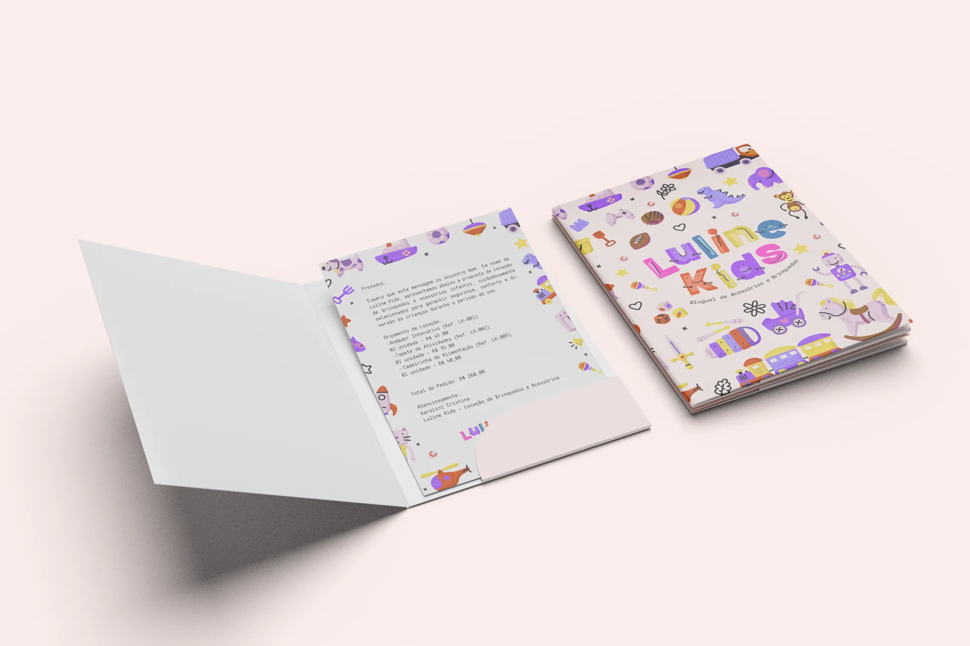
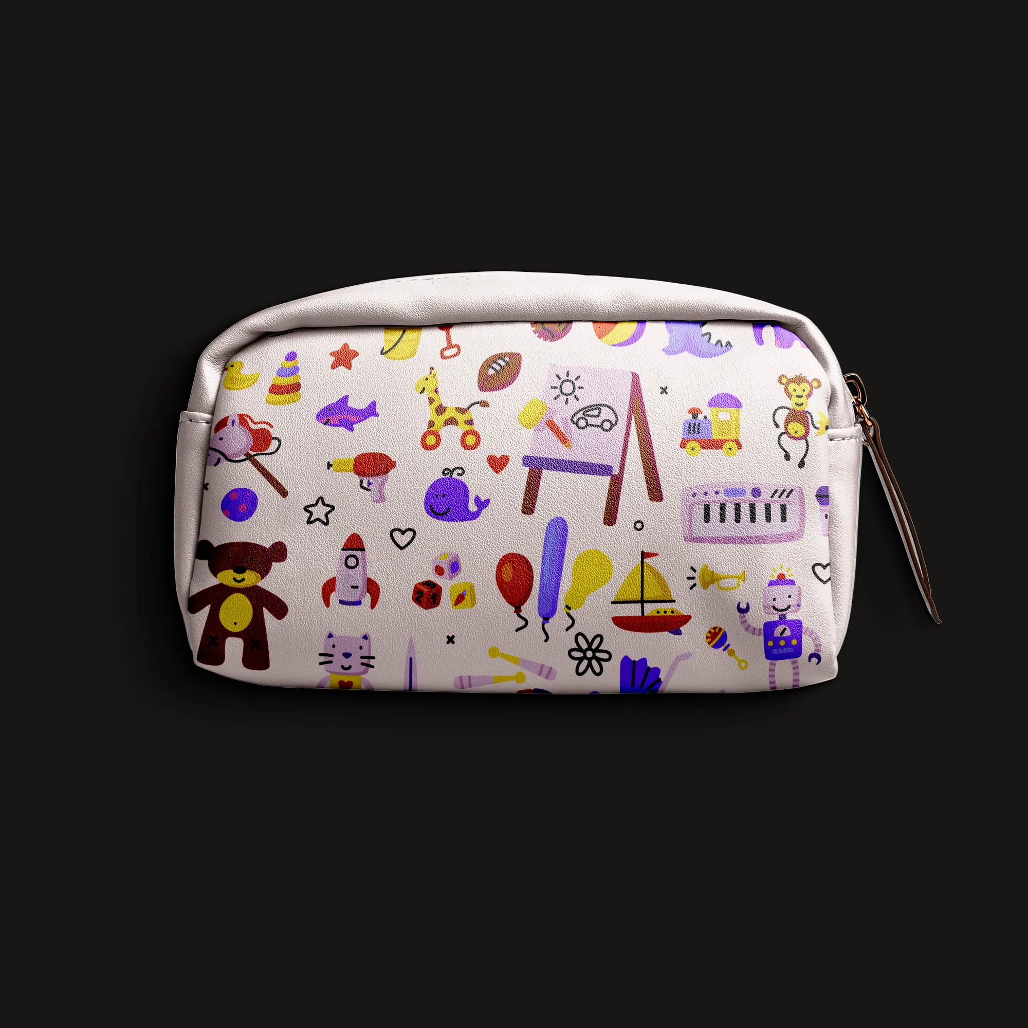
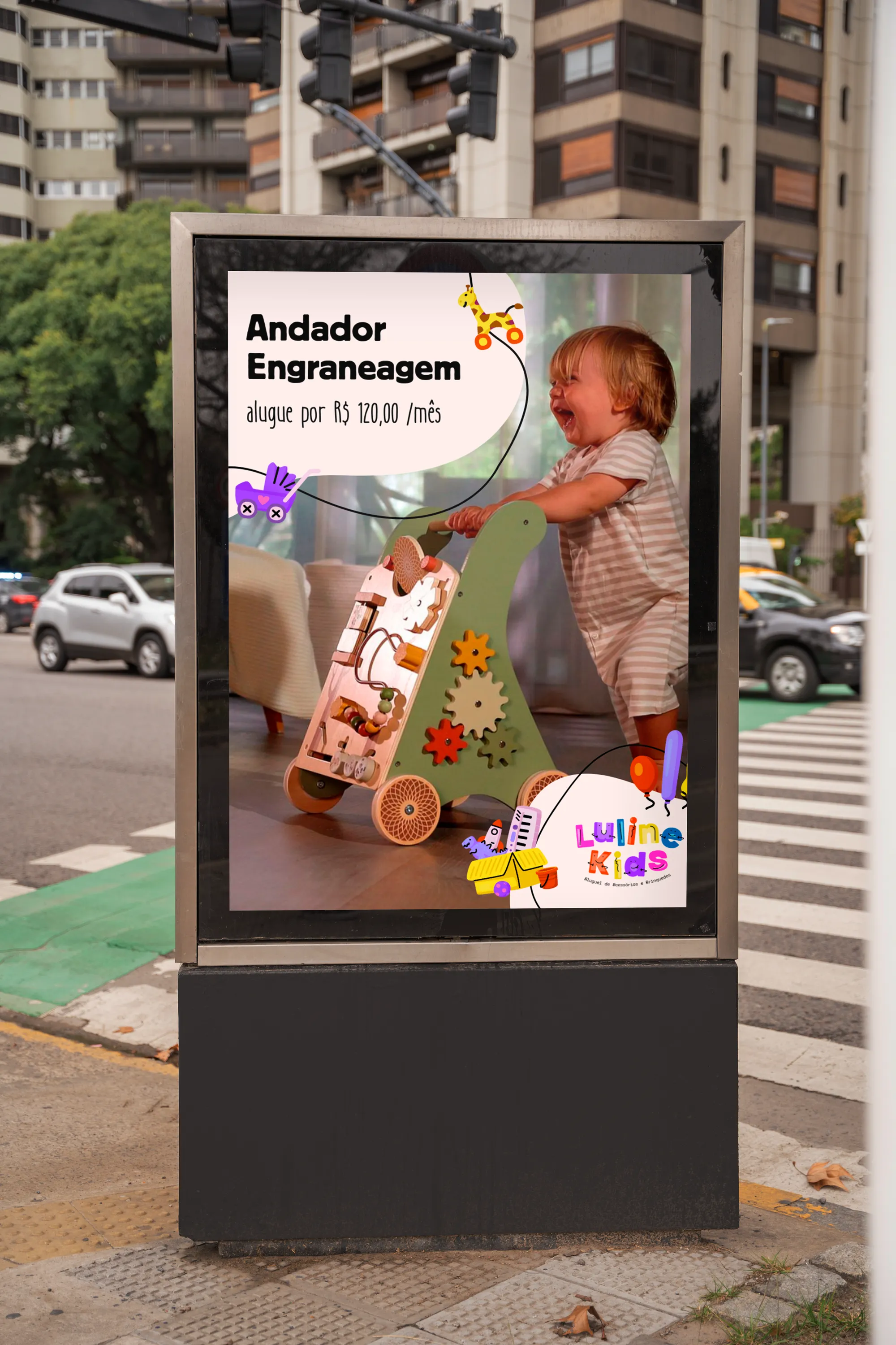
A cheerful, recognisable visual universe, with illustrations of toy cars, instruments, animals and party items in the official palette, applied to stickers, letterhead, document folder, packaging and social media.
Creative decisions
Typographic Lego
Talina was chosen for its thick, commanding, solid appearance, conveying resistance and durability — like the toys and products the brand offers. Built to communicate trust without losing delicacy.
The felt-tip line
Panchi Mono balances the composition with lightness: its fine, continuous line resembles a hand-drawn stroke, like chalk, pencil or felt-tip, connecting the brand to the imagination of childhood.
Colours with a job
Orange for energy and movement, yellow for joy and comfort, blue for serenity and trust, lilac for imagination and sensitivity, pink for delicacy and authenticity.
Illustrations as a system
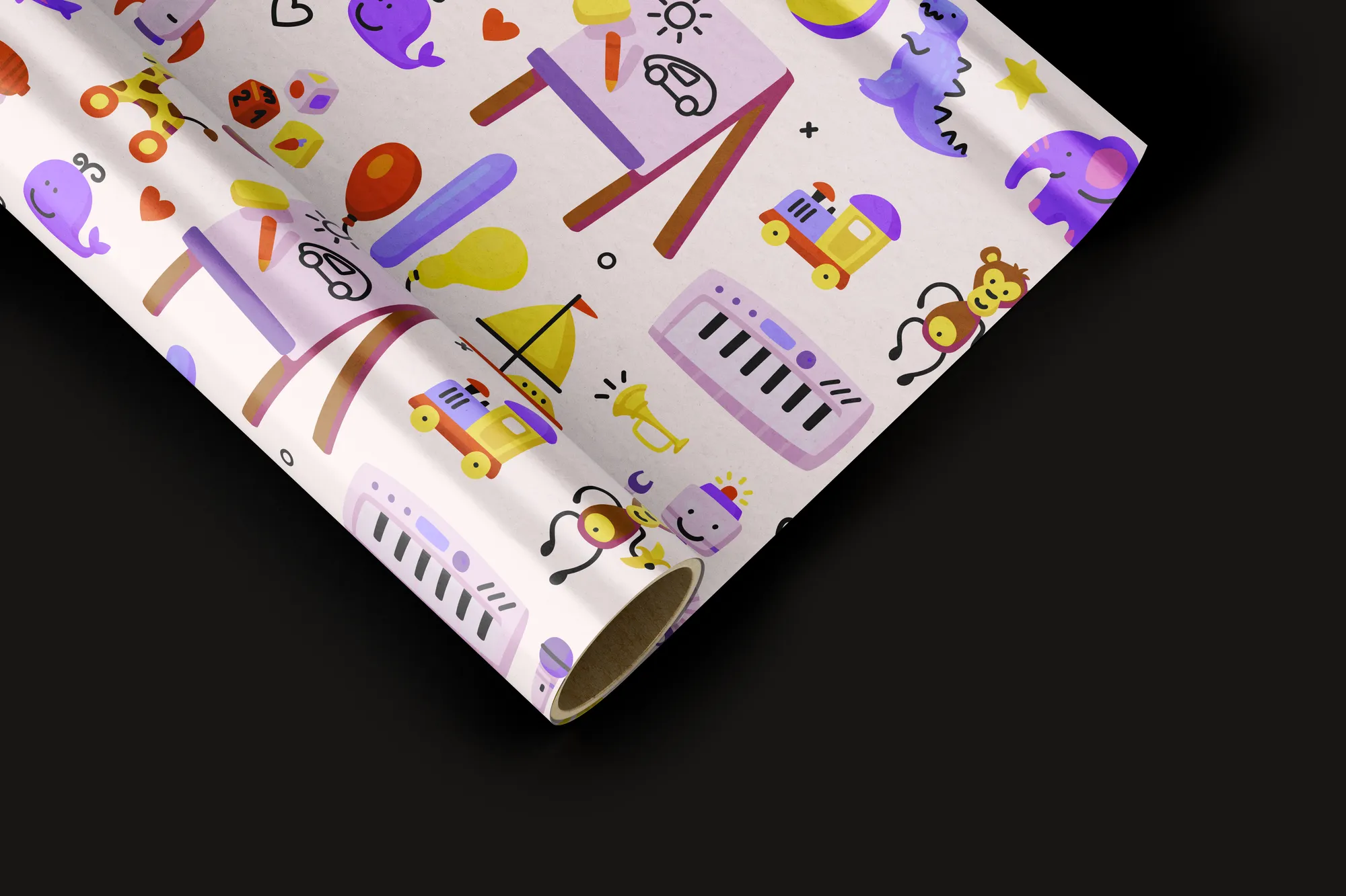
Every toy and accessory was drawn in the official palette. Soft black line strokes give contrast to details, and rounded forms reinforce the feeling of safety, childhood and imagination.
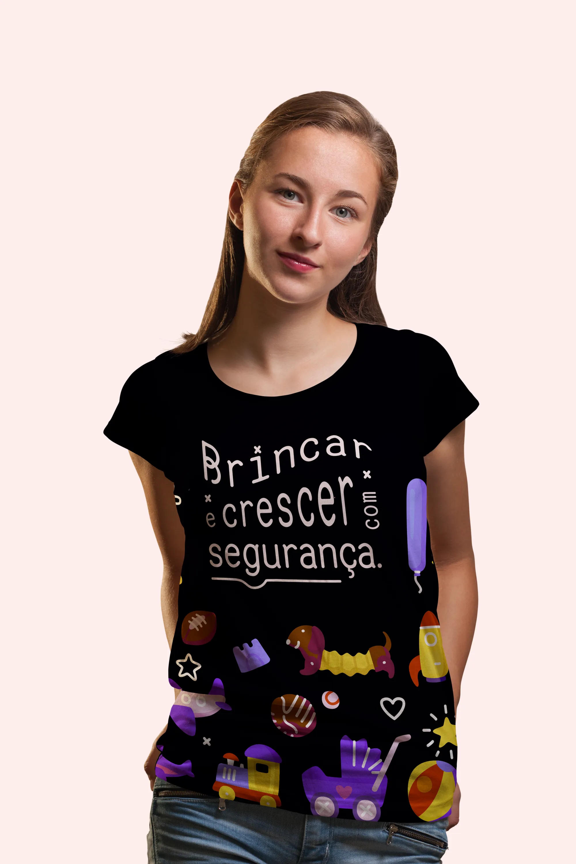
Play and grow, safely.