
Distrito Flores Radiantes
From sales district to community: a brand made so resellers feel they belong.
1. Context
There are two audiences. The first, aged 24 to 50, seeks extra income through multi-level reselling. The second, aged 24 to 60, is the direct consumer, who wants everyday practicality and comfort when cooking or storing food.
2. Challenge
The district needed its own identity without fighting the brand it represents. And it had to speak to those joining to sell: people who don't want to stand out alone, but to be part of a group that grows together.
3. Solution
The Everyman archetype: the focus isn't on standing out, but on giving every member a sense of belonging. The symbol joins the brand's best-known bowl, petals, a circle of union and a star. The secondary typeface is Tupperware's own standard.
4. Result
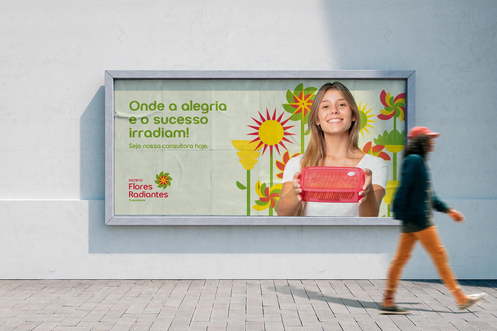
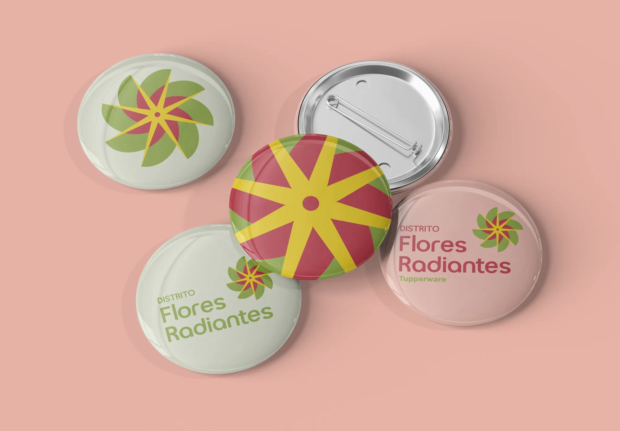
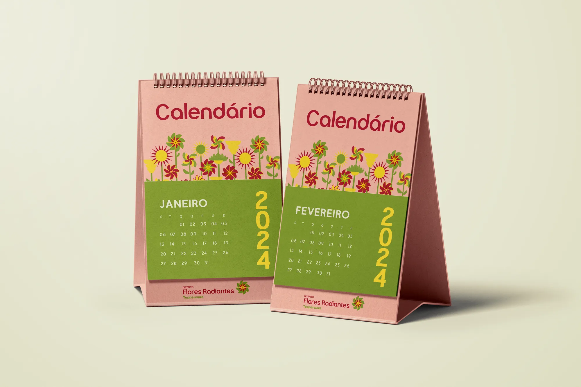
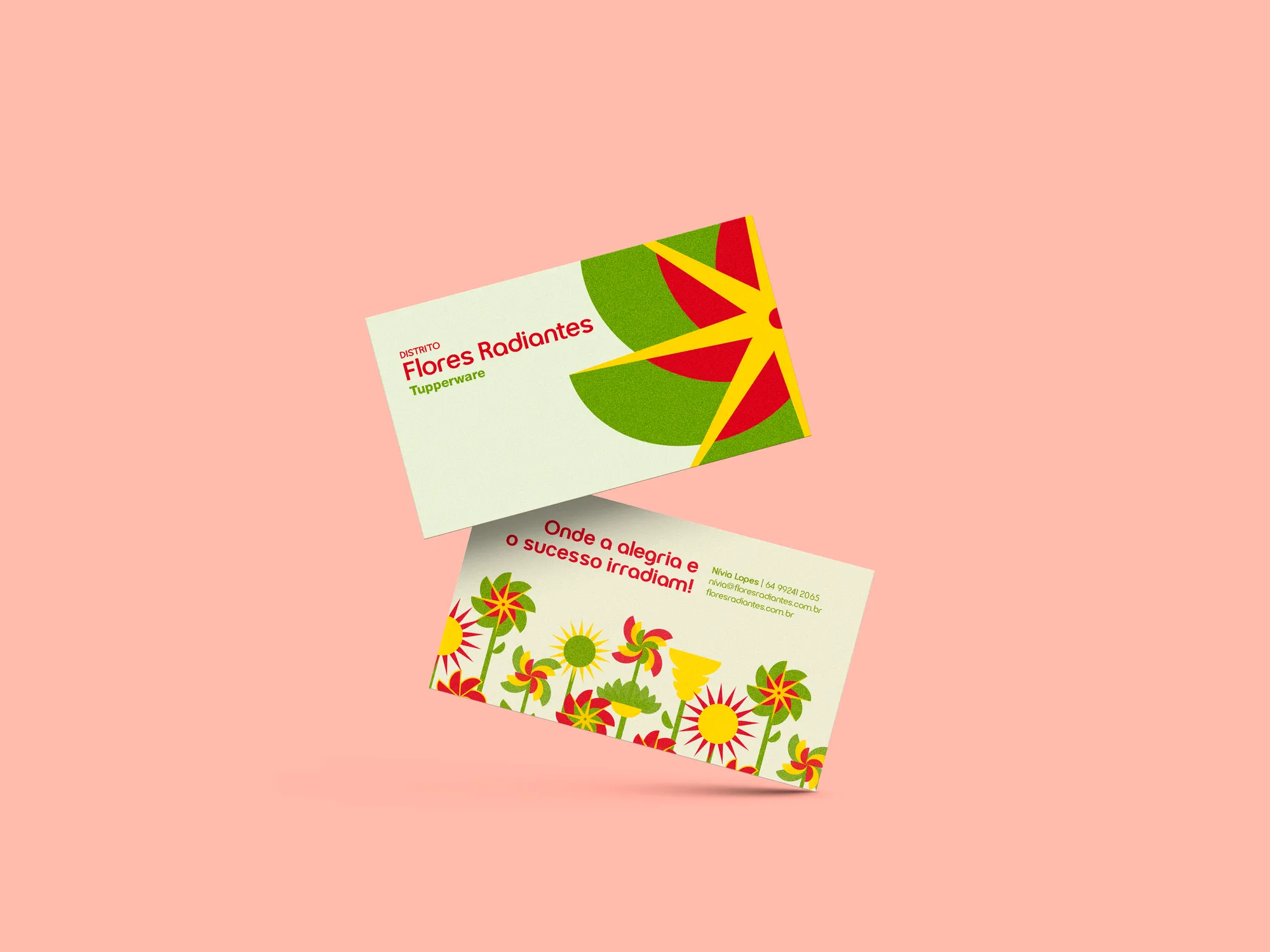
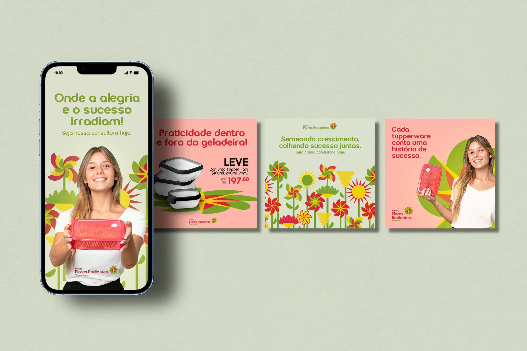
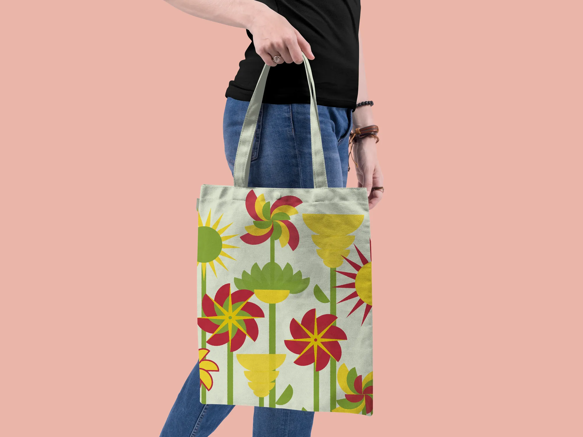
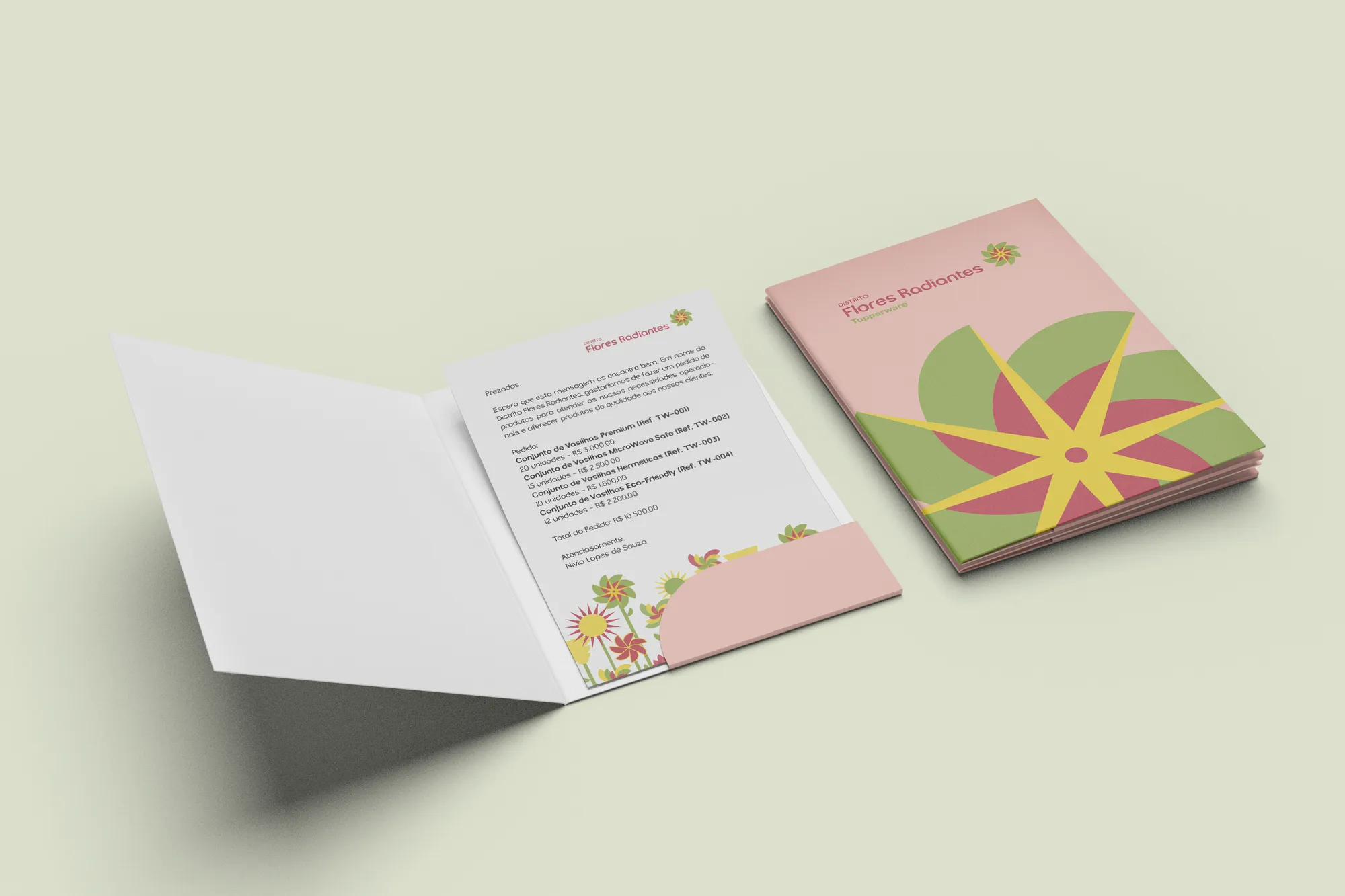
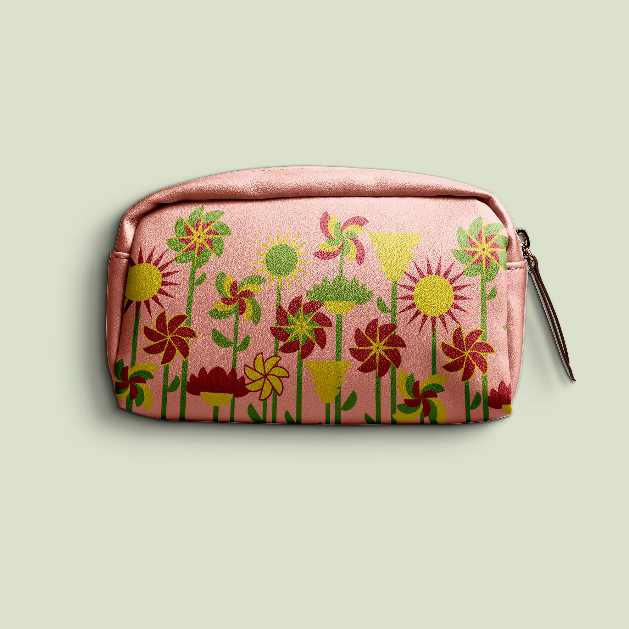
A community kit: apron, tote, badges, calendar, notebook, pouch, mug, t-shirt and street pieces. Vibrant colours make the district recognisable from afar — and the pastels keep the balance.
Creative decisions
The Everyman archetype
Mild, calm feelings, a welcoming and positive environment. The company's essence is not just selling products, but building solid relationships and inspiring individual and collective growth.
Symbol
The Tupper Jumbo — the Maravilhosa bowl —, the flower and its petals, the circle representing union, the star as shine and high spirits, and red details that give an impression of movement.
Lowercase to bring closer
Gucina, a modern, accessible geometric sans, was used in lowercase to bring the brand closer to its audience. Helvetica Neue complements it — and is Tupperware's standard typeface.
Colours with names of their own
Radiant, New Leaf, Rosé, Petal and Vibrant Sun. Together, the vibrant ones reflect happiness and euphoria; the two pastels keep the balance and sobriety the brand calls for.
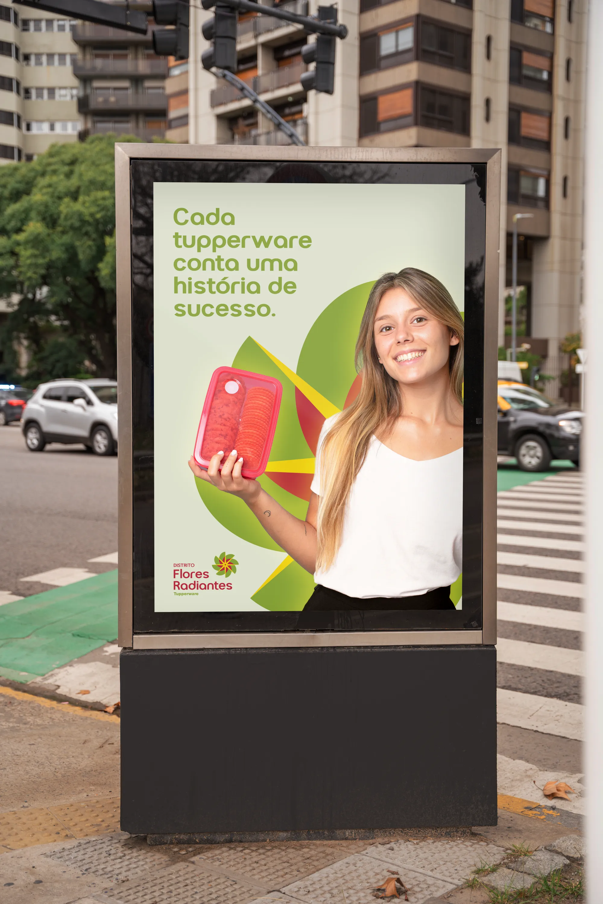
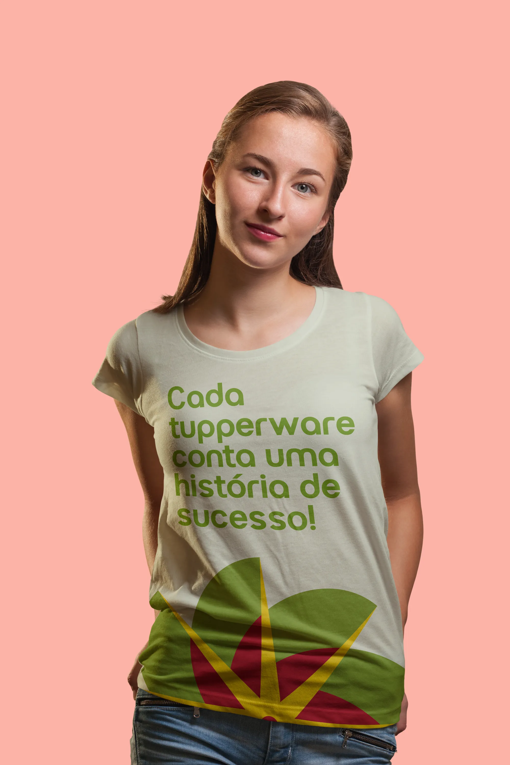
Where joy and success radiate.