
Inner Hour
From a product idea to a moment of the day with a name of its own.
1. Context
The founder wanted a company aligned with her own lifestyle: natural food, training and consistency. The idea went through juices and teas before landing on drink mixes with natural ingredients and fibre — a premium, minimalist product with no easy weight-loss promise.
2. Challenge
The supplement category shouts miracles. The brand had to be built for a woman who believes the opposite — that results come from consistency — and needed a name that was original, memorable and registrable, able to carry an entire product line.
3. Solution
The platform starts from a definition: Inner Hour is not a time, it's a moment — when a woman pauses the outside world and turns inward. Naming went through a funnel of 400 to 500 names. The line was named after states of the day, not ingredients: In-Pulse to ignite, In-Body to regulate, In-Calm to slow down.
4. Result
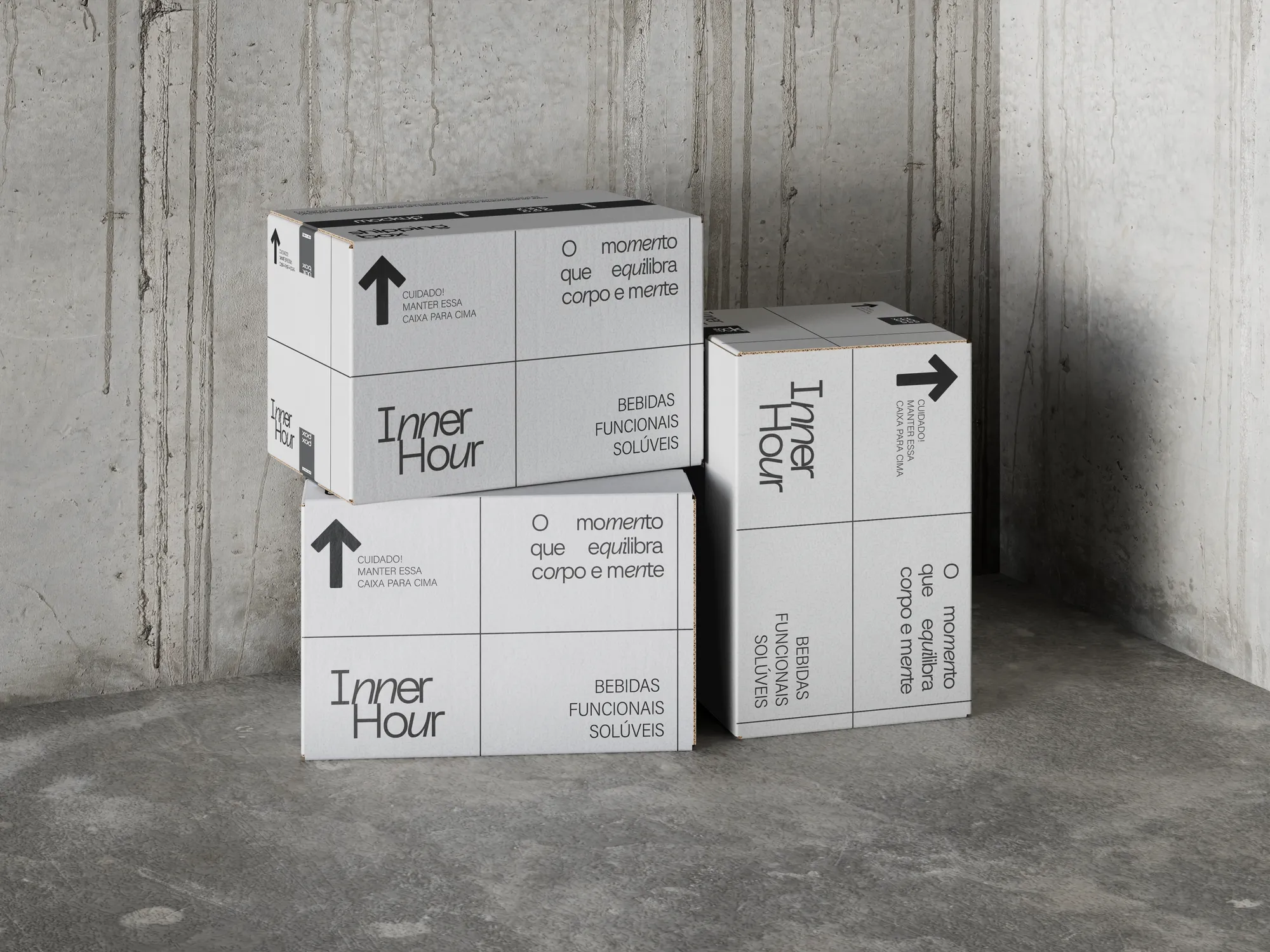
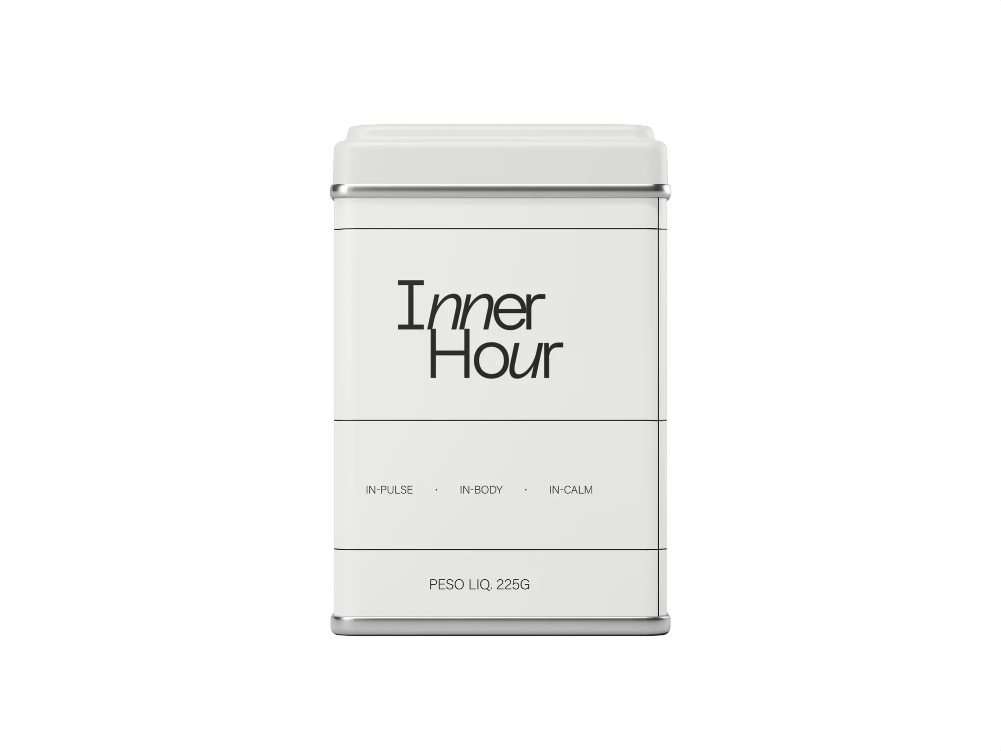
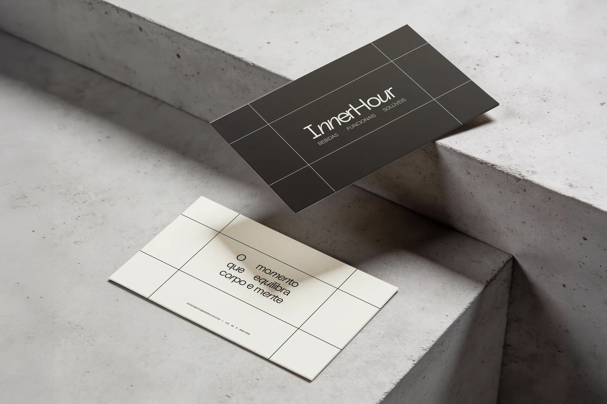
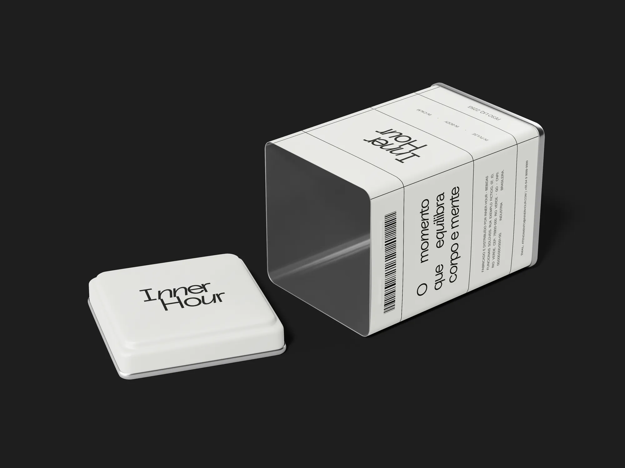
A brand born with a manifesto, positioning, differentiation pillars, a morning-to-night consumption protocol and a packaging system with a colour reserved for expansion. The Inner Circle — an invitation-only community — completes the model: the product is bought, the circle is earned.
Creative decisions
Positioning
A natural, intelligent protocol brand that accompanies women through every moment of inner healing, from morning to night, balancing body and mind — from energy to rest.
Naming through a funnel
Eight problem types mapped, a priority pyramid (original, audience-fit, memorable, trademark-registrable), analysis of competitor names and four creative territories. From 400 to 500 names generated down to the final decision: Inner Hour.
Products as moments
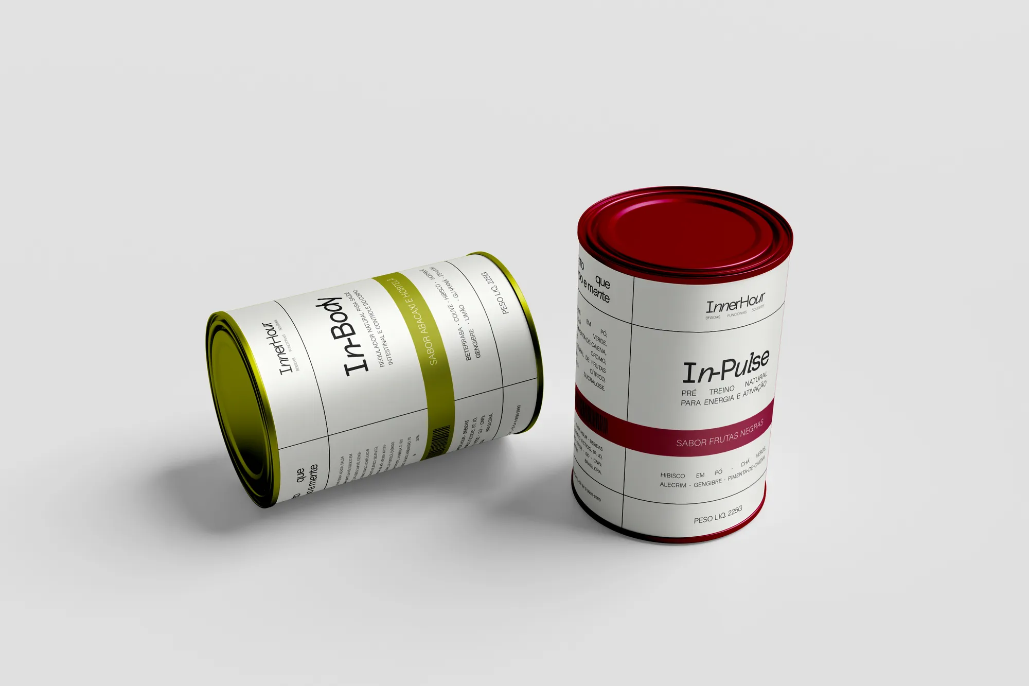
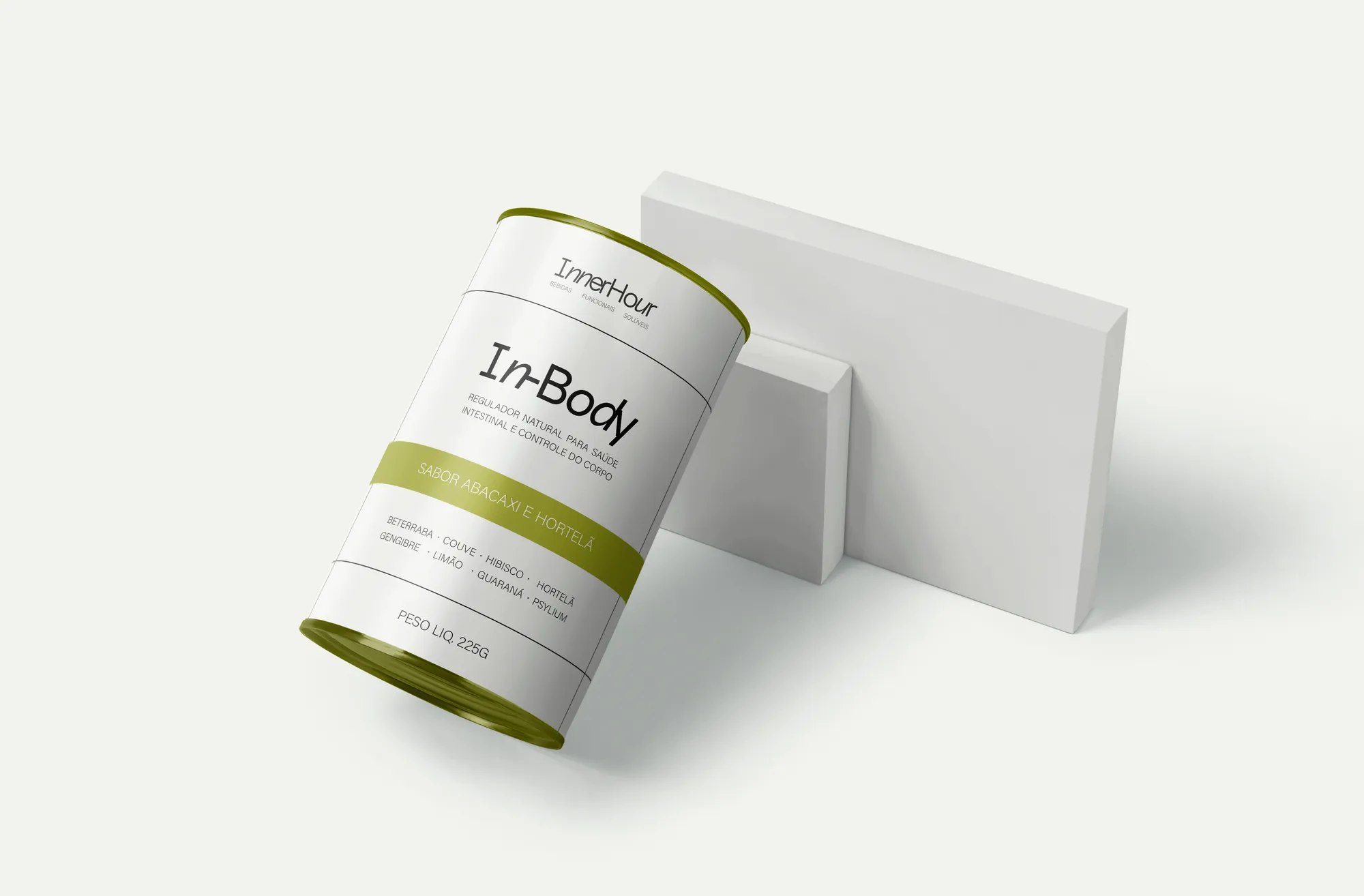
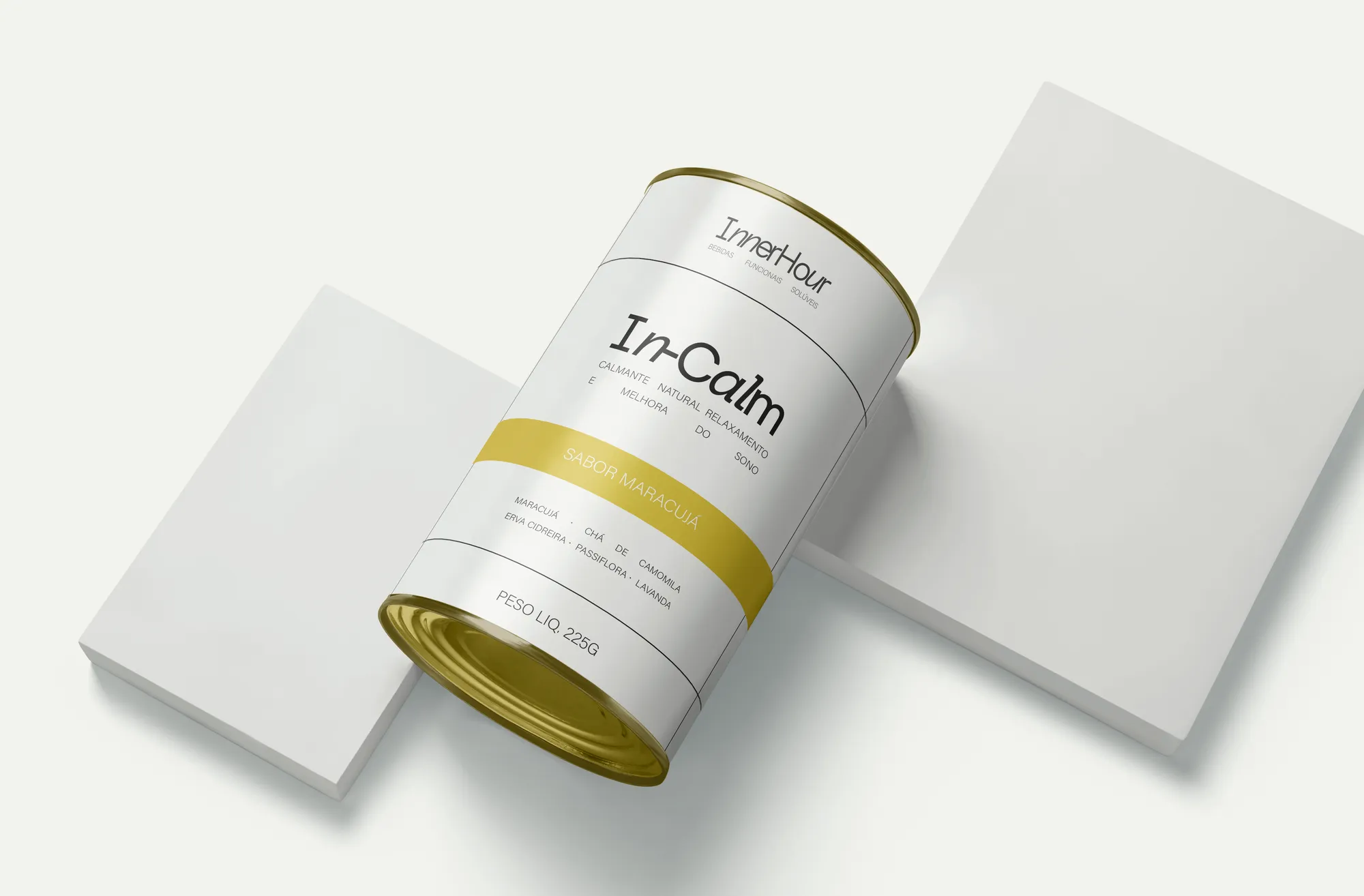
In-Pulse (dark berries) for energy and focus before training; In-Body (pineapple and mint) for regulation and lightness; In-Calm (passion fruit) for rest before sleep. Each product is the physical trigger of a ritual that already existed in this woman's life — it just had no name.
A neutral palette by decision
A monochrome base from off-white to 80% black, so it never competes with photography or with each product's colour: burgundy for In-Pulse, green for In-Body, yellow for In-Calm. Blue was reserved for a future launch — the system grows without being rebuilt.
Typography
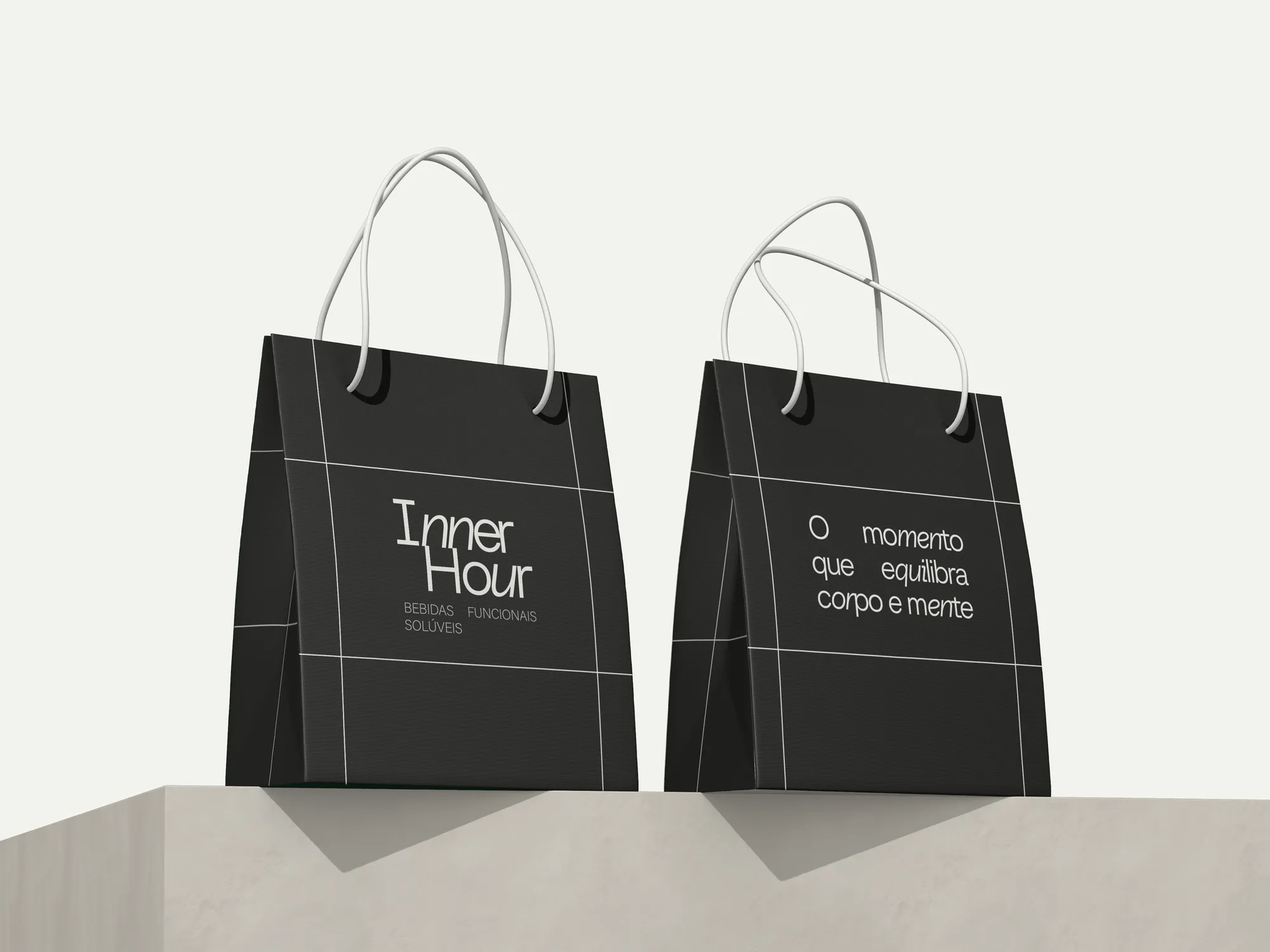
Baru Sans as the primary face — geometric, monoline, with a delicate italic that lends elegance — and Acumin Variable for long copy, ensuring legibility and consistency.
Inner Circle
A closed circle of women who share the same philosophy of care. It isn't open, it isn't bought, and discounts aren't its main benefit. It's what turns customers into advocates and makes the brand hard to copy.
Inner Hour is not a time. It's a moment.