
Open Box Burguer
From the local burger joint to a brand that makes the box the burger's stage.
1. Context
The business already had regulars and colours people knew around town. Its audience ranges from teenagers to forty-year-olds who want a burger that's different from the usual, authentic and indulgent — and who live on WhatsApp and Instagram, where orders happen.
2. Challenge
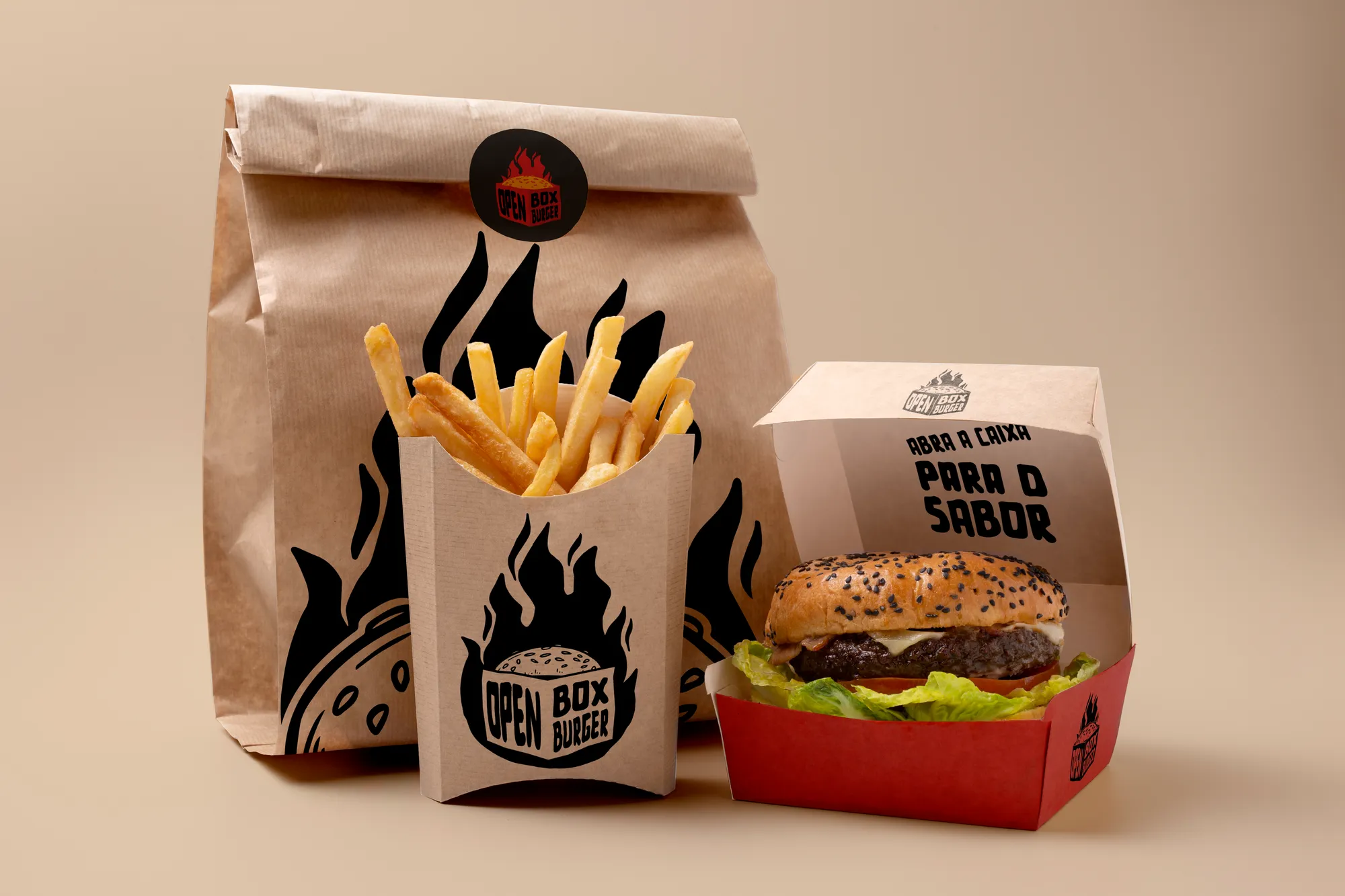
Evolve without losing what customers recognised. The previous colours had to stay, but with real contrast between them. And the brand had to work in a single colour, printed on kraft paper — because packaging is where it shows up most.
3. Solution
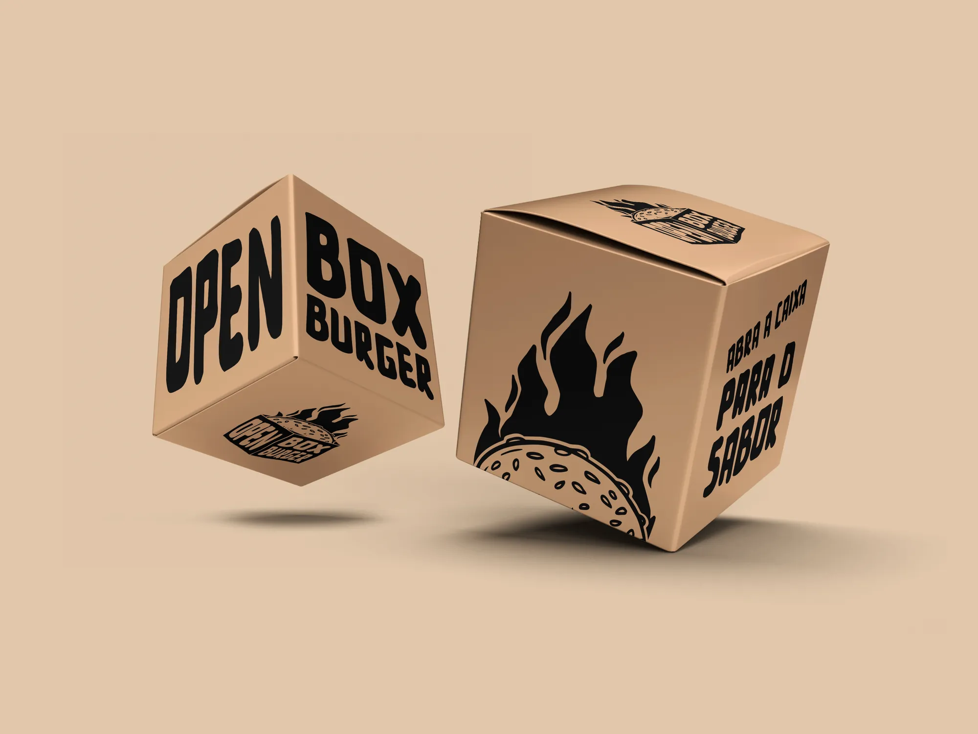
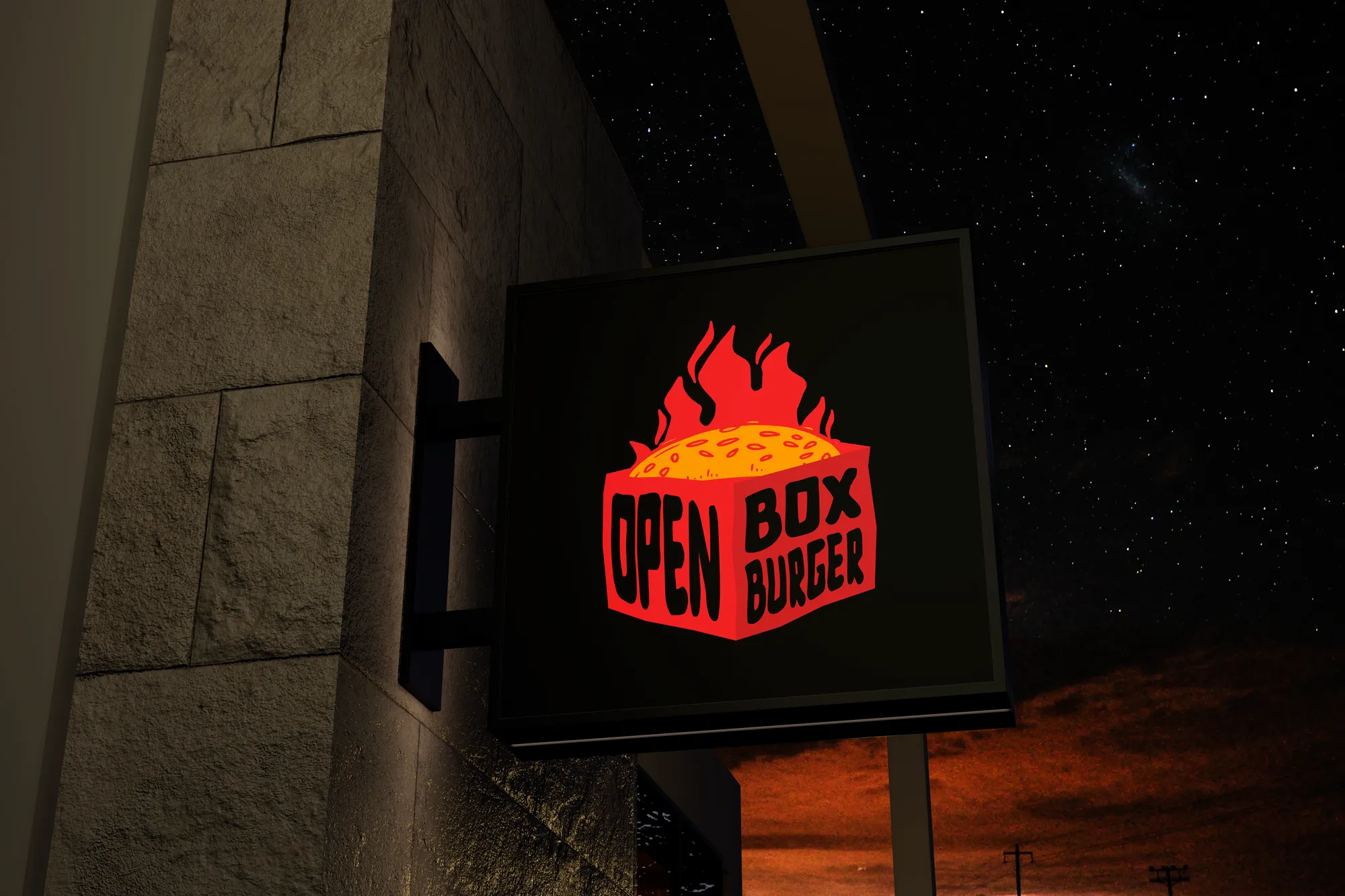
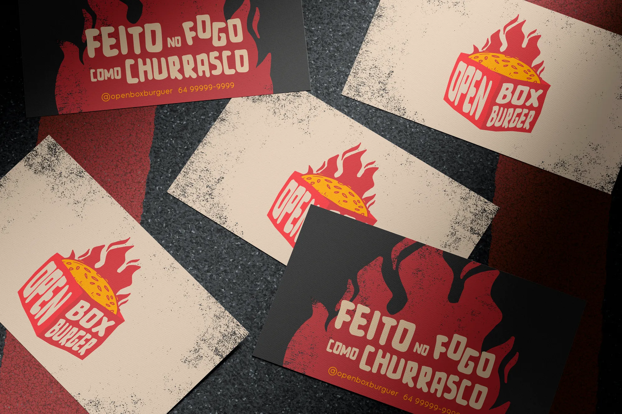
The concept ties the brand to grunge aesthetics and industrial architecture. The primary typeface is hand-made, with a weight that recalls sauce spread across a surface. The symbol is a box drawn in three dimensions, designed to be recognised by its silhouette, even in black and white.
4. Result
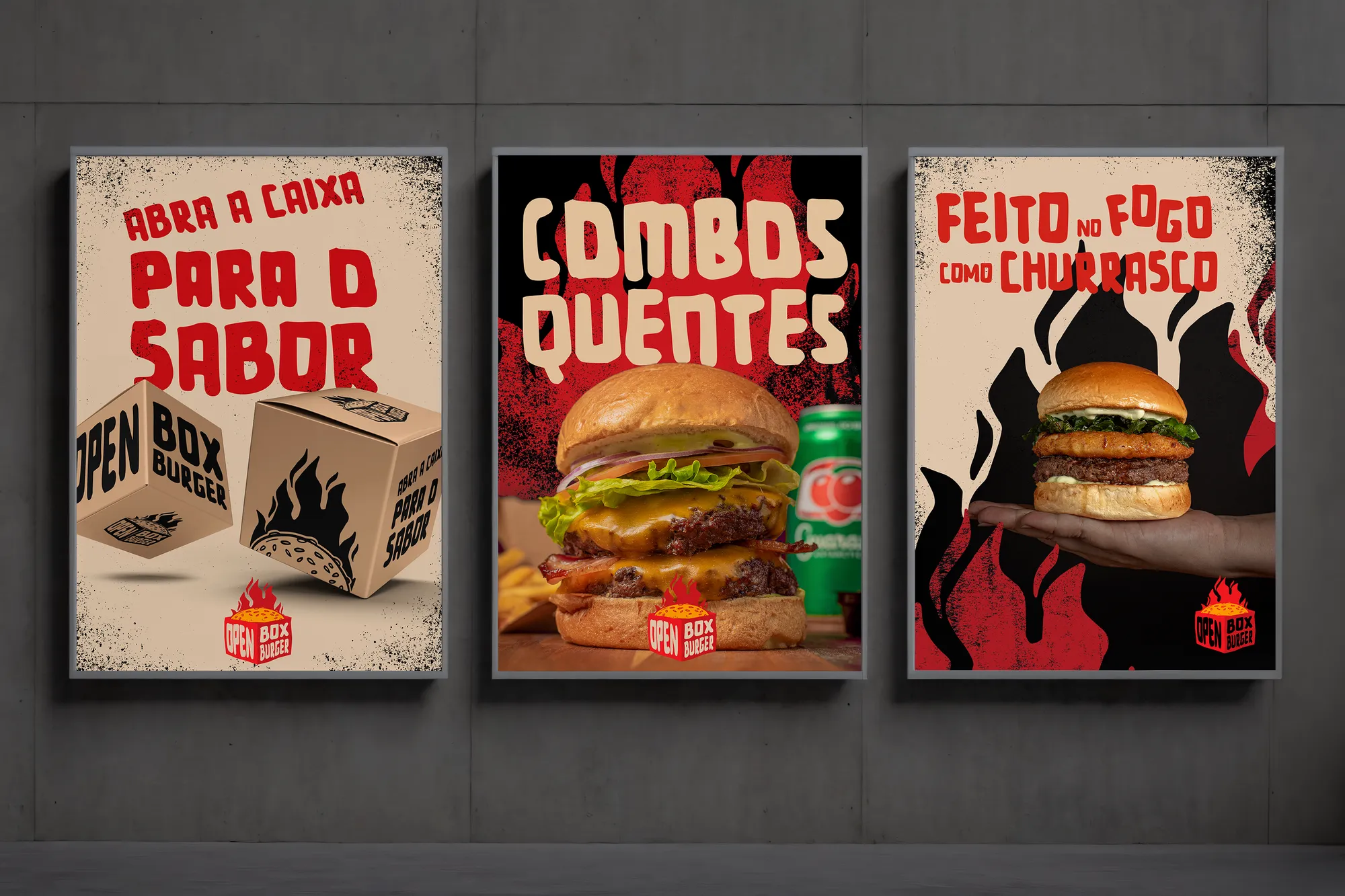
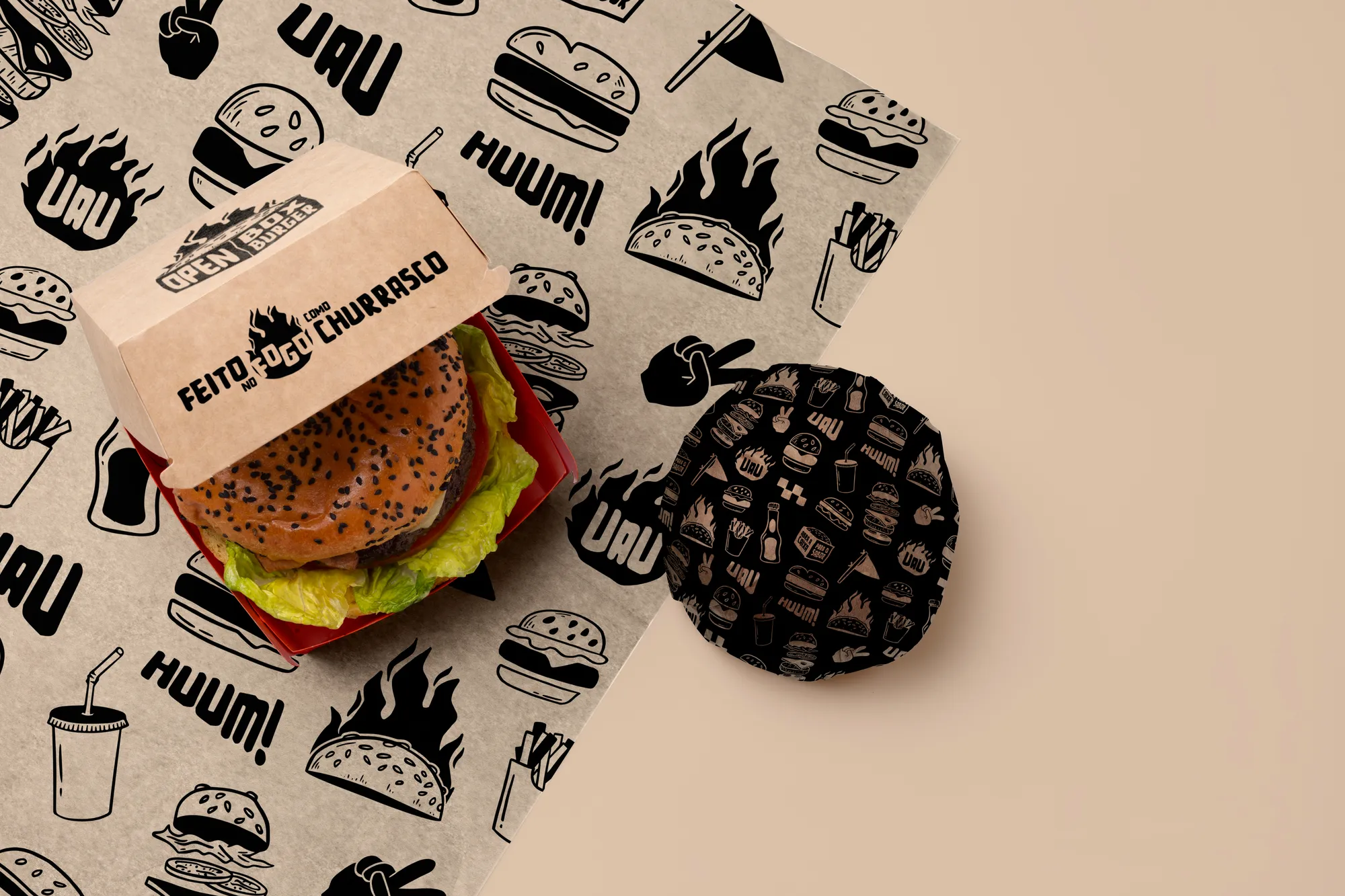
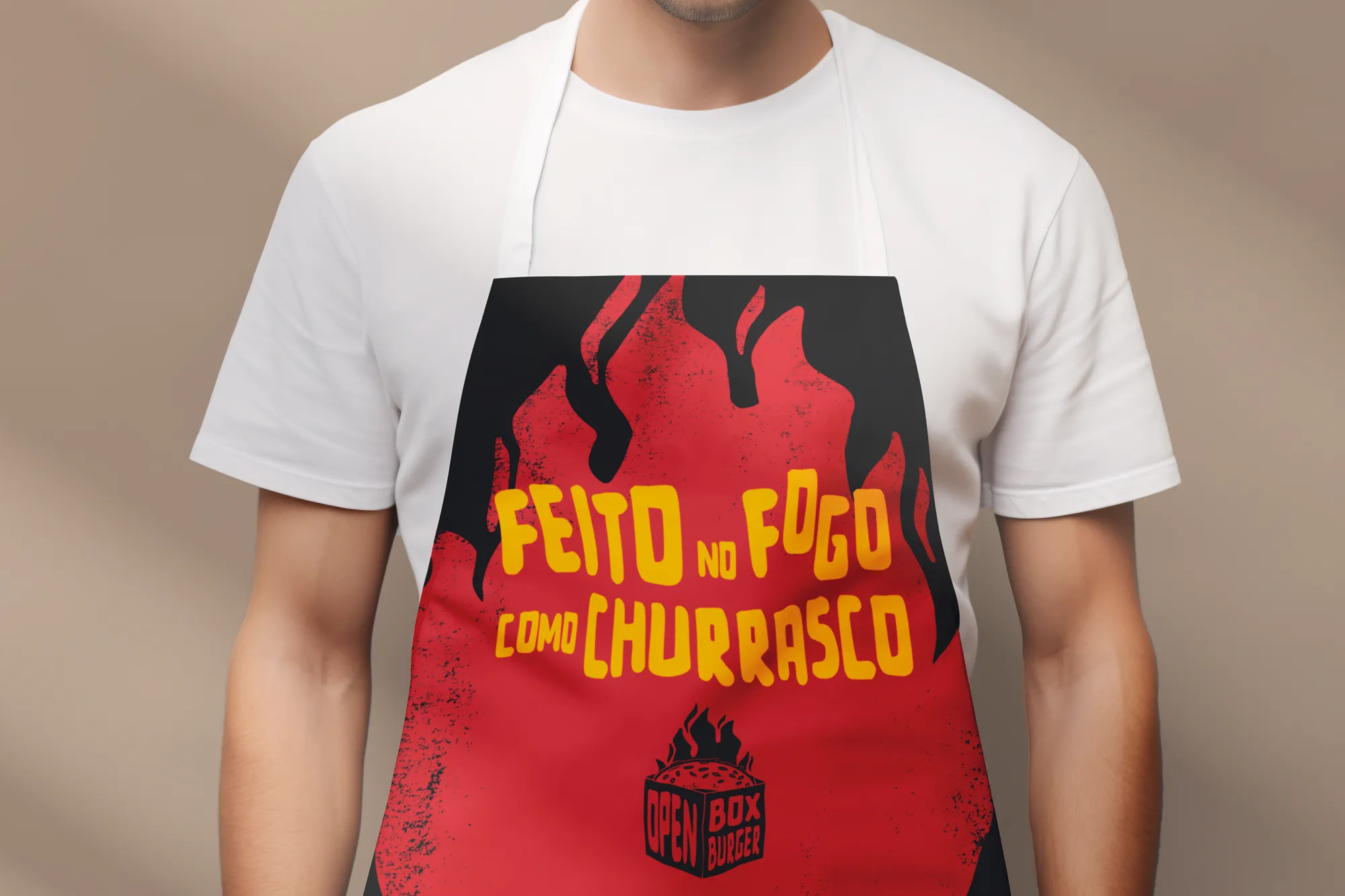
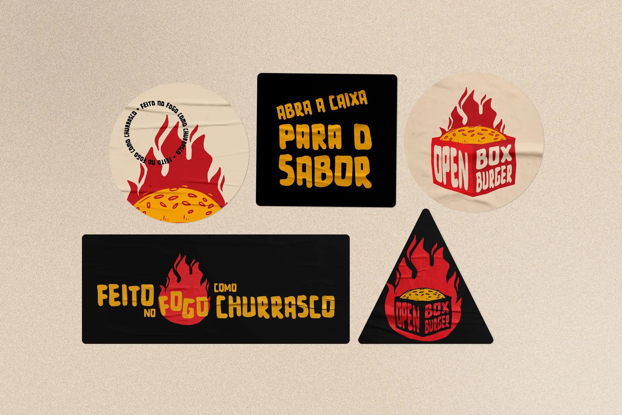
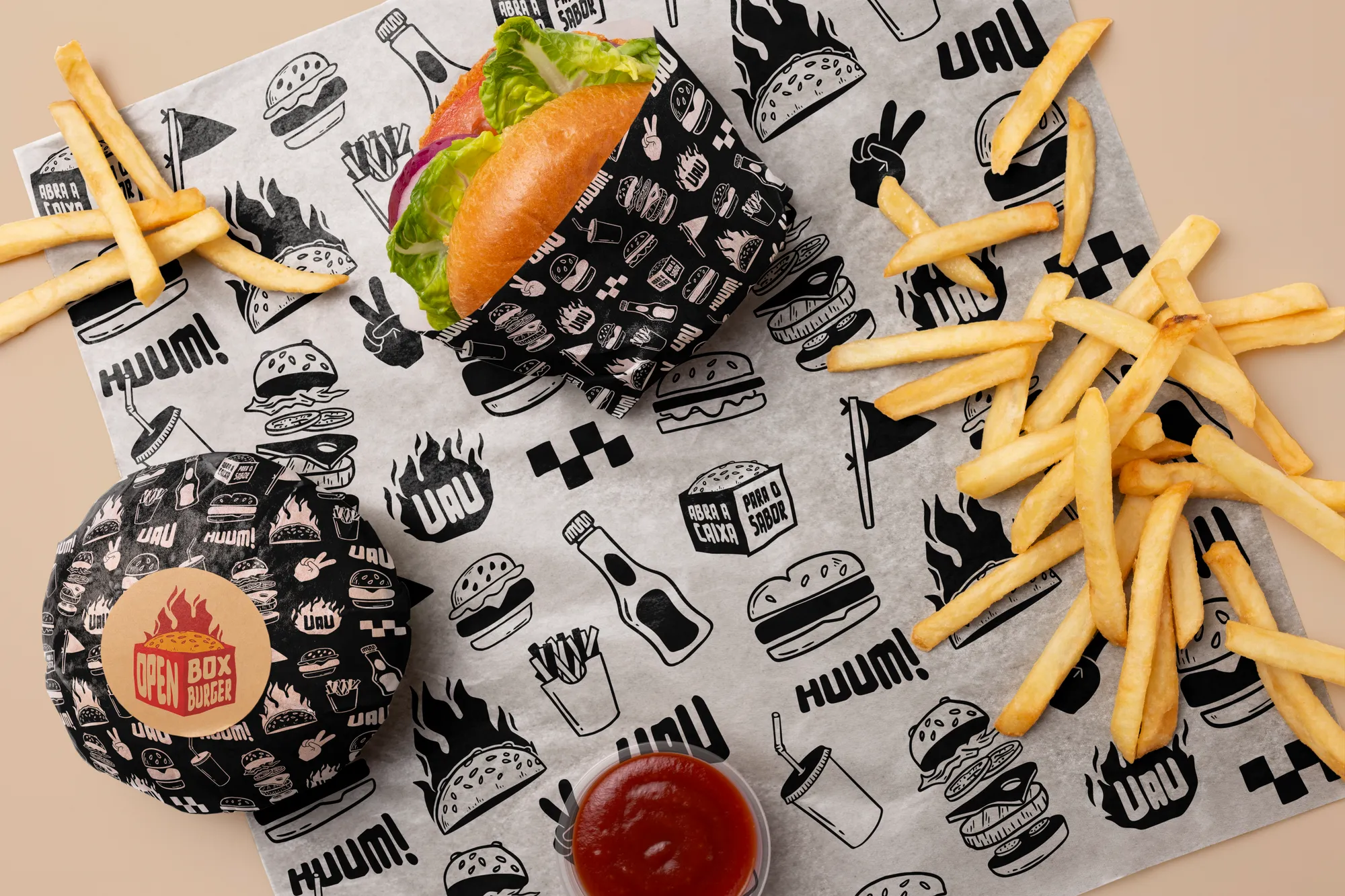
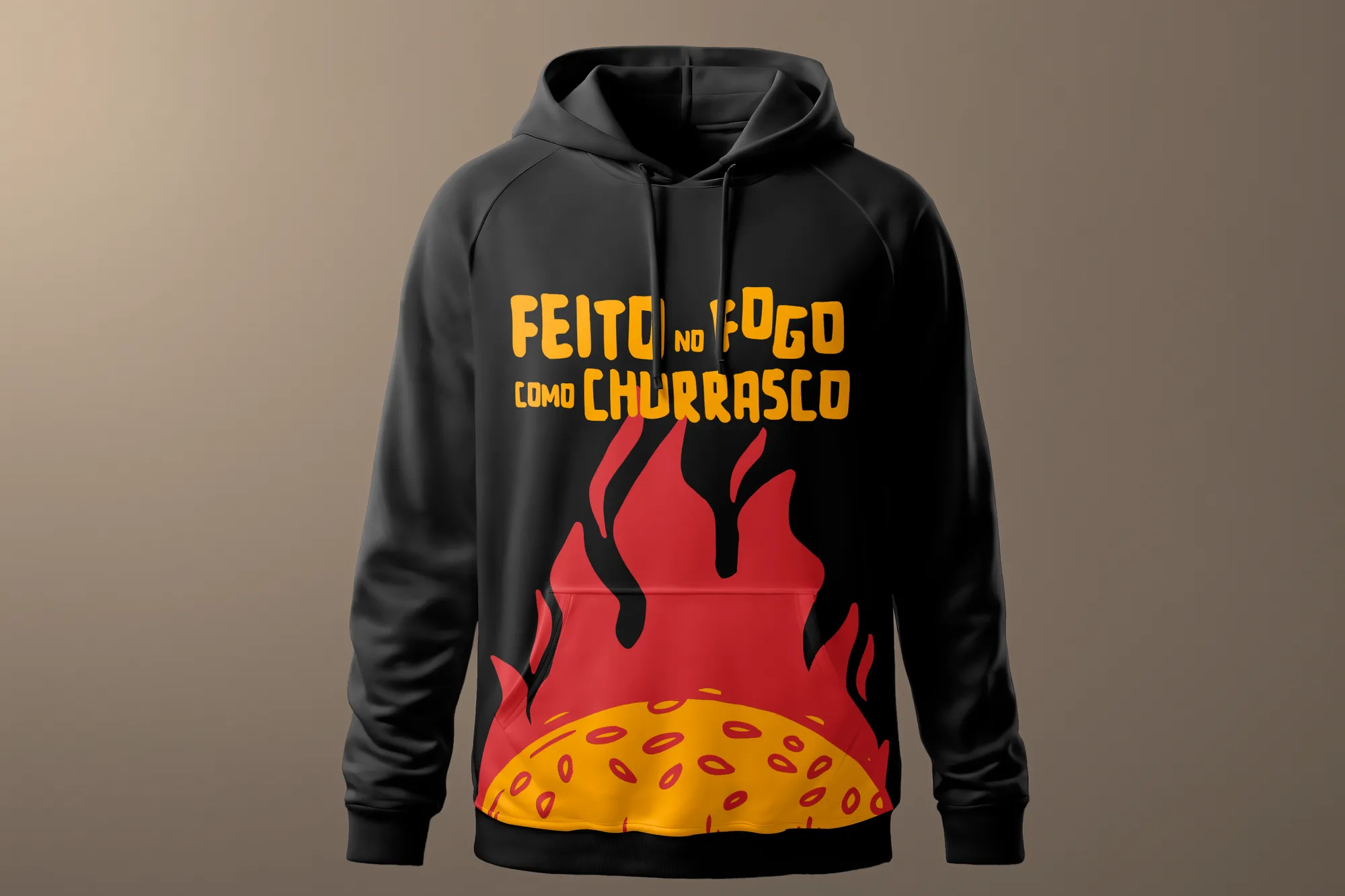
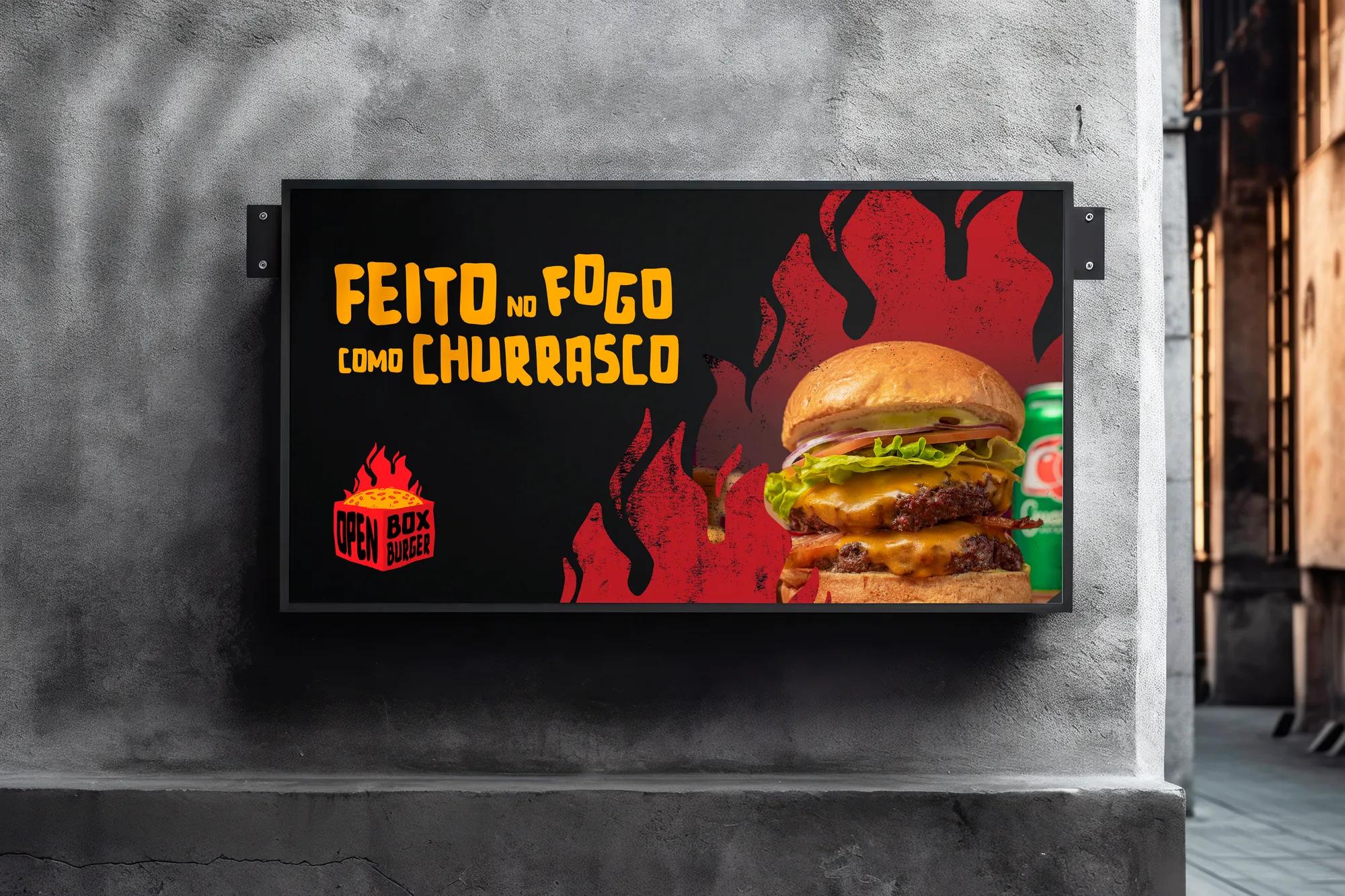
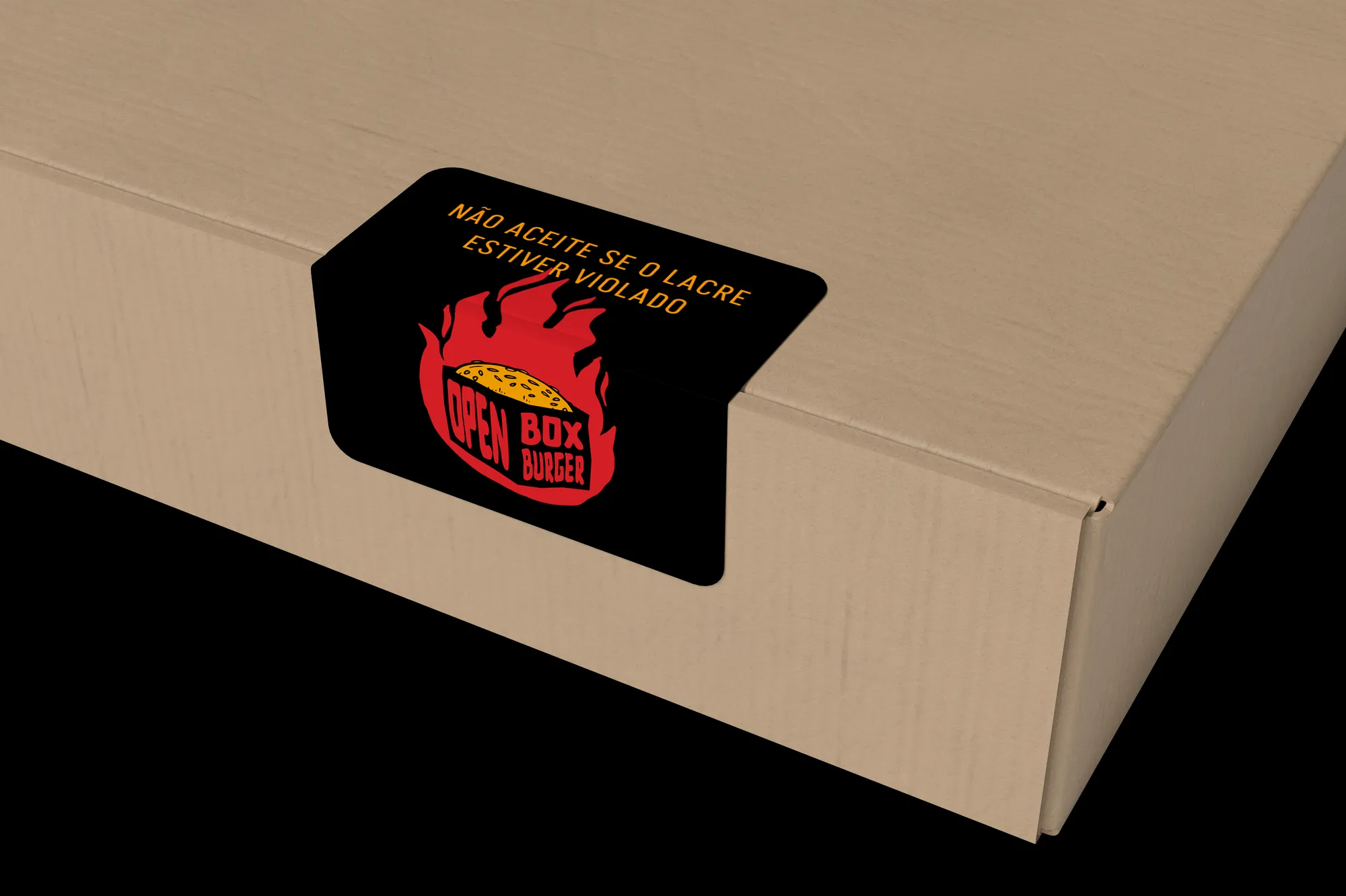
A complete system for the counter and the street: boxes, kraft bags, thermal paper, seal stickers, apron, hoodie, posters and signage. The palette was named after ingredients and gained a second version in greys and black, made for kraft.
Creative decisions
Concept: industrial grunge
The brand was designed to tie its core concept to grunge aesthetics and industrial architecture — the opposite of the sterile gourmet burger. Bold, rebellious, hand-made and young, in attributes and in drawing.
Type that looks like sauce
Bold Vibes: hand-made and vectorised, sans-serif with uneven proportions. Its heavy weight recalls the texture of spread sauce. Geomatrix supports it in lowercase for copy, taglines and subheads.
A palette of ingredients
Ketchup, Pepper, Mustard, Sesame and Mayo. The colours started from what the business already used, adjusted to contrast with each other and stay recognisable even tone-on-tone.
The box as symbol
Drawn three-dimensionally so the silhouette of a box would be recognised instantly — across materials, and in black and white too.
Made for kraft
A second palette, in shades of grey and black, was created for materials printed on kraft or white stock. On packaging, the brand resolves in a single ink.
Open the box for the flavour.