
Dentae
From a practice carrying the dentist's name to an oral rehabilitation centre that doesn't depend on one person.
1. Context
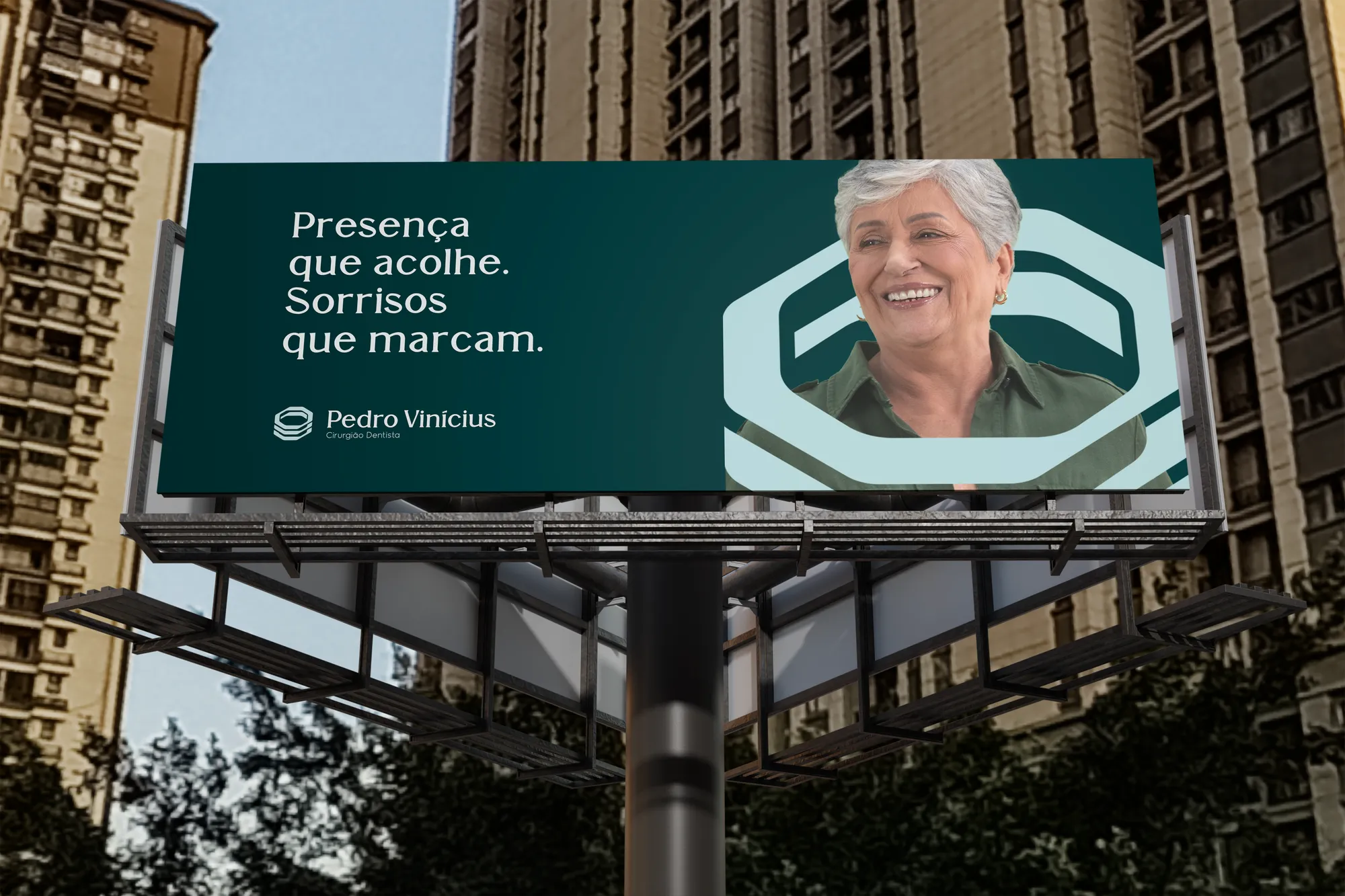
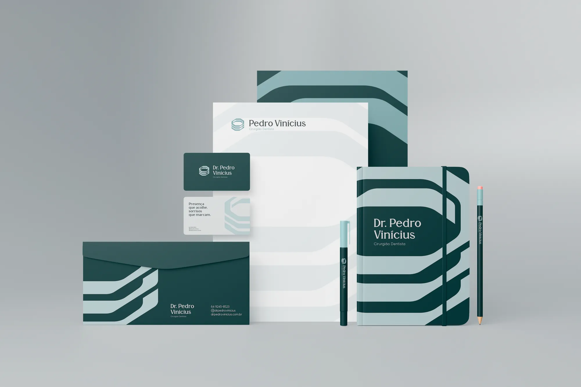
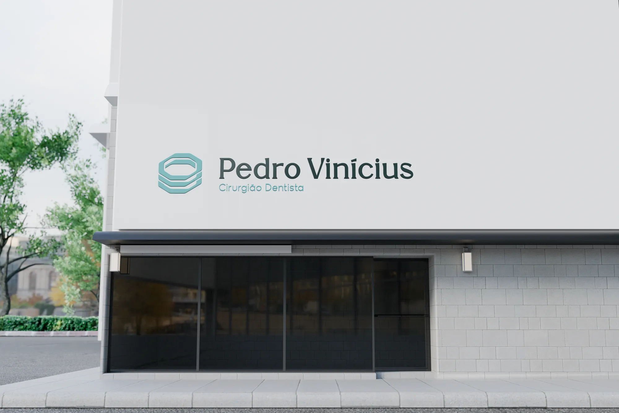
In 2025 the studio designed the personal identity of Dr. Pedro Vinícius, dental surgeon: a symbol created from the top view of a molar, overlapped to recall the threads of an implant screw — and the feeling of an embrace. The clinic grew and became bigger than his name.
2. Challenge
The diagnosis showed a well-loved clinic that was structurally fragile: friendly but disorganised, welcoming but without processes, human but reactive. The brand had to stop depending on Dr. Pedro and project an institution — without losing the spontaneous warmth patients already recognised.
3. Solution
The platform defined promise, purpose and positioning: the most human integrated oral rehabilitation centre in the region. The name Dentae takes the institutional role; Content — Integrated and Social Dentistry — houses the social programme. The verbal identity teaches the brand to speak calmly, clearly and always in the first person plural.
4. Result
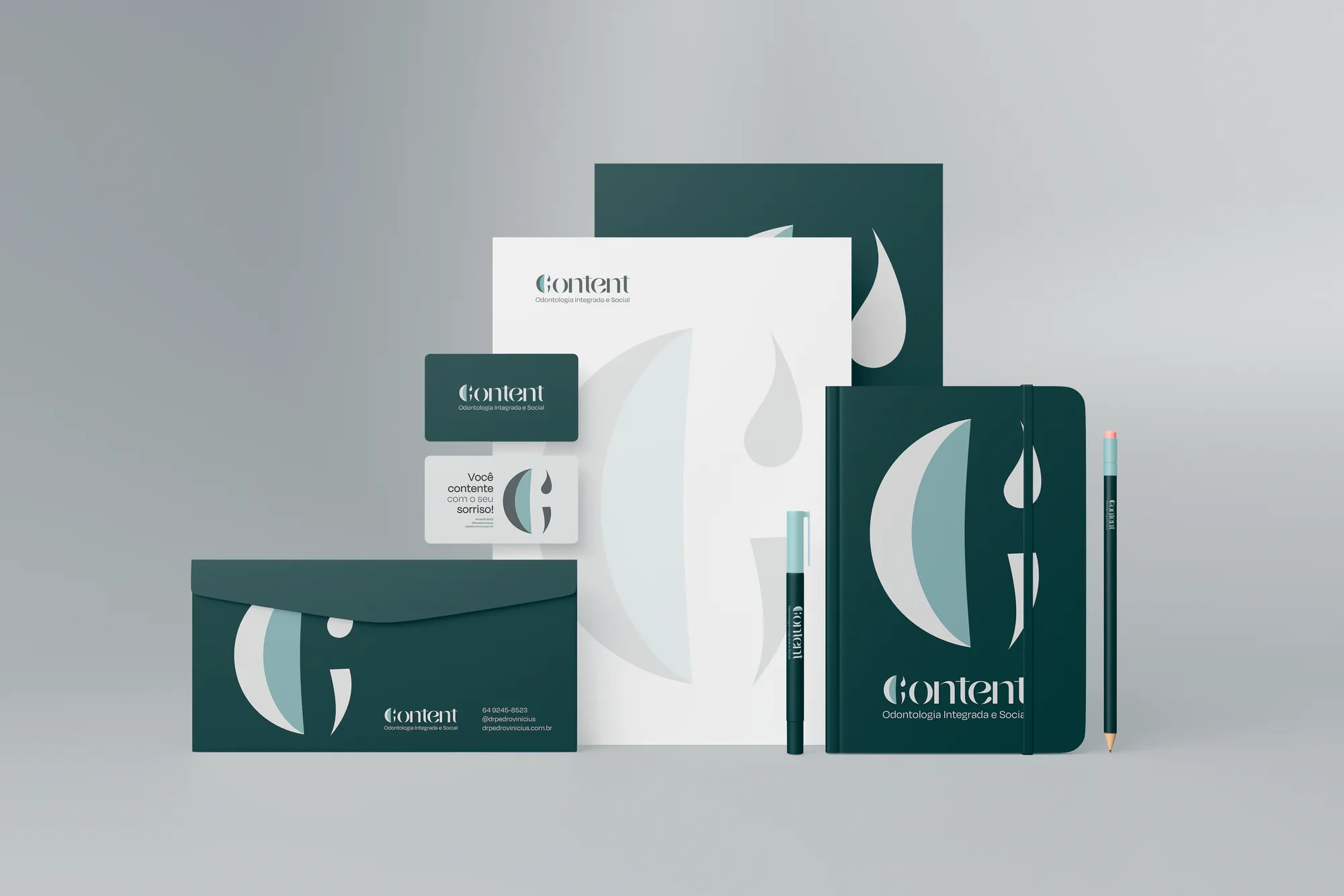
Two brands in a single system, with a voice guide, verbal territory, a list of what may and may not be said, and redesigned clinical materials. The original symbol wasn't discarded: it evolved, carrying into the institution the story that began in the practice.
Creative decisions
Positioning
The most human integrated oral rehabilitation centre in the region — a reference in advanced implants, comprehensive care and a welcoming premium experience.
From person to institution
The projected personality includes a decisive item: institutional — not dependent on Pedro alone. That's why the voice speaks as we, reinforcing team, method and collective care, and avoids personalist language such as "my method".
A symbol that evolves
The molar seen from above — strong, sturdy, with rounded forms — gained the silhouette of a smile and a cross. The result is institutional and recalls a hospital, while conveying care and protection.
Content, the second brand
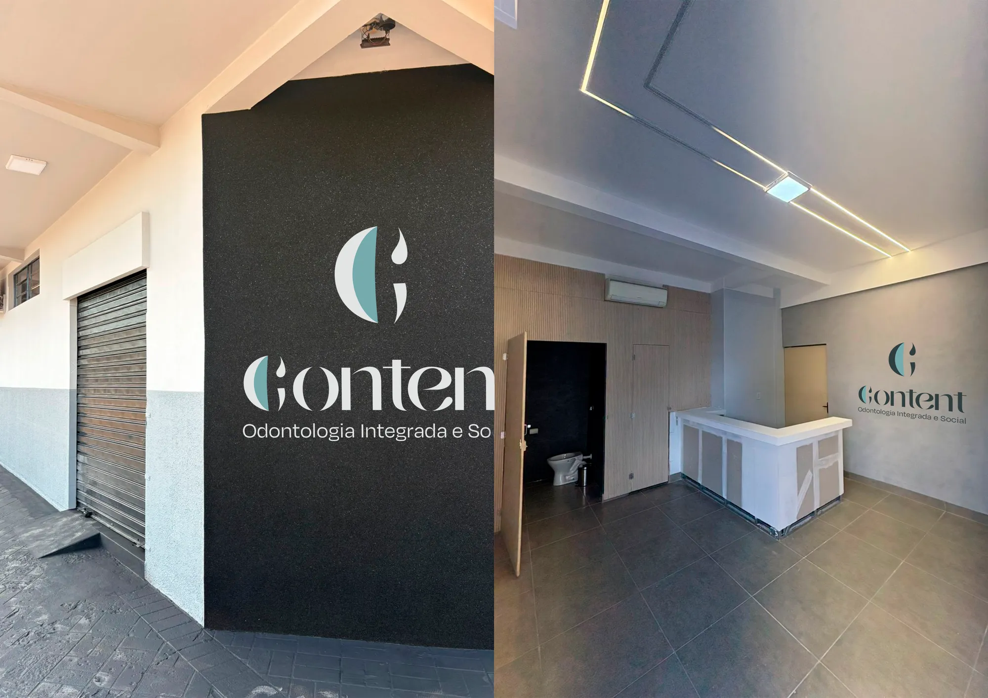
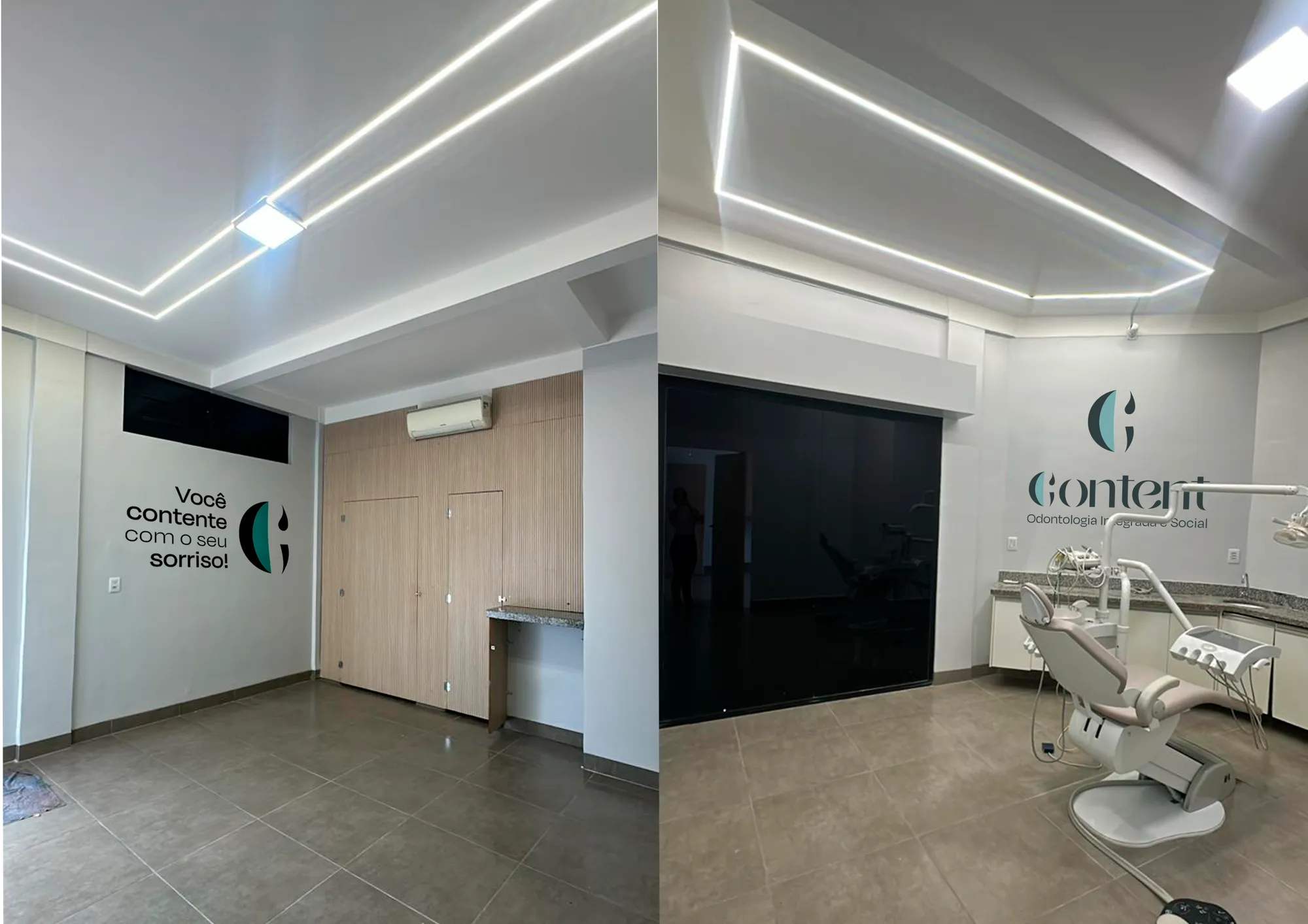
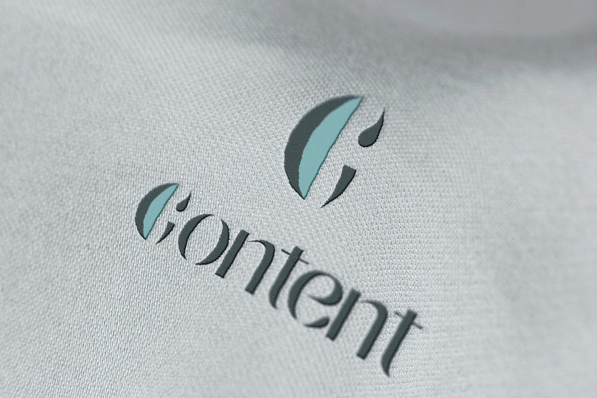
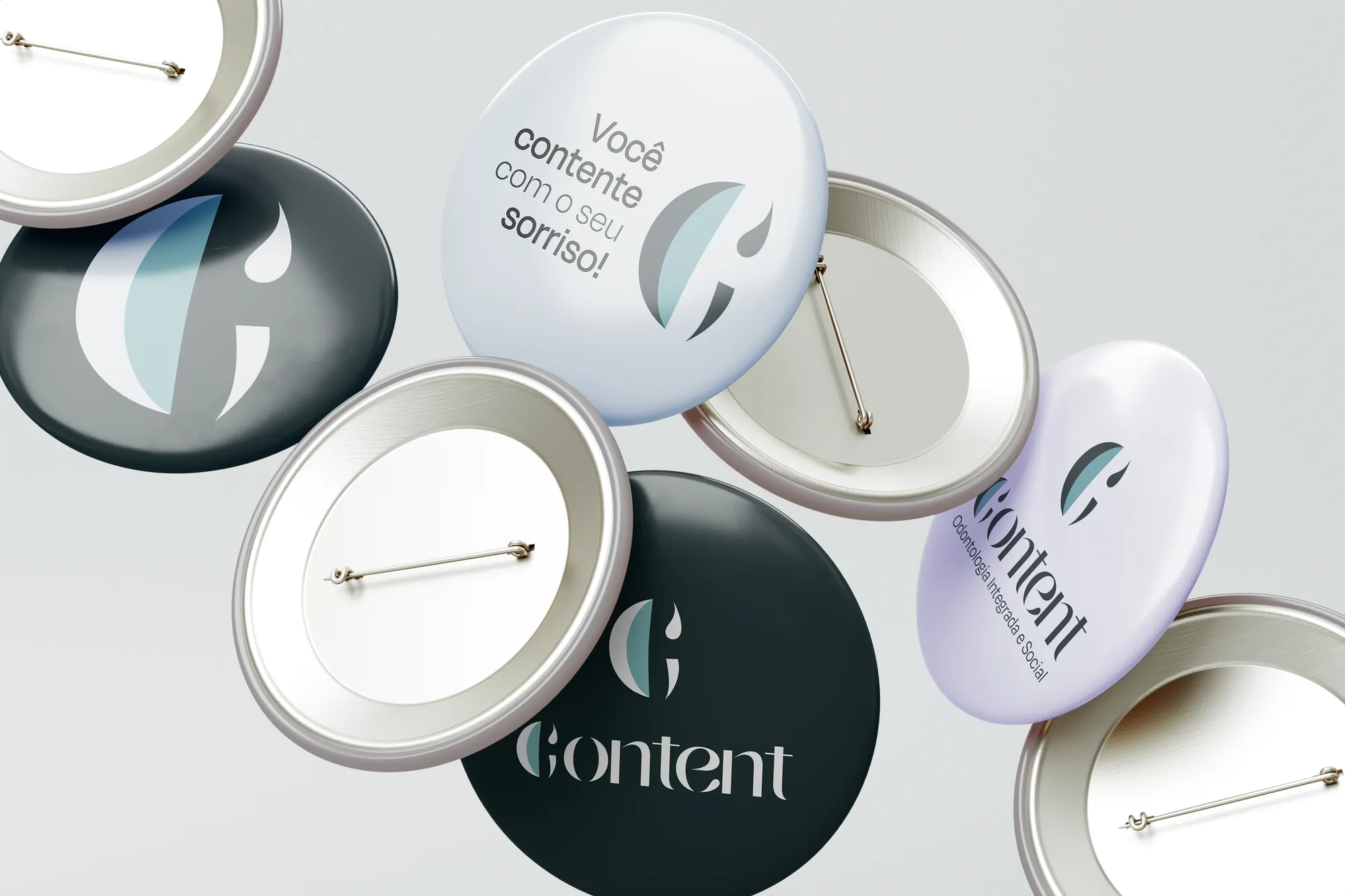
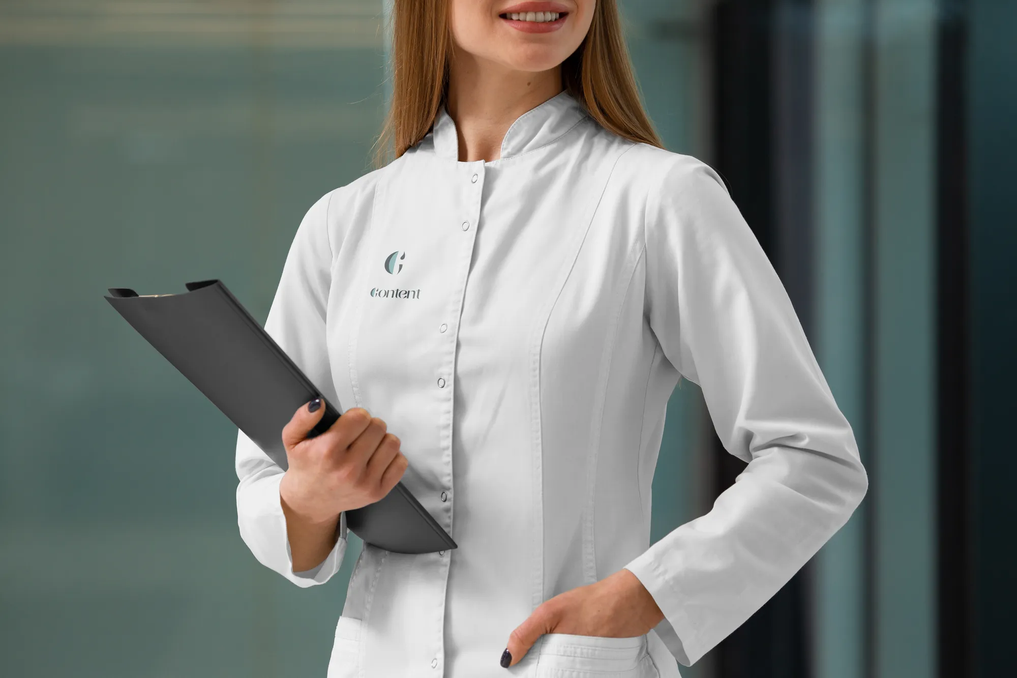
Content's symbol comes from the letter C of the system's own typeface and subtly draws a smiling face. In Portuguese the name does the slogan's work too: contente means happy — happy with your smile. Two brands, one family.
Typography and colour
Ceraso, a contemporary serif with full-bodied stems, supported by Degular. Jade green — the colour of scrubs and equipment, conveying calm and precision — alongside black and greys, the colour of instruments.
What the brand doesn't say
No absolute promises, urgency or price talk: "guaranteed results", "last chance" and "perfect smile" were removed from the vocabulary. Scientific credibility is part of the identity.


The smile is the consequence of care well conducted.