
Metras Engenharia
From a company still without a name to the brand that signs a family's first home.
1. Context
The company was being set up, planning to build, renovate and design for people aged 25 to 40 seeking their first home — customised their way and financed. The brief carried a precise reading of the purchase: the wife influences, the husband buys, the family enjoys.
2. Challenge
Start with the name. It had to avoid acronyms and anagrams, be free as a domain and on social media, and have a real chance of trademark registration. And the identity had to speak to both sides of the decision — hence a neutral brand, working in digital and in print alike.
3. Solution
Twelve shortlisted names were assessed by domain, social handles and trademark class. Metras passed with no identical mark in class 42 or any other — a high chance of success. In the identity, the Hero archetype: the company as the family's ally on the journey to their own home, with a symbol joining a semi-detached house and the letter M.
4. Result
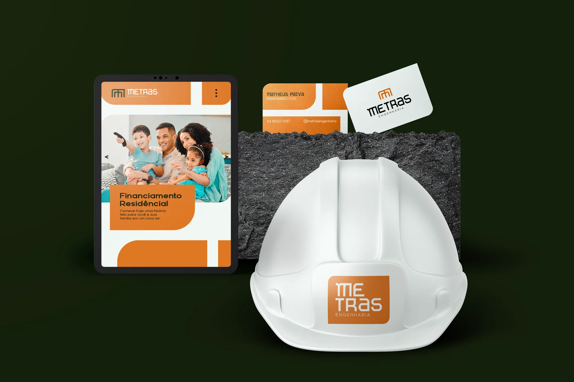
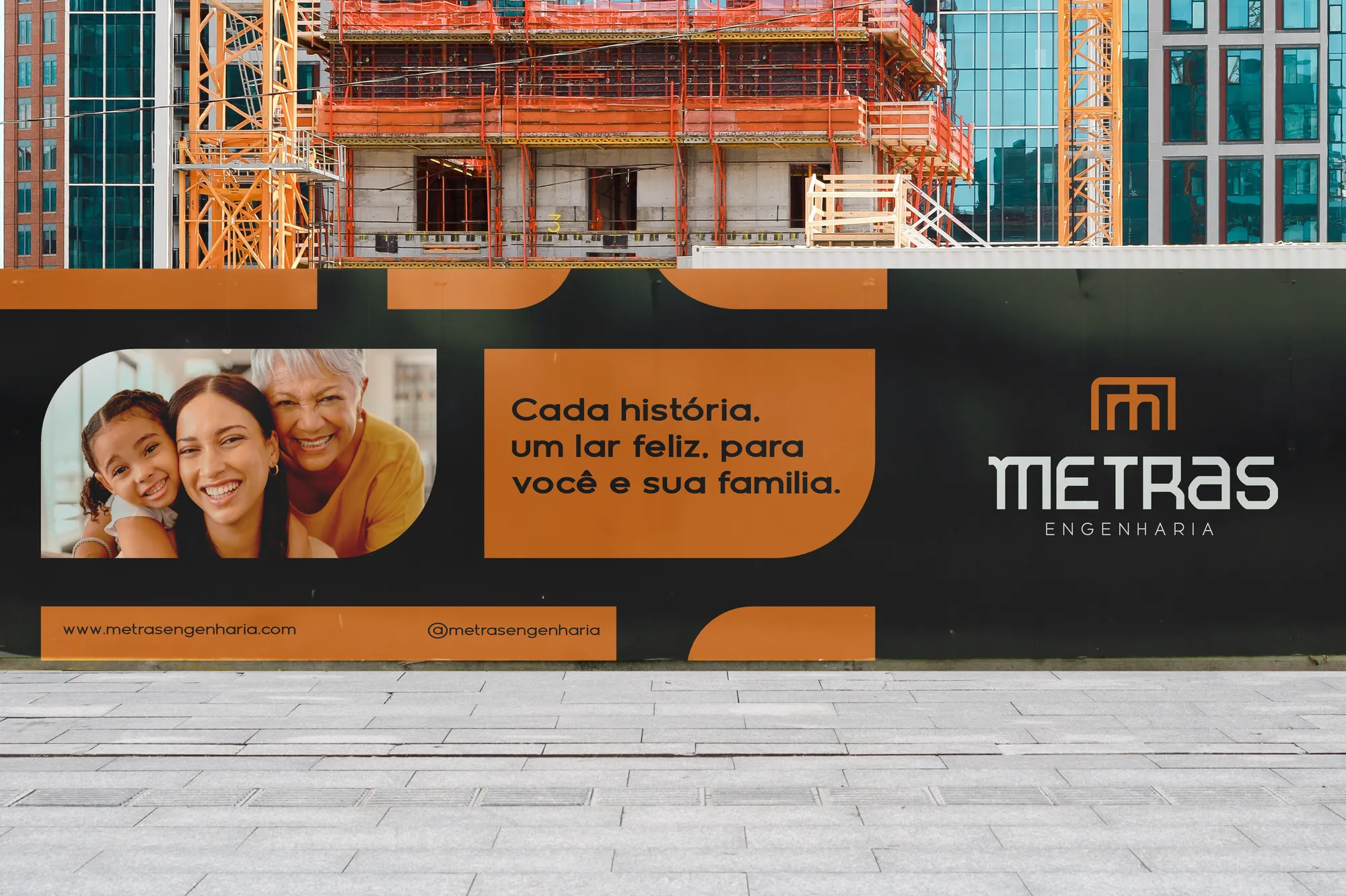
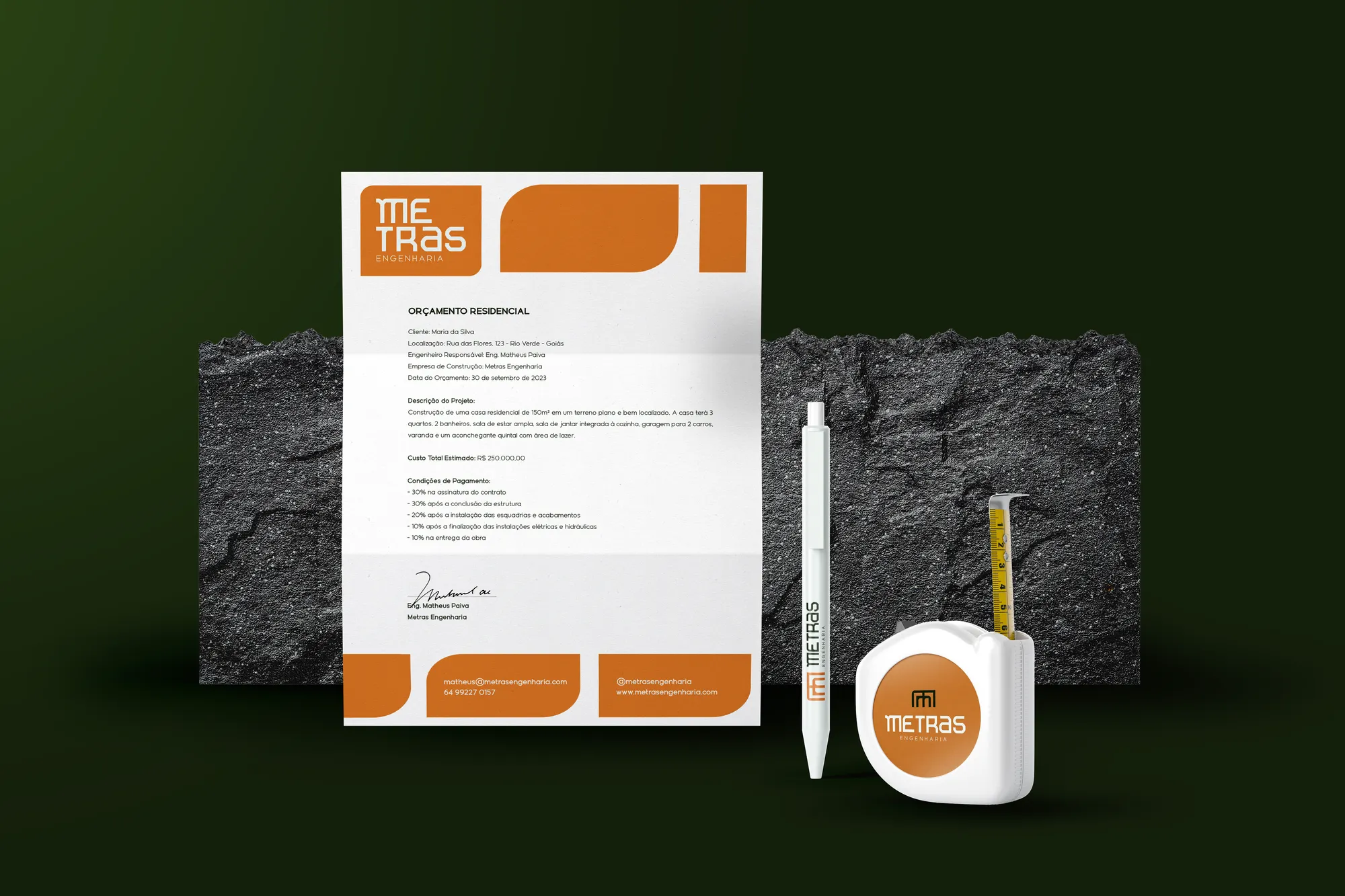
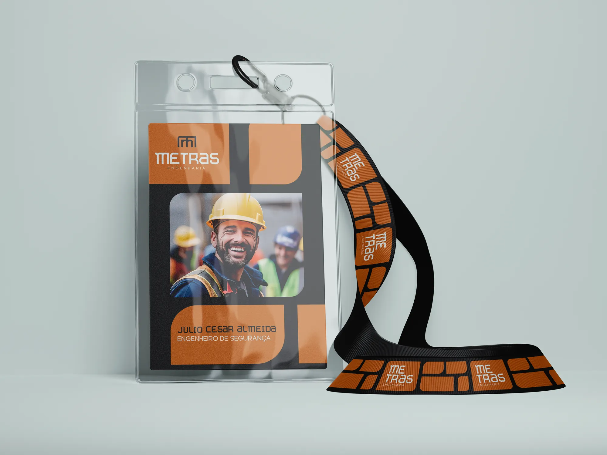
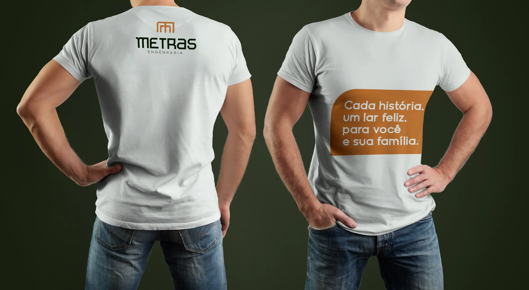
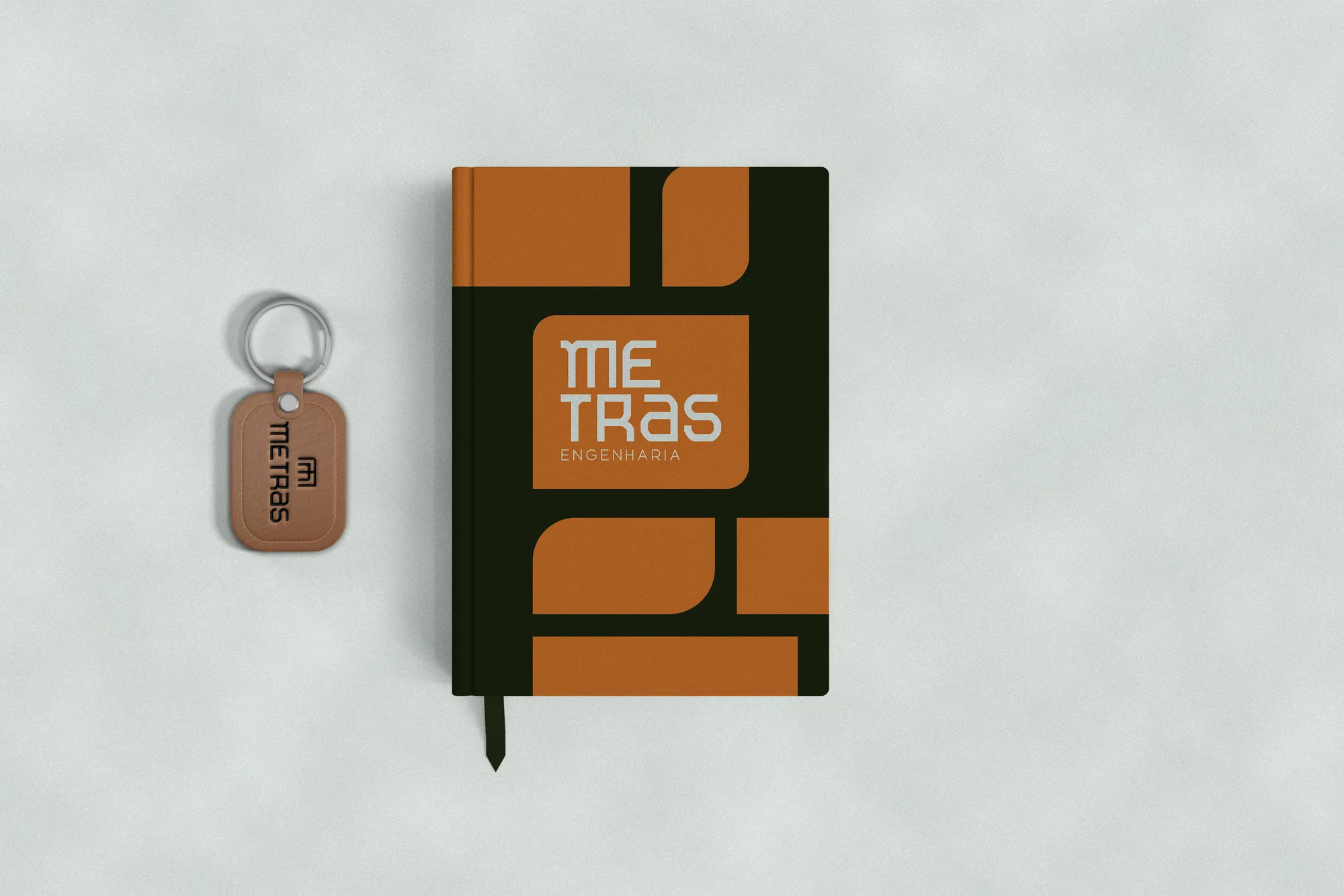
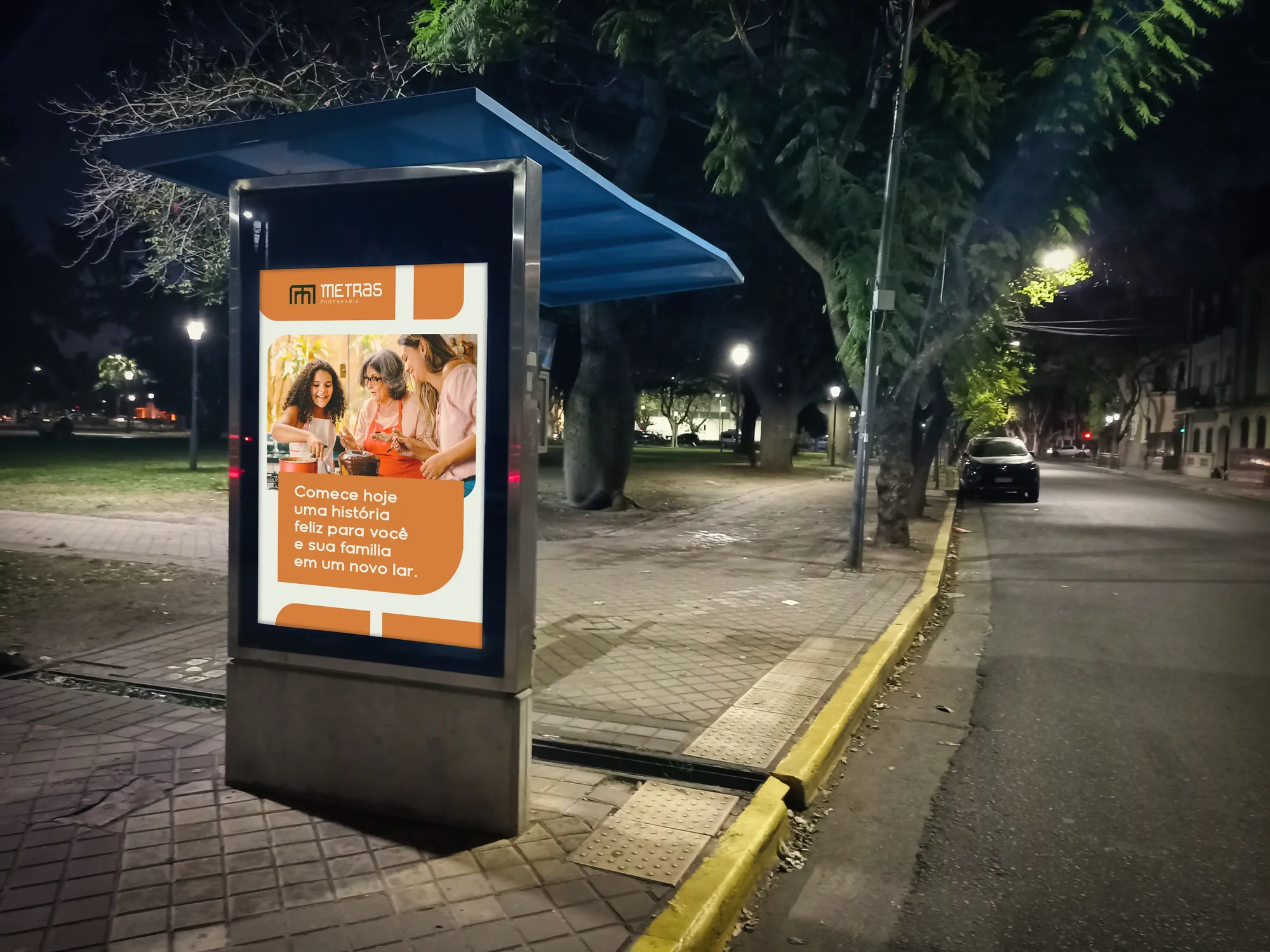
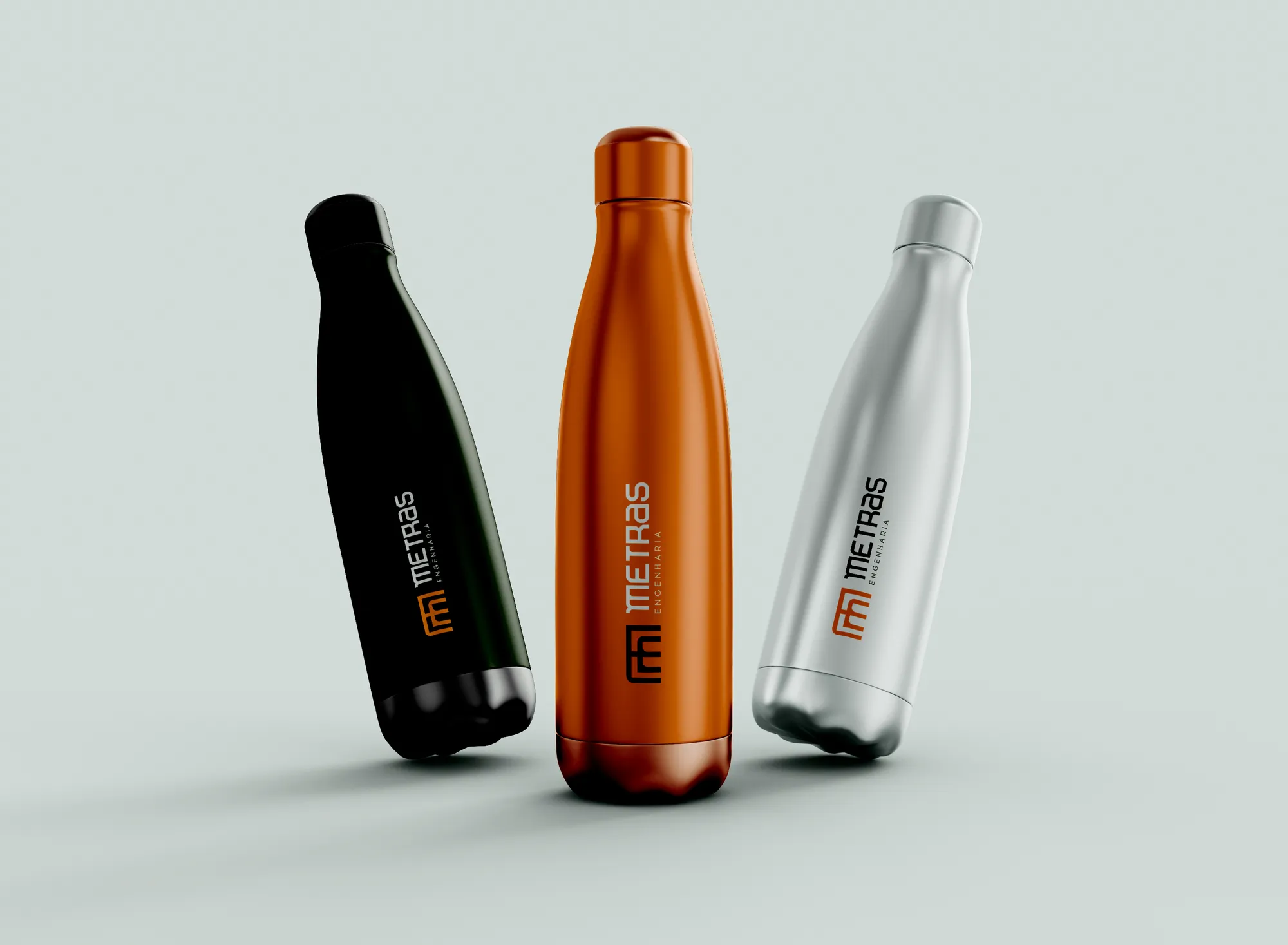
A brand ready for the building site and for sales: stationery, presentation tablet, hard hat, uniforms, badge, site board, blueprint tube and street media. All in the colours of building material itself.
Creative decisions
Naming with verification
Every finalist went through three filters: .com and .com.br domains, availability on Facebook and Instagram, and analysis of marks in trademark class 42, with the chance of success rated high, medium or low. Metras was one of the few with a clear path.
The Hero archetype
The identity conveys confidence and stability, and the idea that the company is an ally on families' journeys toward the dream of owning a home.
Sturdy typography
Monolita, a modern geometric with a horizontal axis wider than its vertical — creating a sense of stature — and thick strokes that show seriousness and strength. Geomatrix complements it in taglines and copy.
Building-site colours
Brick Brown for solidity and reliability, Olive Green for stability, Concrete Grey for stature. A palette designed as a warm invitation to middle-class families facing a residential investment.
Symbol: straight lines and curves
A semi-detached house, a row of houses and the letter M in a single drawing. Straight lines bring modernity and seriousness; curves bring comfort and warmth.

Every story, a happy home, for you and your family.