
Kairós Energia Solar
From one more solar panel company to the brand that makes a family feel safe investing in the sun.
1. Context
The audience is aged 25 to 40 and wants to save money or turn home and business into sustainable spaces. Men and women decide together — which is why the brand was born neutral — and the relationship happens on social media and WhatsApp, with fast, personal service.
2. Challenge
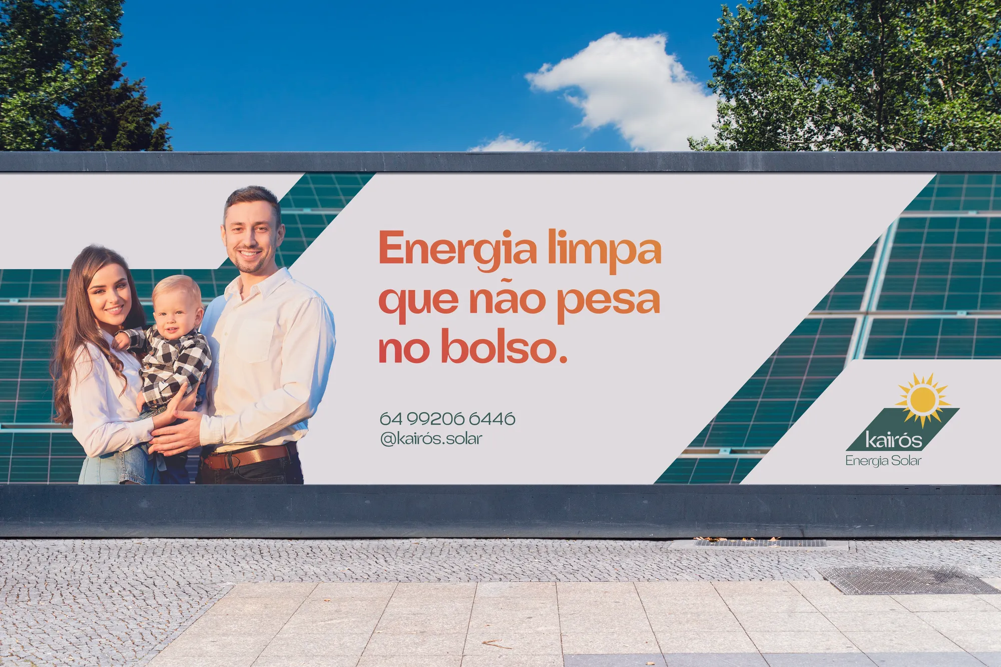
Solar energy is a major investment for middle-class families: the brand had to convey safety and trust before any savings argument. And it had to migrate well from digital to print, as the company would work with storefront, billboards, uniforms and stationery.
3. Solution
The Hero archetype positions Kairós as an ally on the journey of those who dream of this investment. The typeface is square and stable, with curves that signal technology. The symbol brings together solar panel, light and dynamism — and the palette sets green and steel grey against the warm colours of the day.
4. Result
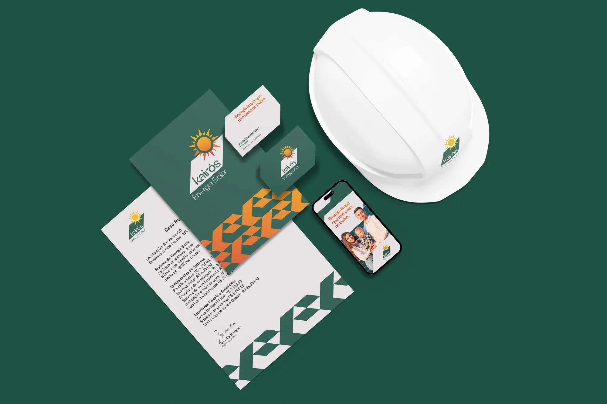
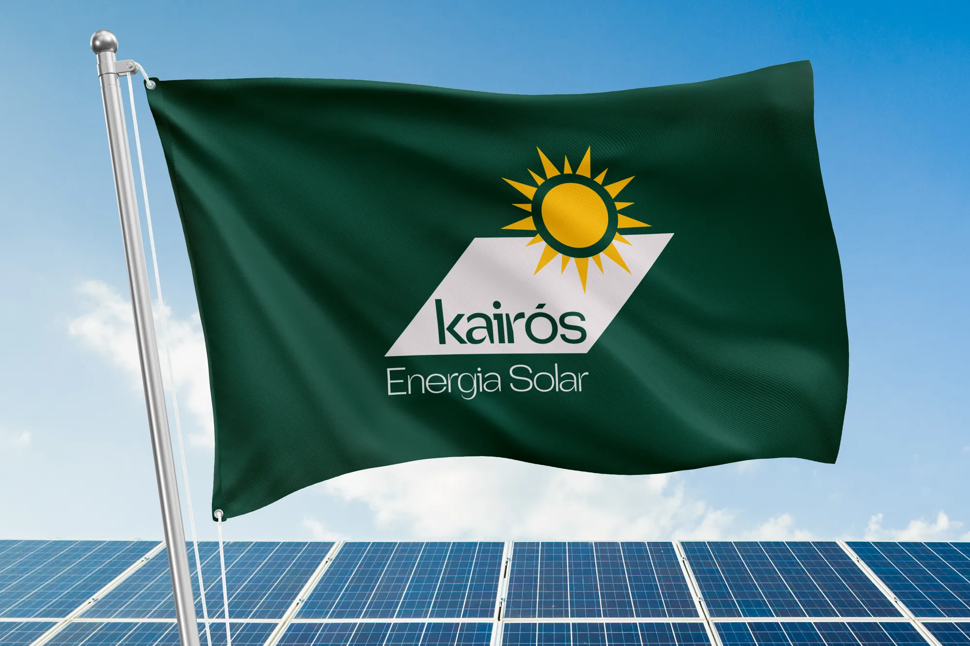
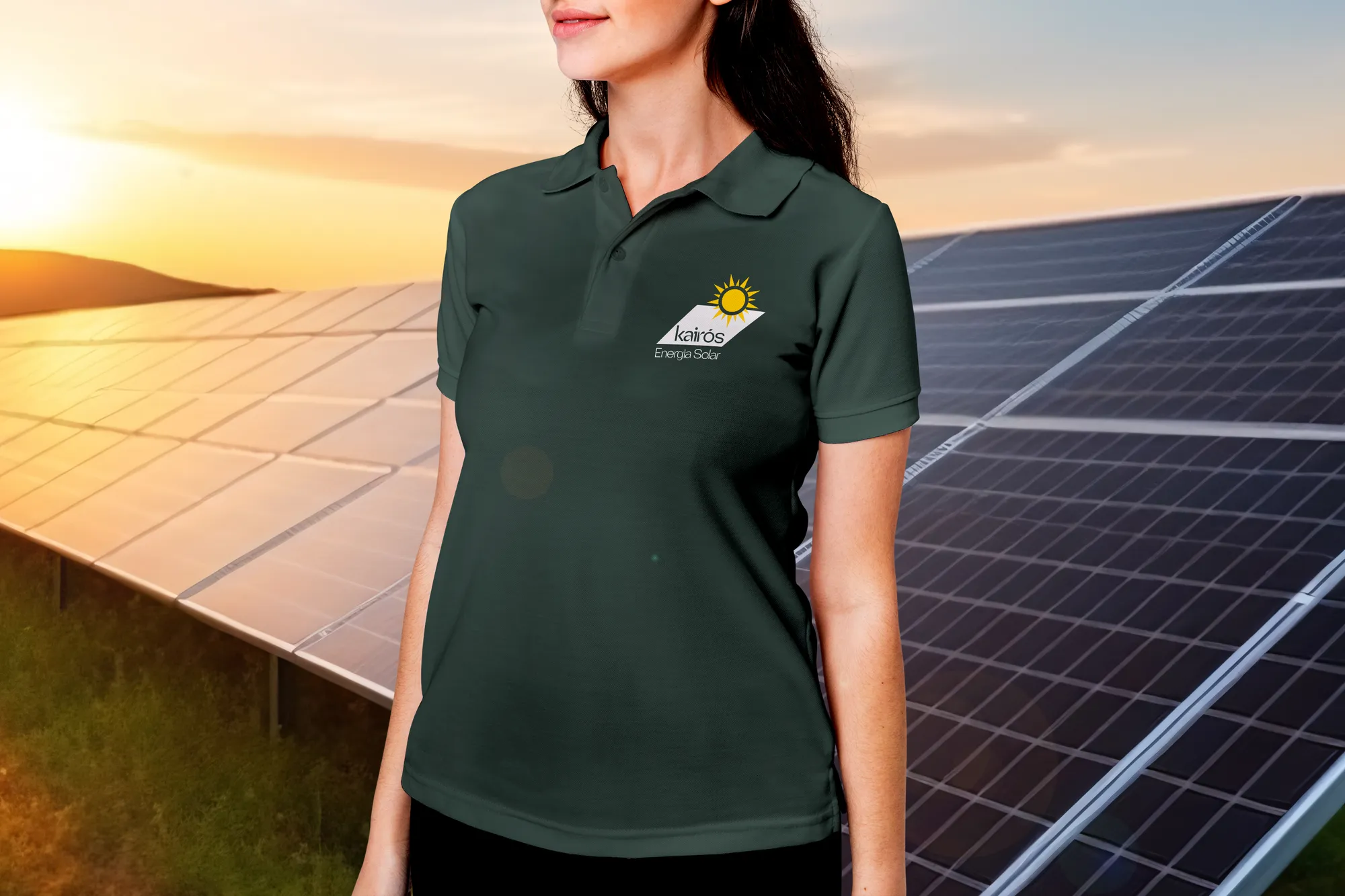
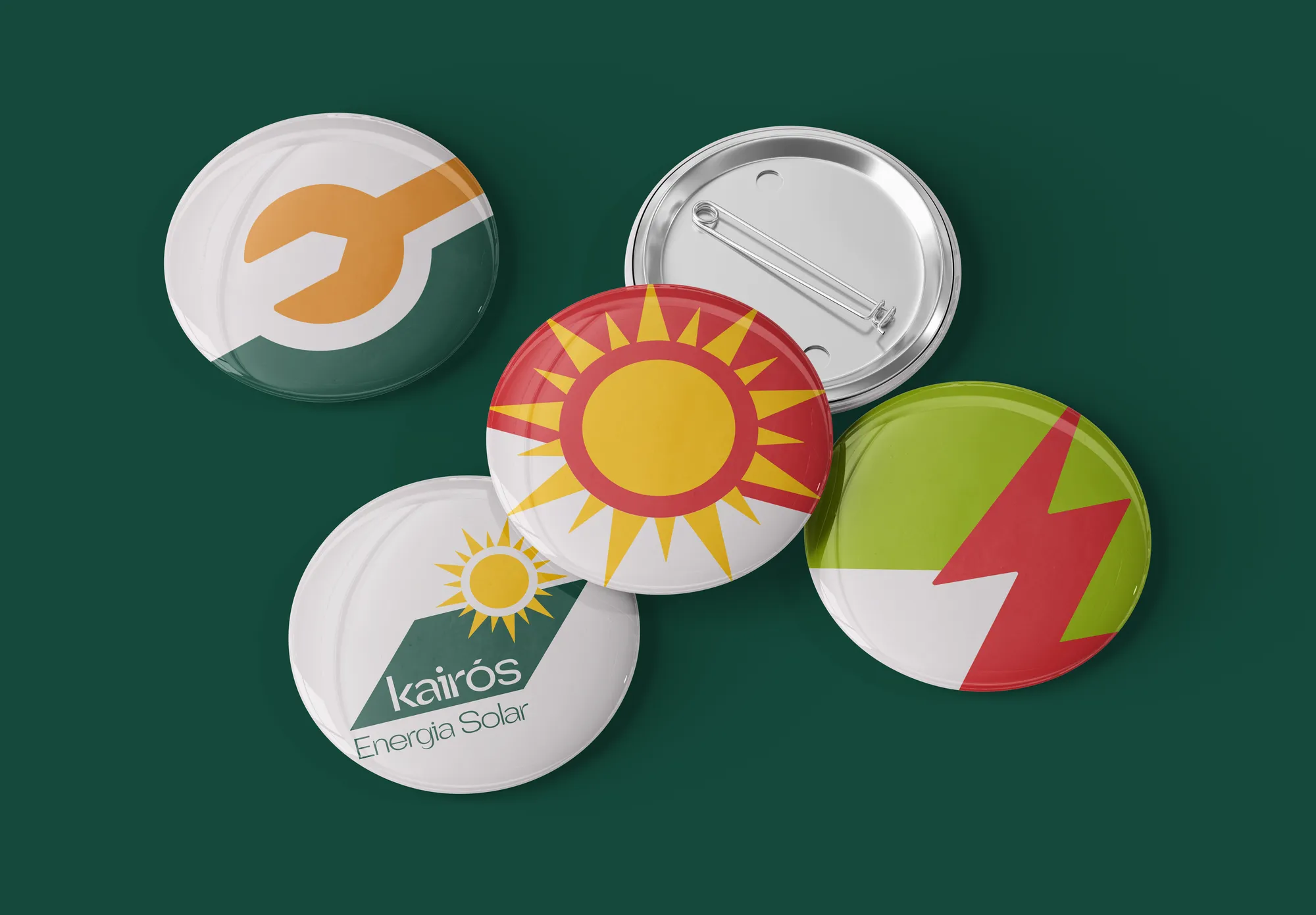
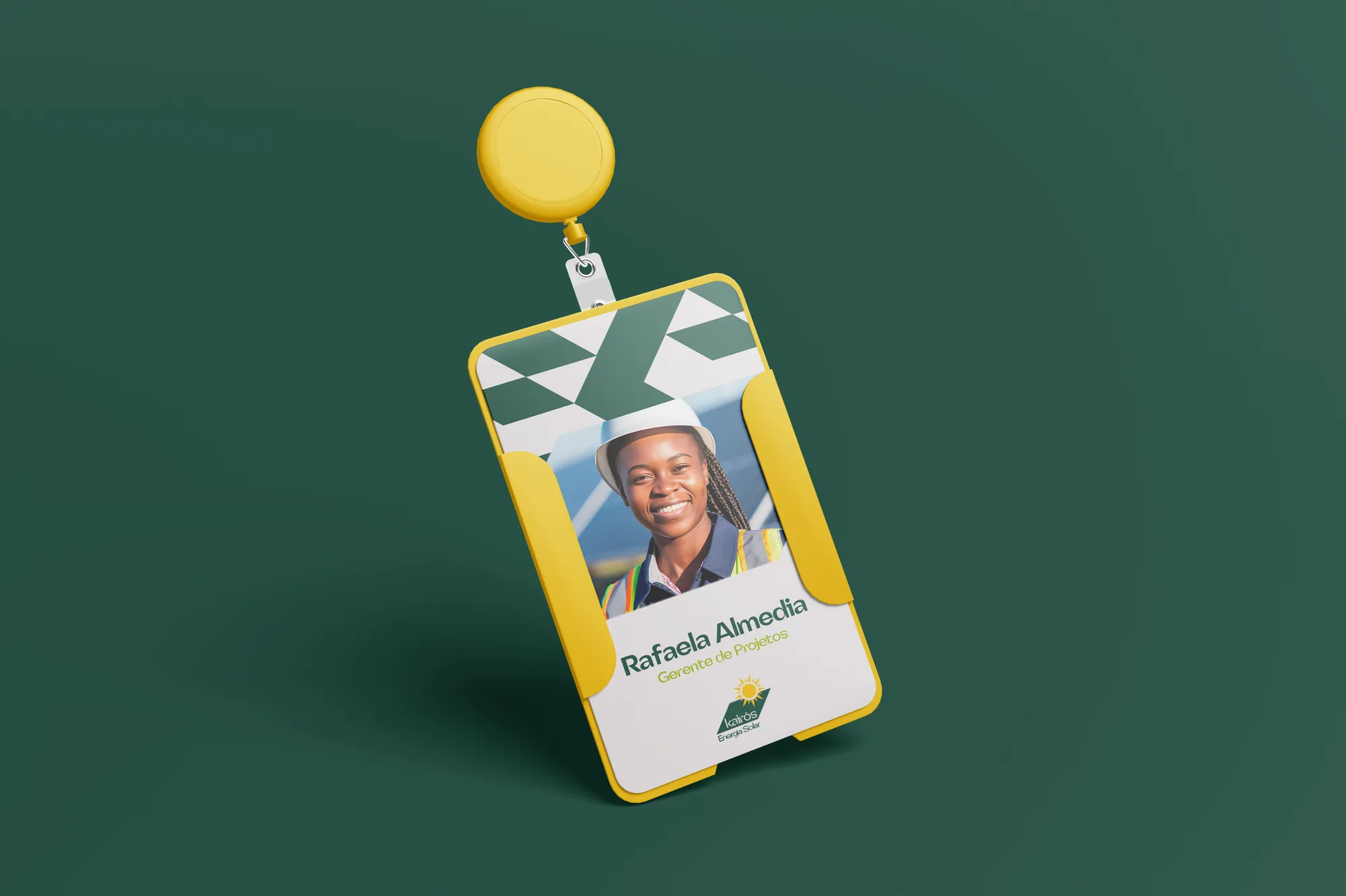
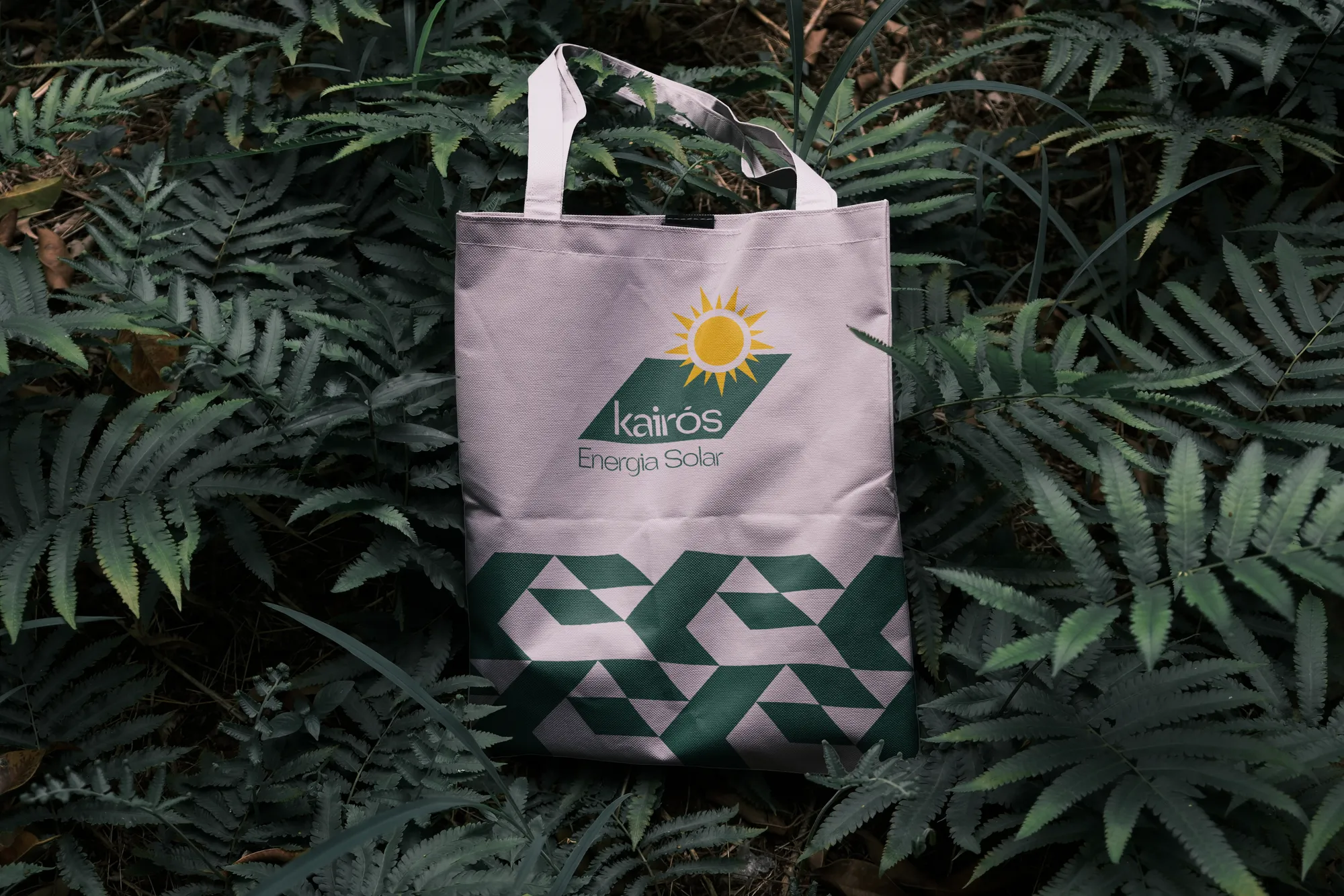
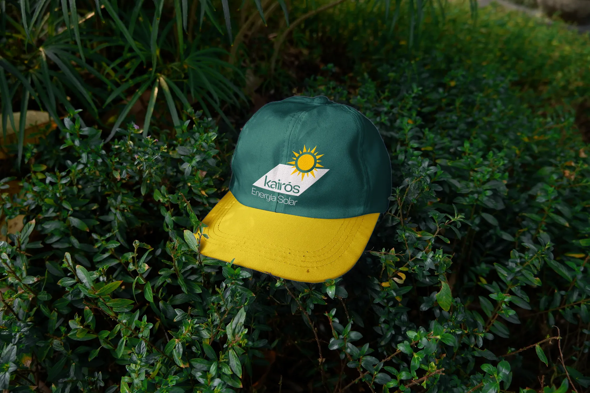
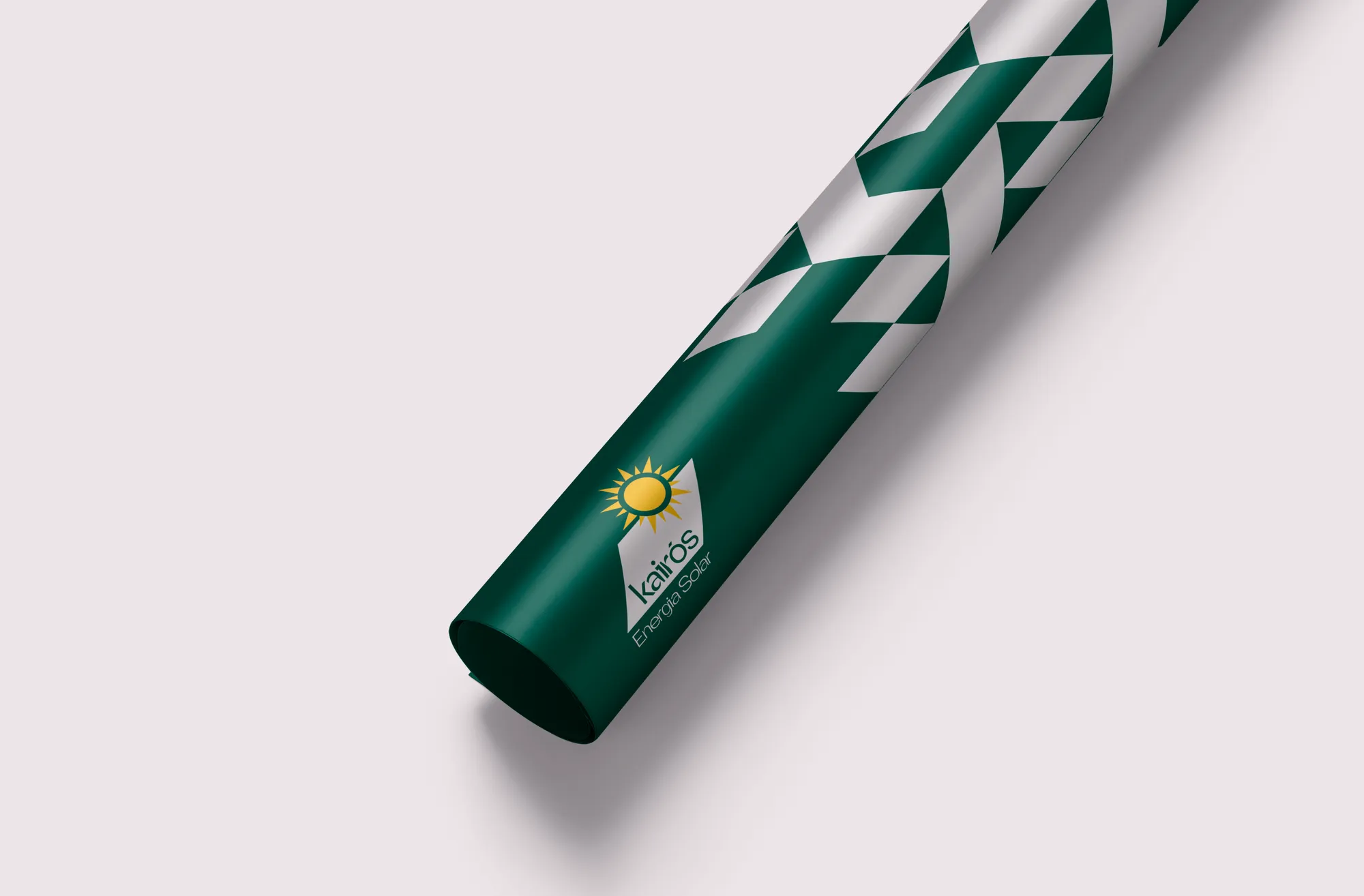
A system with sub-brands and applications for the street and the team: billboard, bus stop, flag, cap, t-shirt, badge, site stationery and blueprint tube. In the campaign, the brand says what a family wants to hear, without shouting discounts.
Creative decisions
The Hero archetype
Brands that inspire overcoming challenges and positive transformation. The identity conveys confidence and stability, and the idea that the company is an ally to those seeking or dreaming of this investment.
Typography
Quanta Grotesk, a modern geometric: equal axes make the letters squarer and convey stability; full strokes show seriousness and strength; occasional curves tied to the terminals bring modernity and technology.
Colours of the day
Leaf Green for stability and Steel Grey for stature and credibility. Grass Green, Sun Yellow, Copper Orange and Fire Red come in as warm contrast: joy, day, light, sun and clarity.
Symbol
Solar panel, light, dynamism and animation brought together in a single form — drawn with motion already in mind.
A neutral brand, from digital to print
Since both men and women seek this investment, the brand doesn't pick a gender. And it was necessary to develop elements that migrate to print, as the company works with that kind of material.
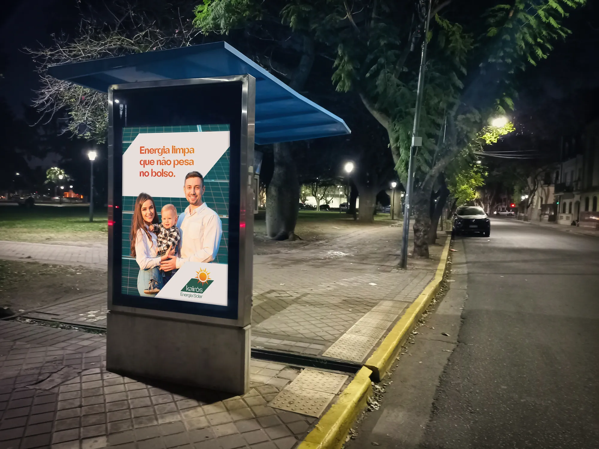
Clean energy that's easy on the wallet.