
Pignatti Construções
From high-end builder to signed work: curation became the brand.
1. Context
Clients are men and women aged 40 to 70, upper-class and financially established, who see property as a reflection of achievement. Leads come through brokers specialised in luxury and through discreet — sometimes confidential — advertising.
2. Challenge
For this audience, luxury isn't announced: it's recognised. The brand had to communicate seriousness and personalisation without ostentation, serve corporate projects and different developments, and still carry what only Pignatti has — the name of the person who chooses every detail.
3. Solution
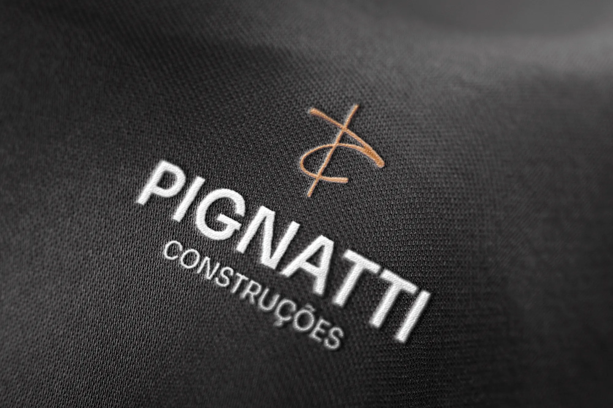
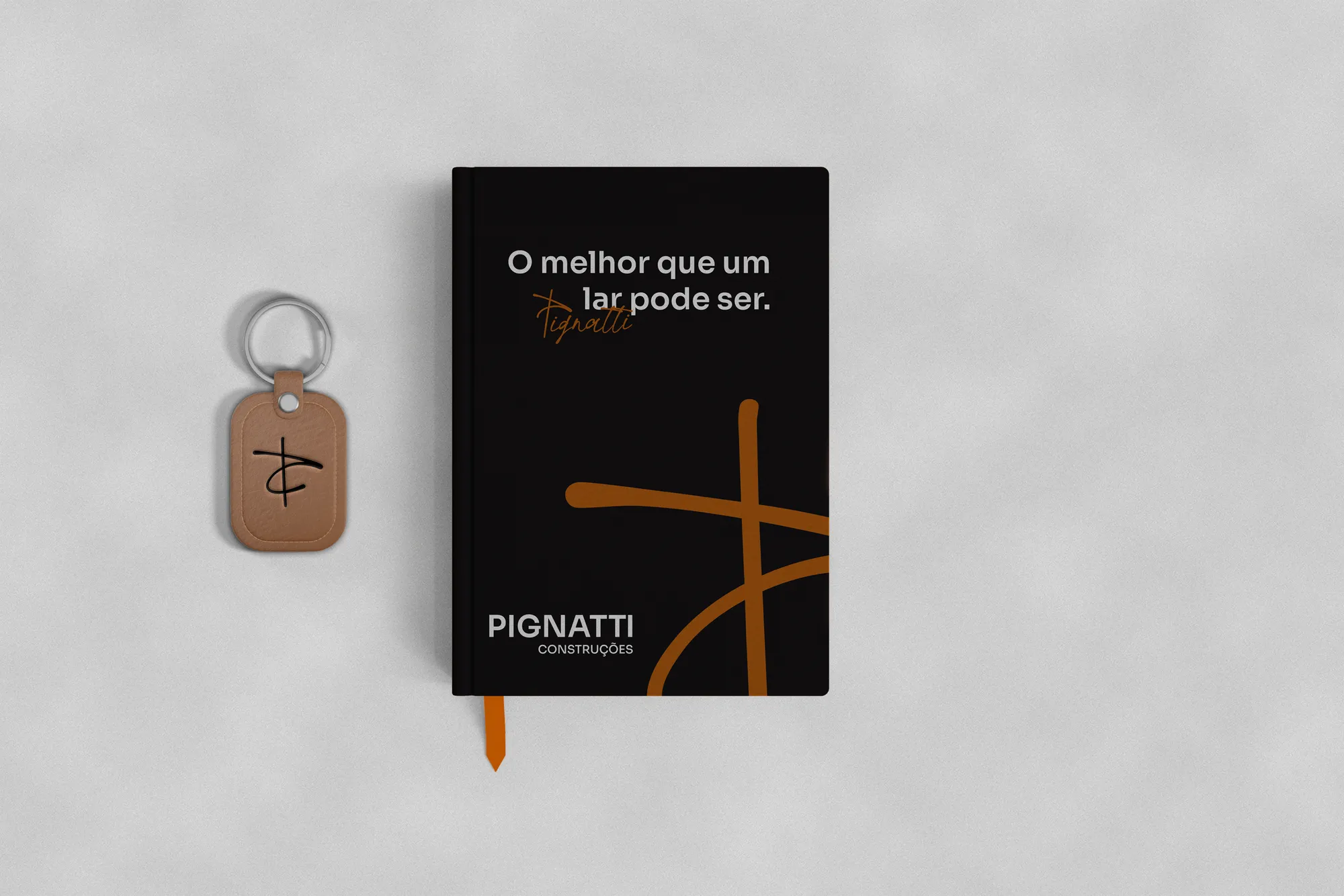
A geometric, uniform typeface for stability, paired with a handwritten one that works as a signature. The symbol fuses the initials P and C into a drawing that recalls a crane. The palette of blacks and greys gains a single differential: Brick Brown.
4. Result
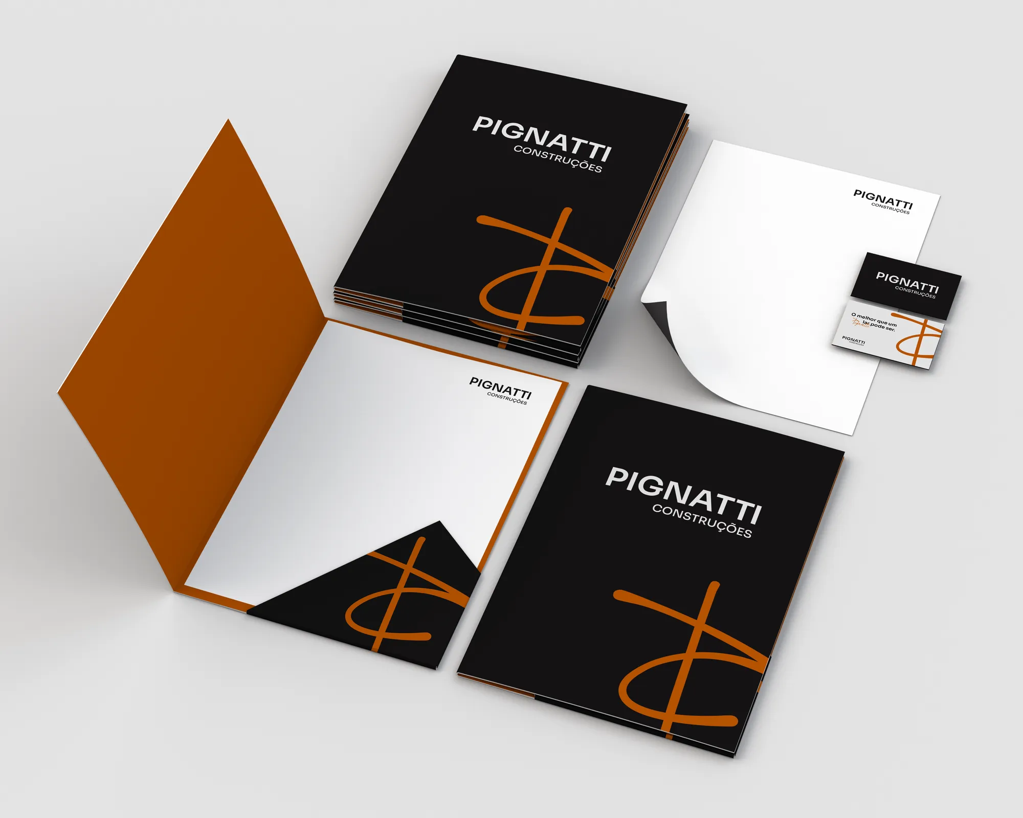
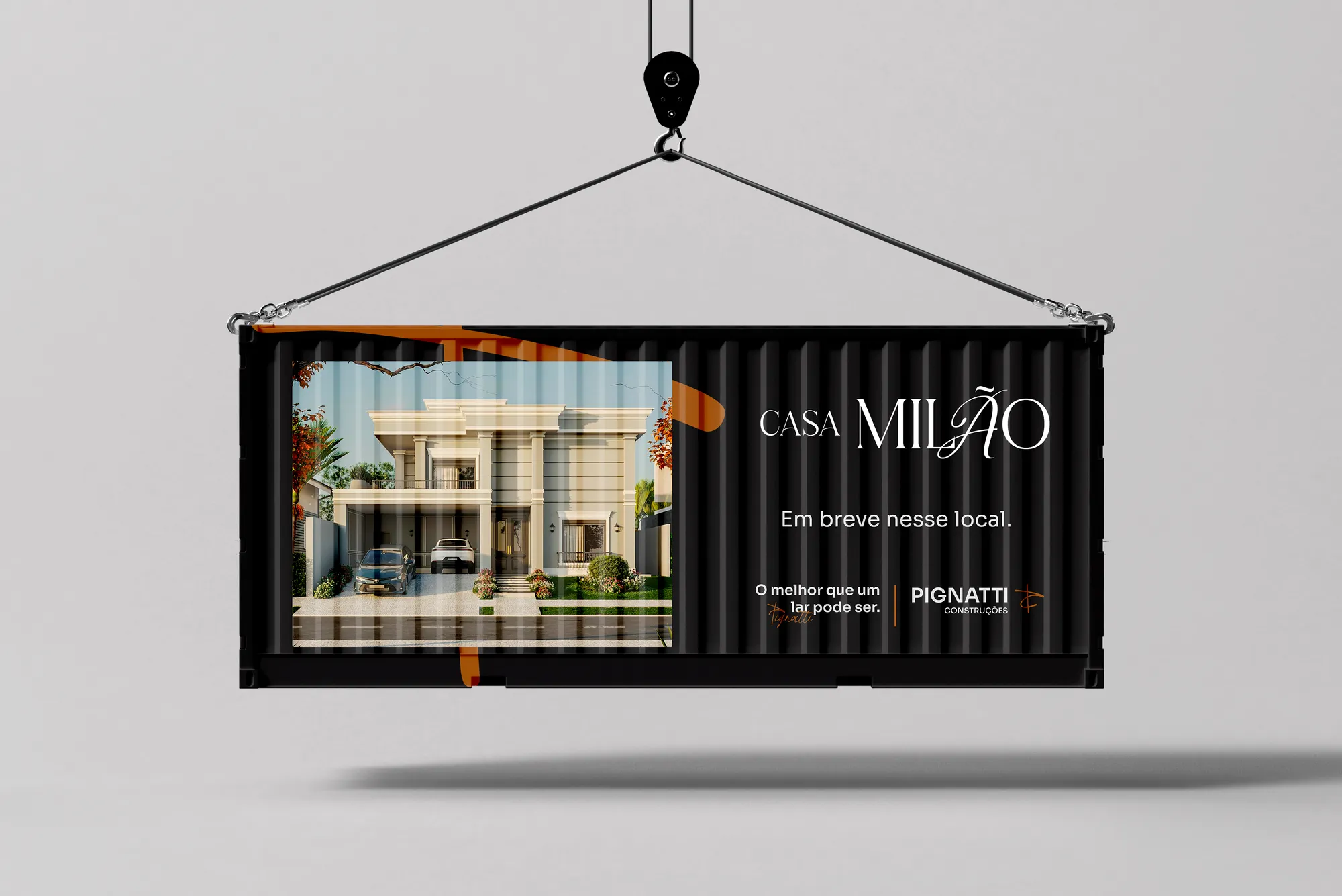
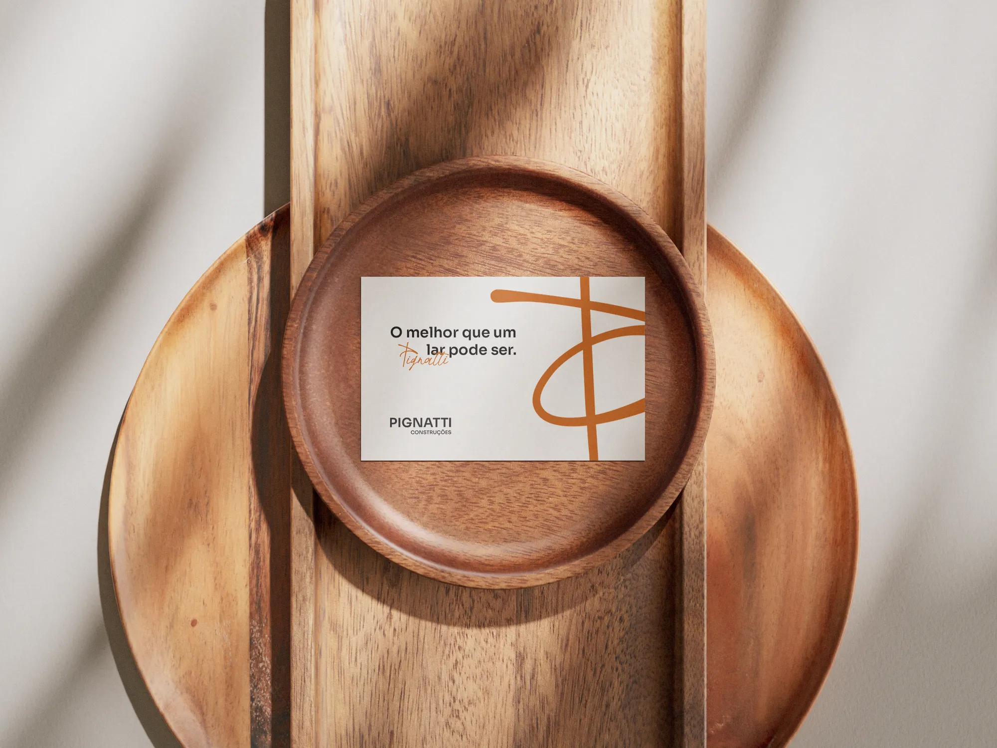
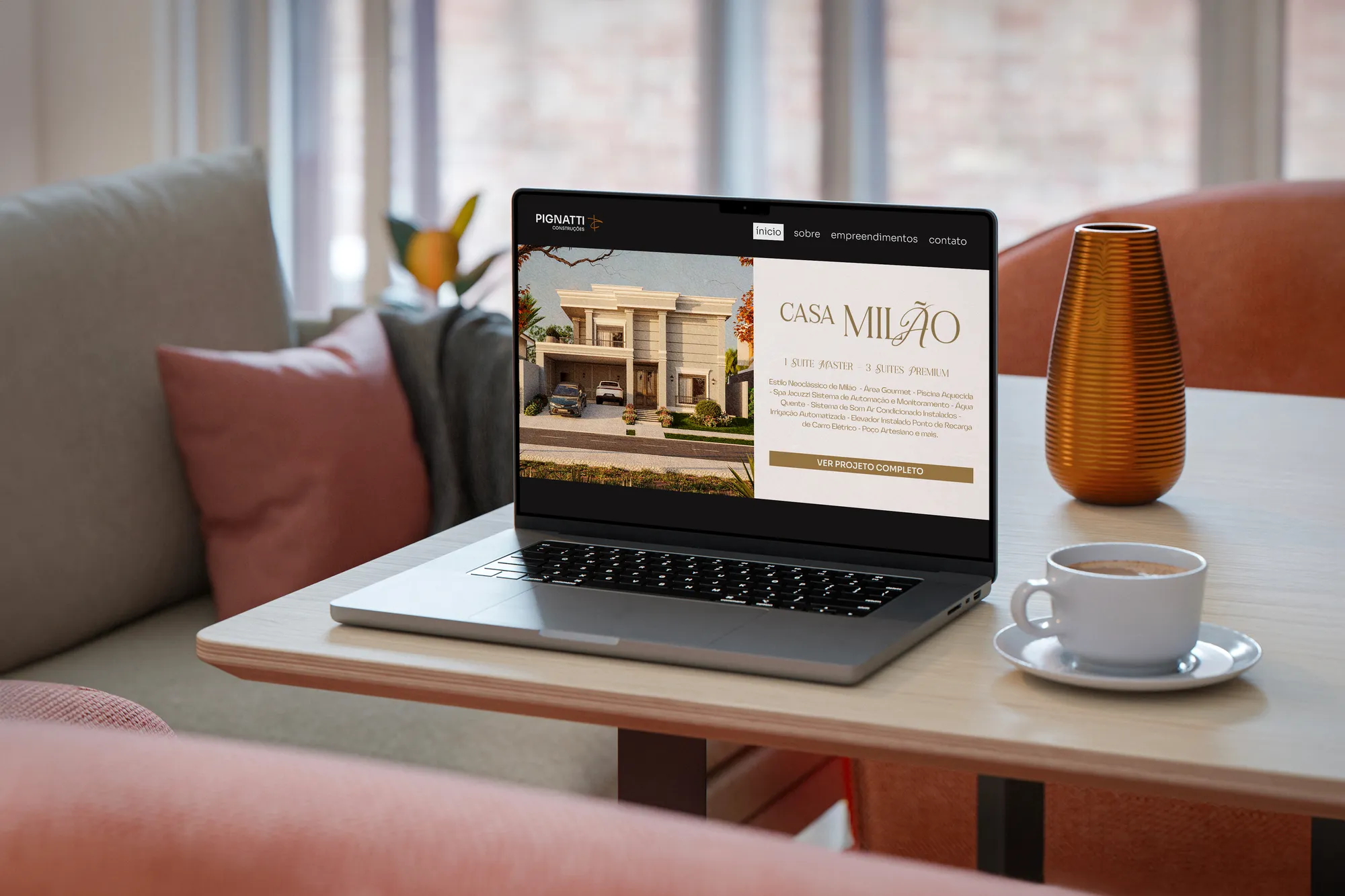
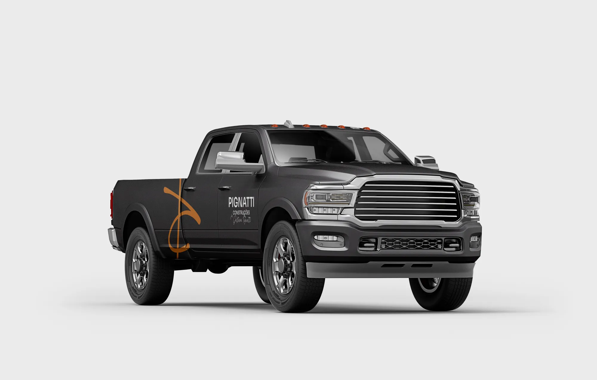
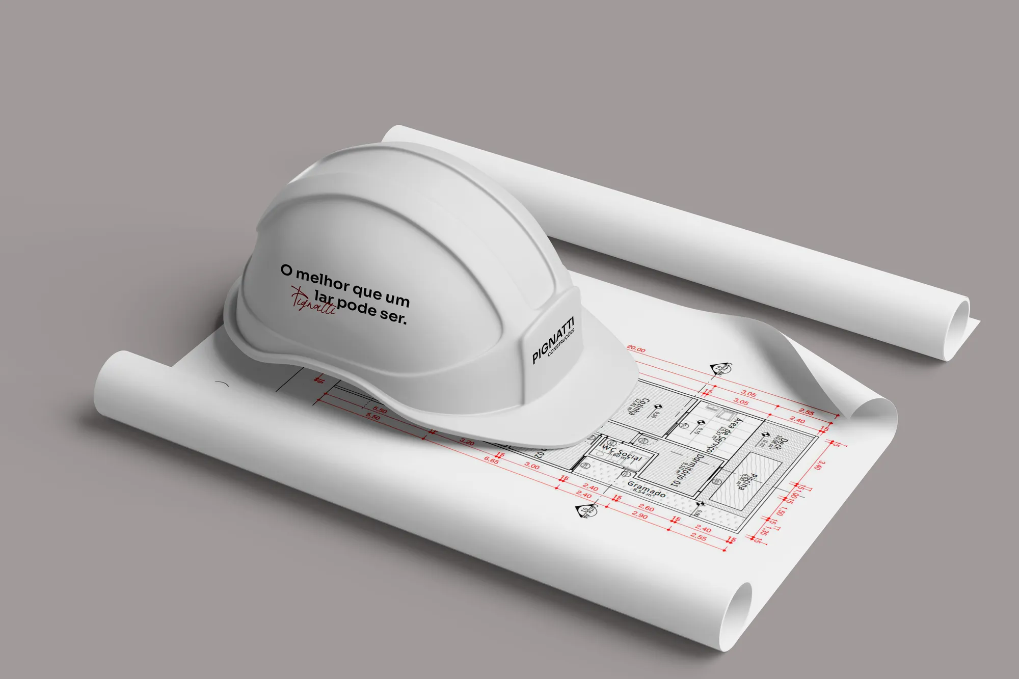
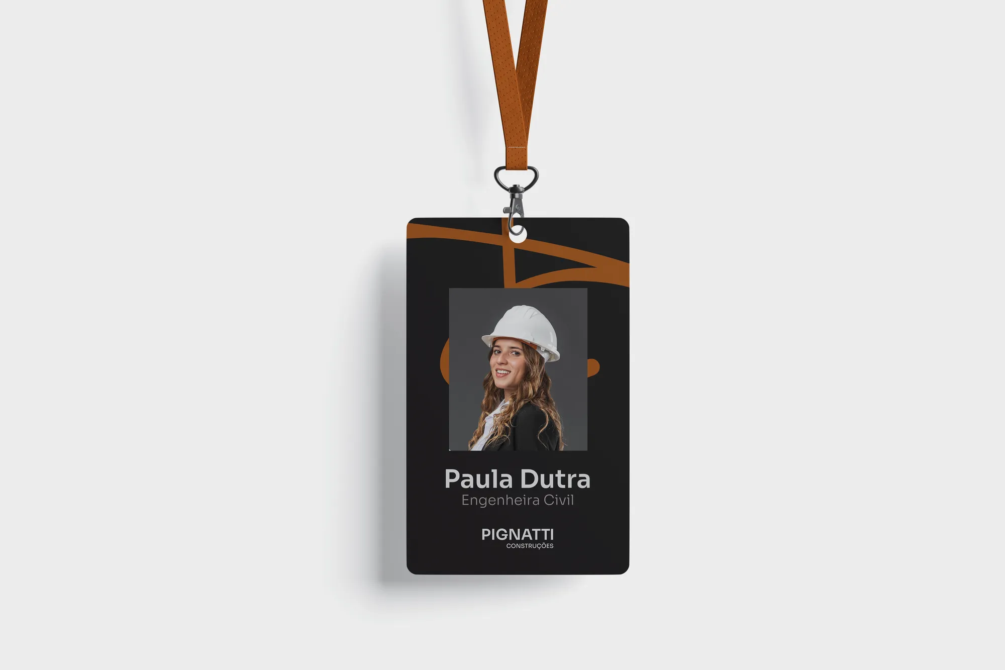
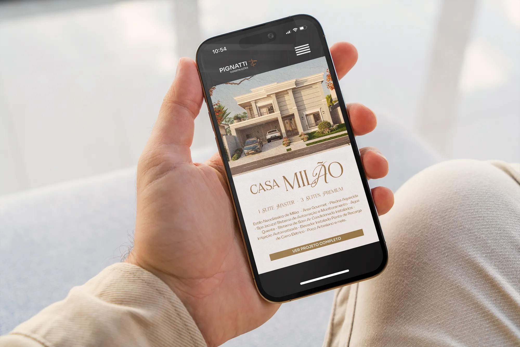
An identity that dresses the builder and its developments — such as Casa Milão, presented with its own collateral. Texture, stationery, site signage and sales pieces follow the same system, always leaving room for the signature.
Creative decisions
Typography in two roles
Sora, a regular geometric sans: uniformity and balance that show stability and seriousness. Parttime, a script, represents signatures and adds the touch of luxury and personalisation.
The signature as attribute
The company is validated by Gustavo Pignatti's curation. That's why the script isn't ornament: it's where the brand says who answers for the work.
Symbol: P + C = crane
Conceived from the fusion of the brand's initials, constructed to recall a crane — one of the most iconic elements in the world of construction.
One brown among the greys
Asphalt Black, Concrete and Plaster confer luxury and make the brand versatile in corporate projects. Brick Brown, the secondary colour, highlights subtle details and gives the brand its singularity.
Texture
The enlarged symbol becomes an exclusive pattern. Even at large scale it keeps its original message and ensures personalisation, closeness and a touch of exclusivity.

The best a home can be.