
Moduleve
From a little-known building system to a brand that shows its structure with pride.
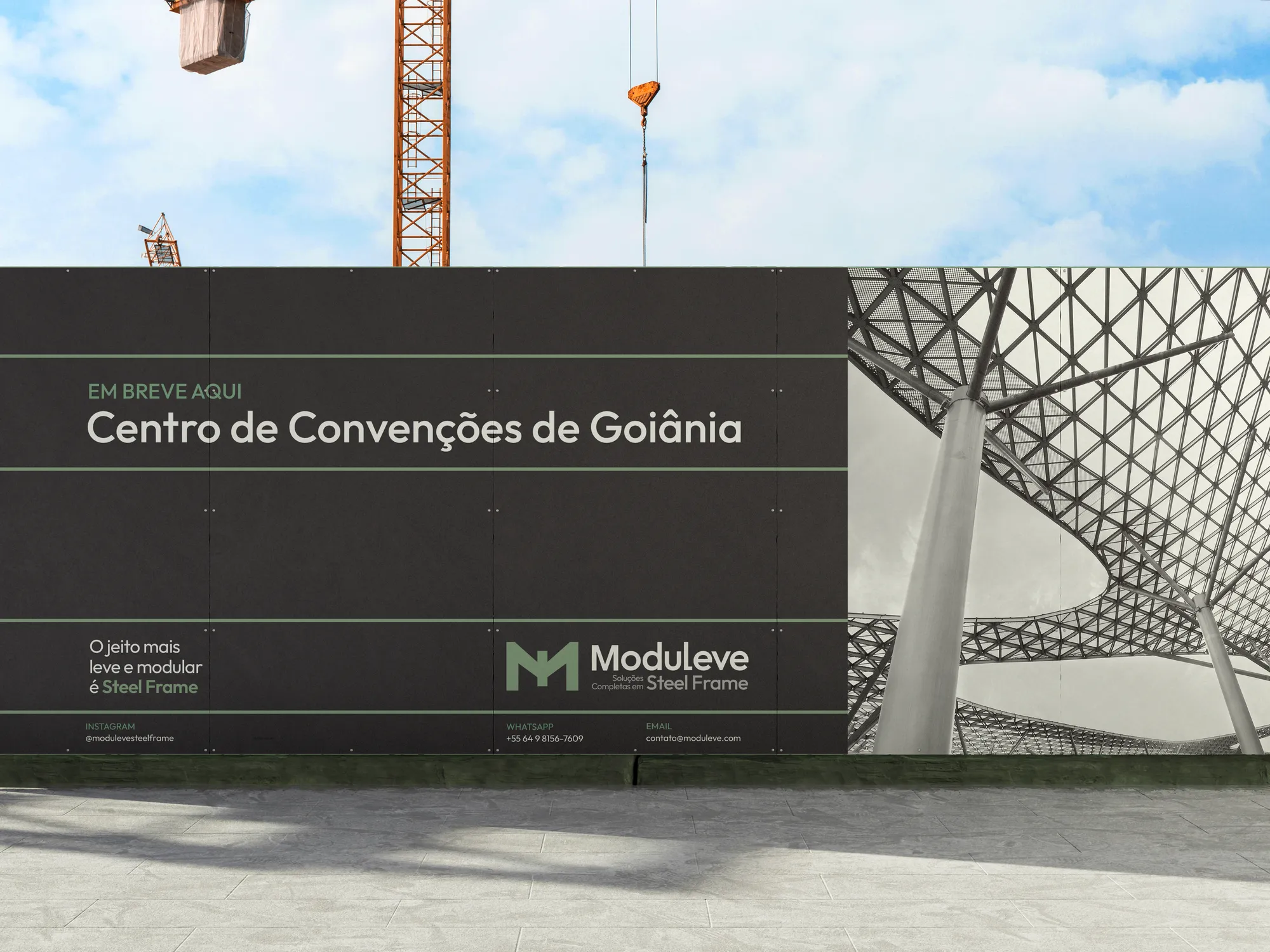
1. Context
The audience brings together established professionals and business owners aged 35 to 55, upper and upper-middle class, with a progressive outlook and environmental awareness. Sales are B2B, direct with builders and developers, and also B2C, with a showroom and hands-on demonstrations of the technology.
2. Challenge
Steel frame still needs explaining. The brand had to convey technical excellence to the market and, at the same time, make tangible a construction method the end client doesn't know — starting with a registrable name in a segment full of "steel" and "frame".
3. Solution
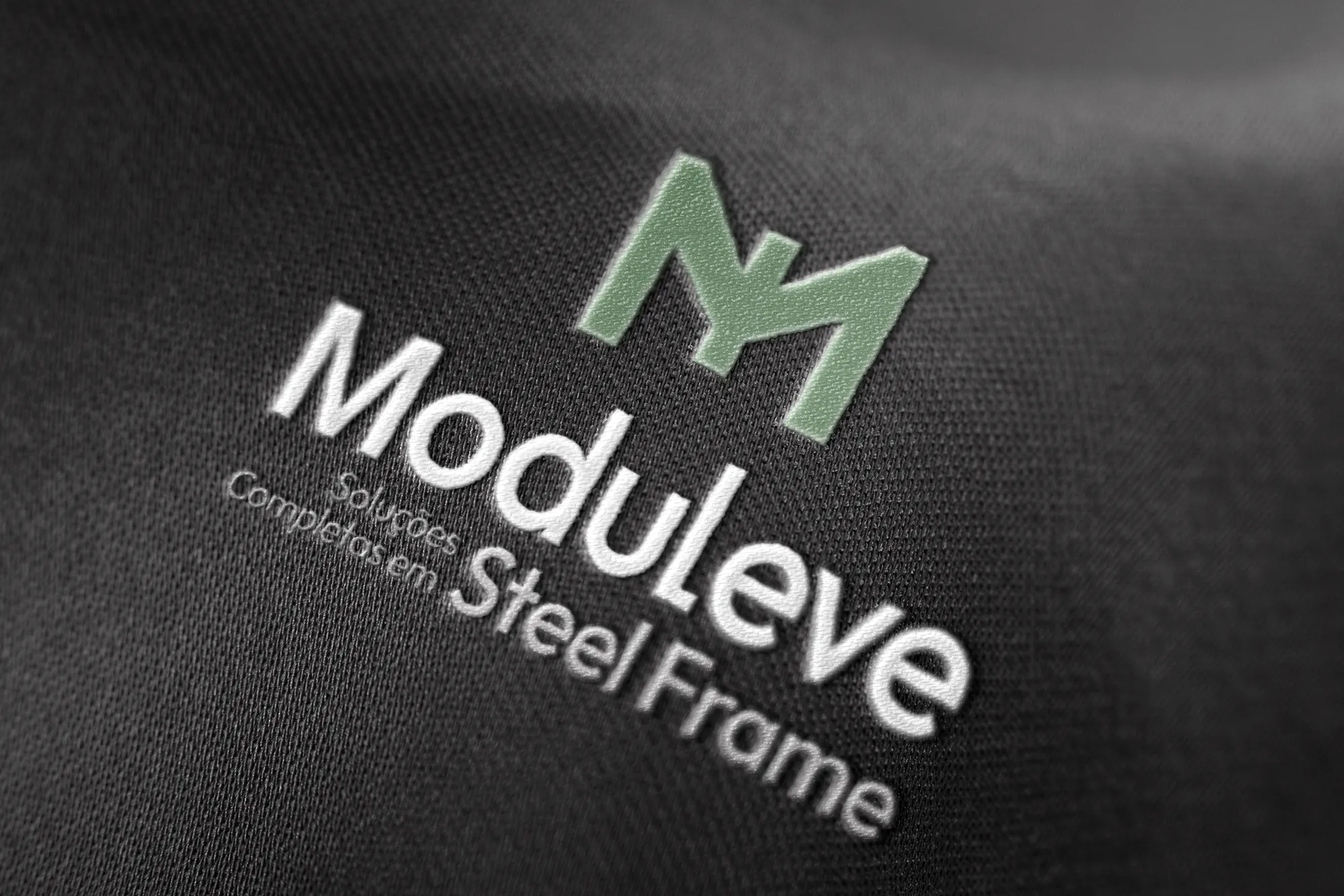
Naming filtered the options through successive rounds, checking for similar registered marks. The identity adopts the Hero archetype: an ally in the evolution of construction. Typography, symbol and texture all follow the system's own logic — parts that fit together.
4. Result
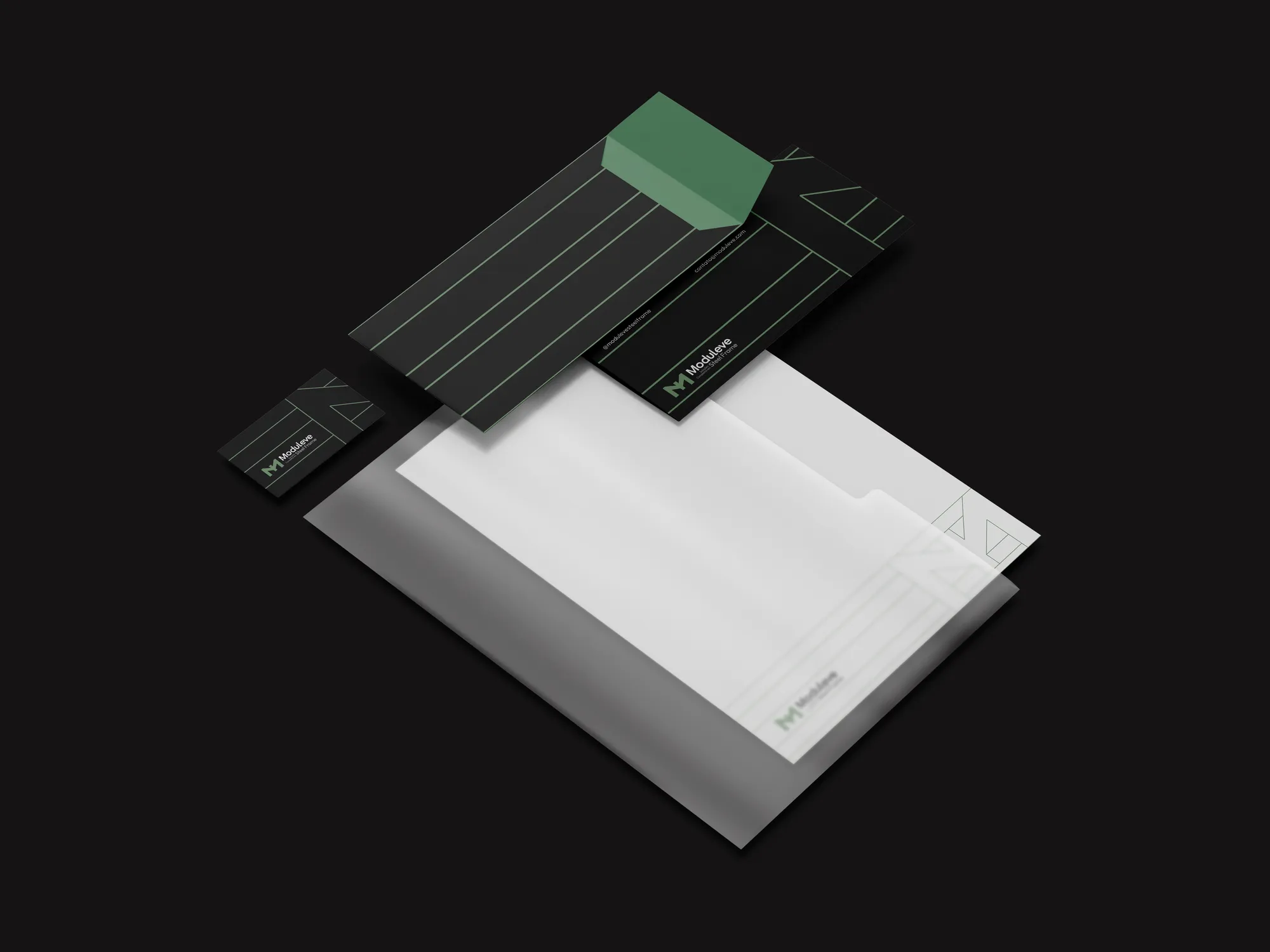
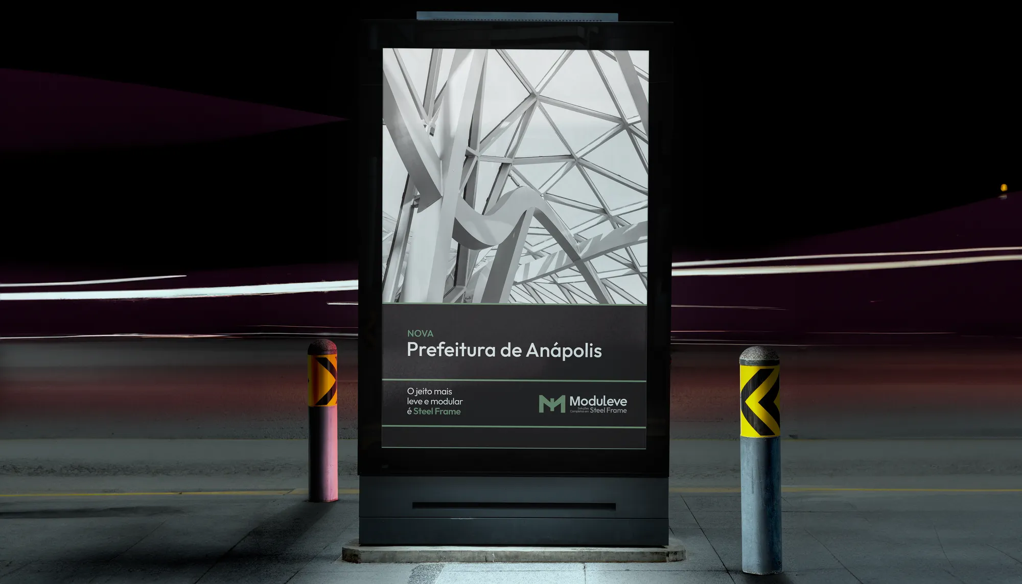
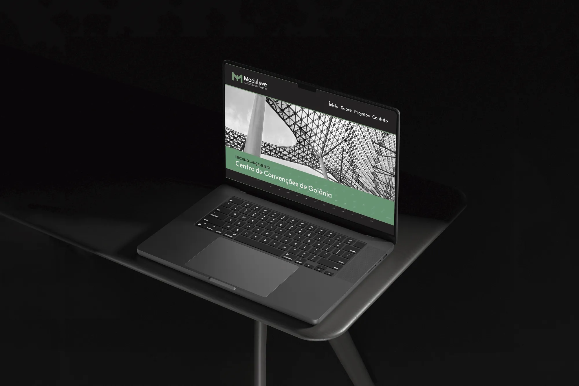
A complete corporate system, with clear hierarchies for B2B and B2C communication, which extended into the sister brand Modusteel. Green appears sparingly and in the right place: where the brand wants the eye to stop.
Creative decisions
Naming in rounds
The list was narrowed selection after selection. In the trademark analysis, Moduleve had no identical mark in class 42 or any other; the similarities found were mapped and the chance of success was rated before the decision.
Modular typography
The Outfit family: geometric, precise, clean-lined. Its modular, structured construction reflects the principles of steel frame — technical precision, building efficiency and contemporary design — and serves everything from headlines to project specifications.
From iron to stainless
A gradation running from Black Iron to Stainless evokes the sturdiness of steel and technological precision, with versatility in corporate applications and legibility across media.
Moduleve Green
The distinctive element. It represents the system's environmental benefits — clean processes, dry construction, modular planning and resource optimisation — and acts as the highlight colour, applied strategically.
Symbol and texture
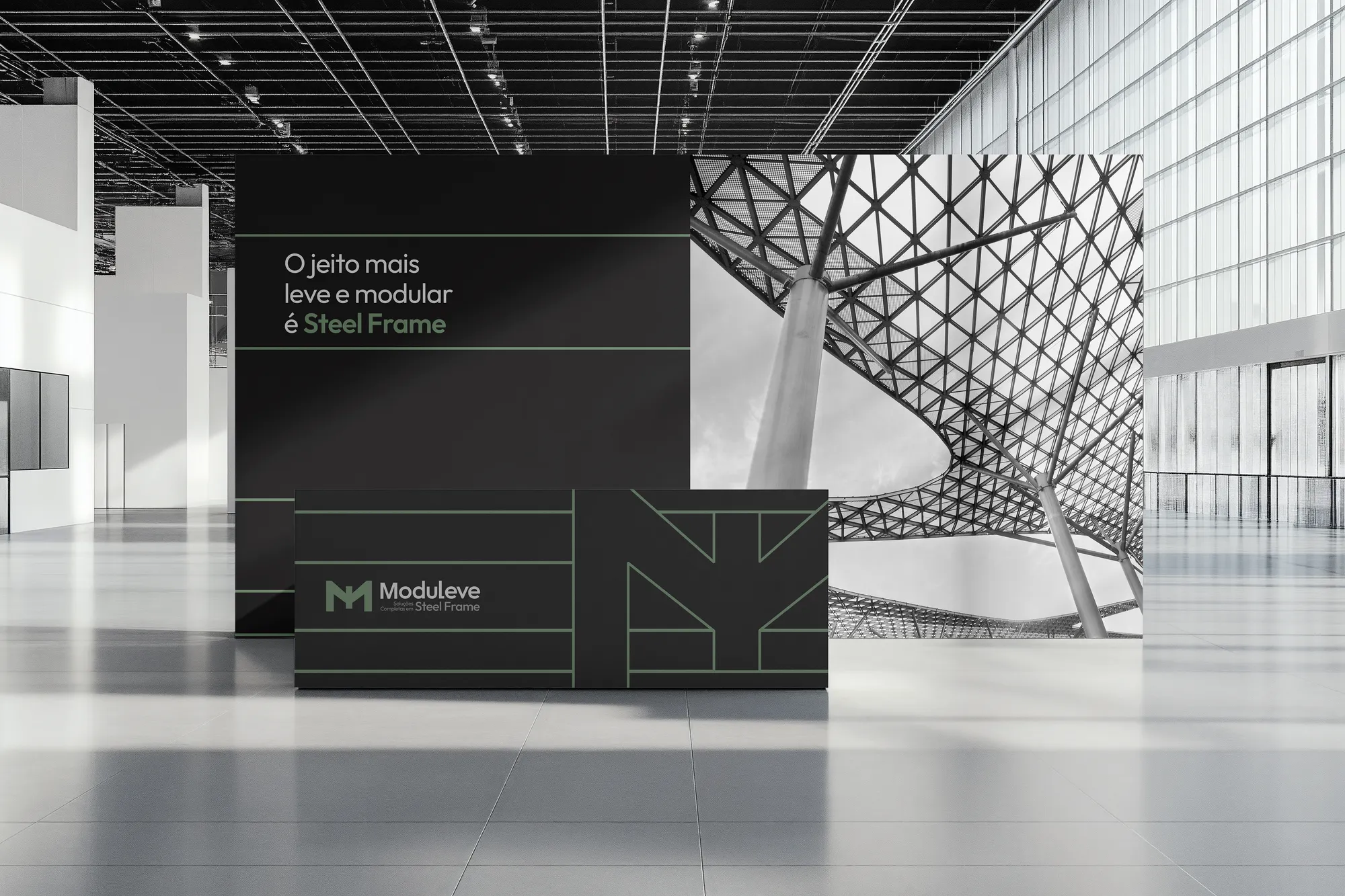
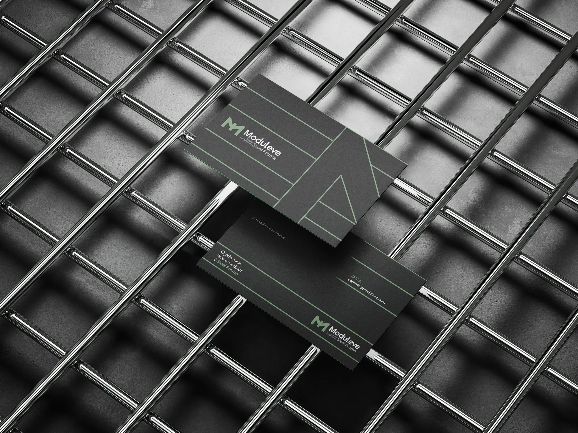
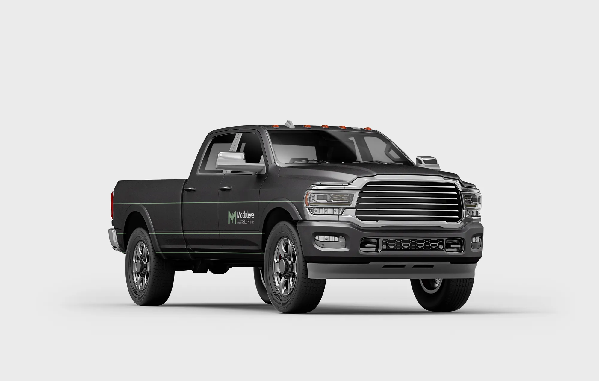
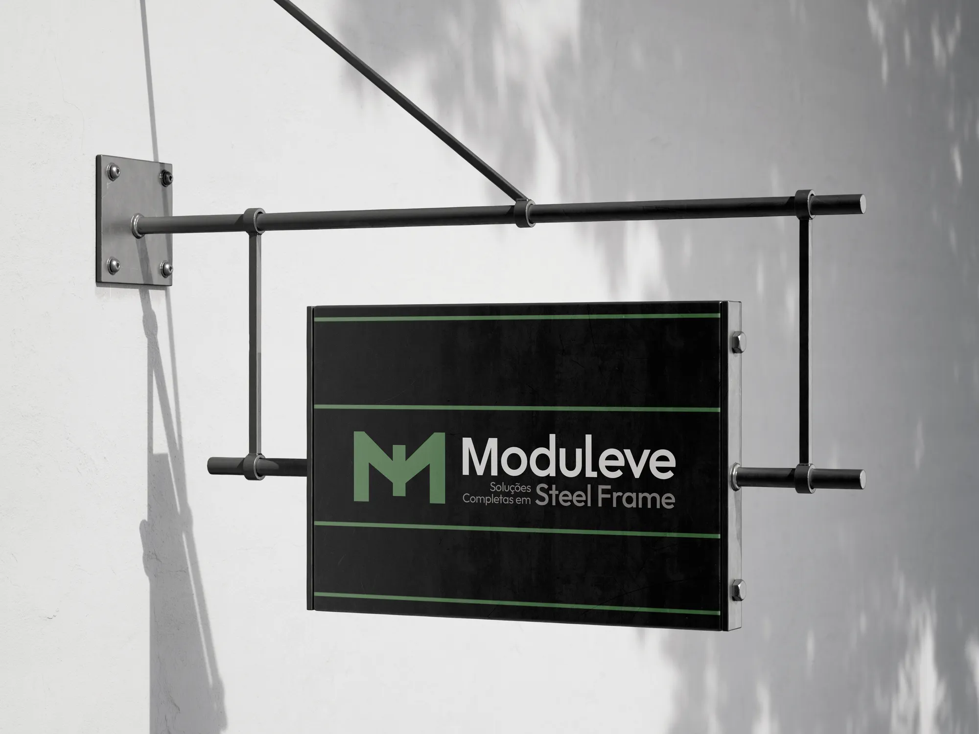
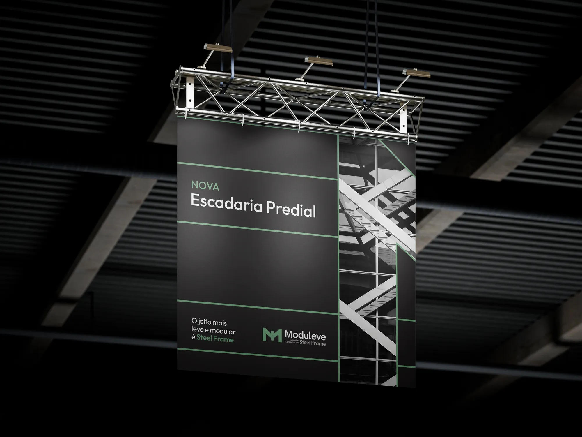
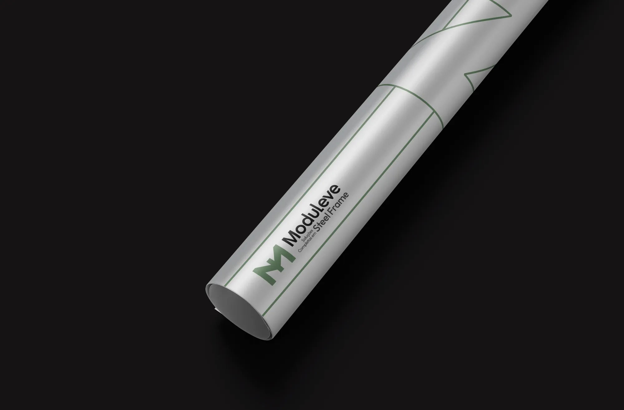
The letter M, with a skyline in its counterform and metal joints in its drawing. Deconstructed, the symbol becomes a mesh of lines that directly recalls the steel frame structure.
The lightest, most modular way is steel frame.