
Check-in dos Sonhos
From video producer to seal of approval: every hotel filmed becomes a recommended destination.
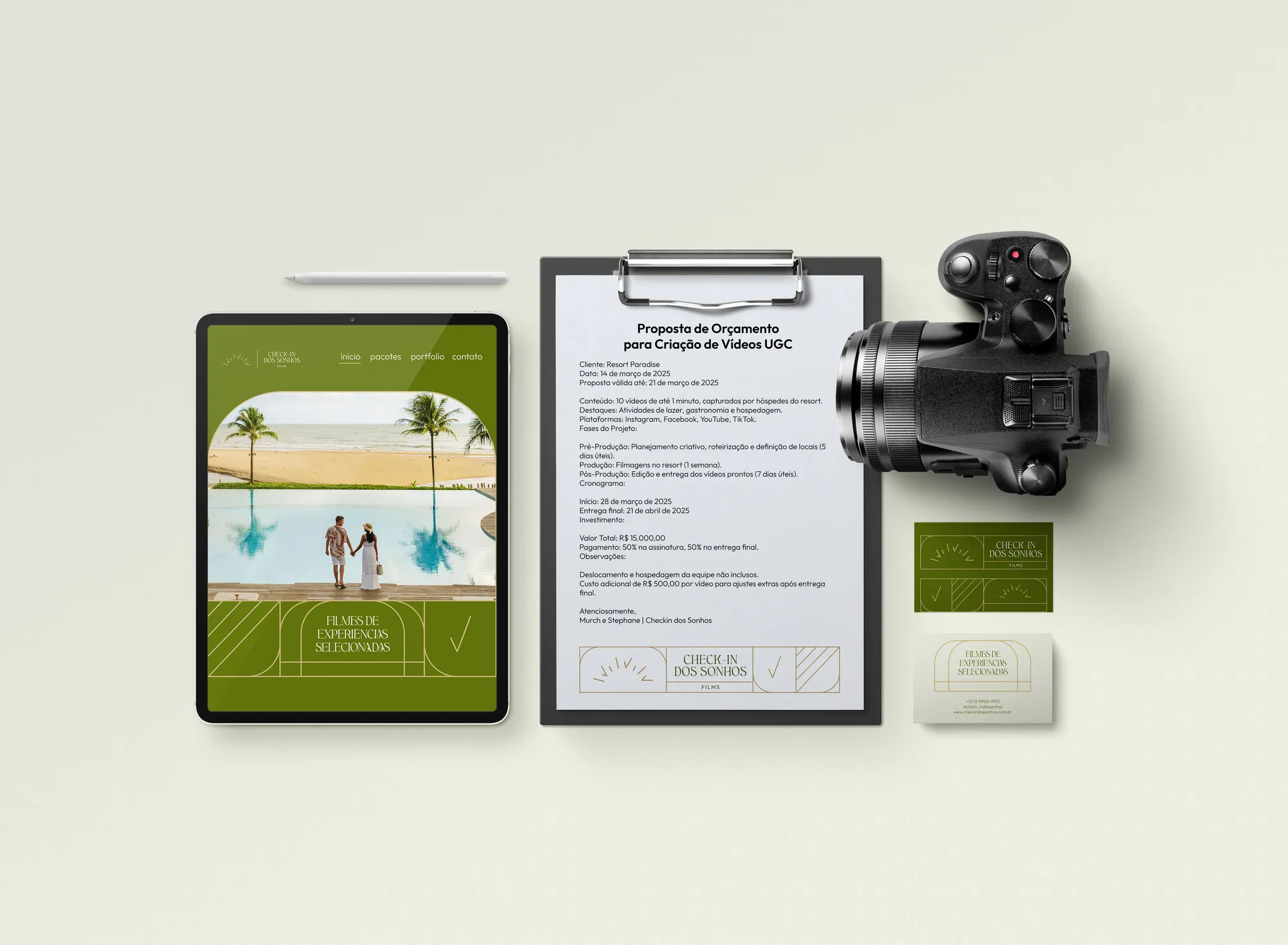
1. Context
The producer focuses on premium accommodation that wants to strengthen its digital presence with engaging videos and UGC content. Indirectly, it reaches high-end travellers aged 25 to 65 who prioritise luxury, exclusivity and impeccable service.
2. Challenge
These hotels seek productions that convey sophistication, comfort and the unique experience they offer, in a competitive market. The brand of the one filming had to match the one being filmed — and still mean something to the guest.
3. Solution
The Lover archetype steers the brand toward devotion to beauty. The sun represents the energy of unforgettable journeys and the warmth of hospitality. The check, a universal sign of approval, states that every hotel filmed is an approved and recommended destination: a dream fulfilled.
4. Result
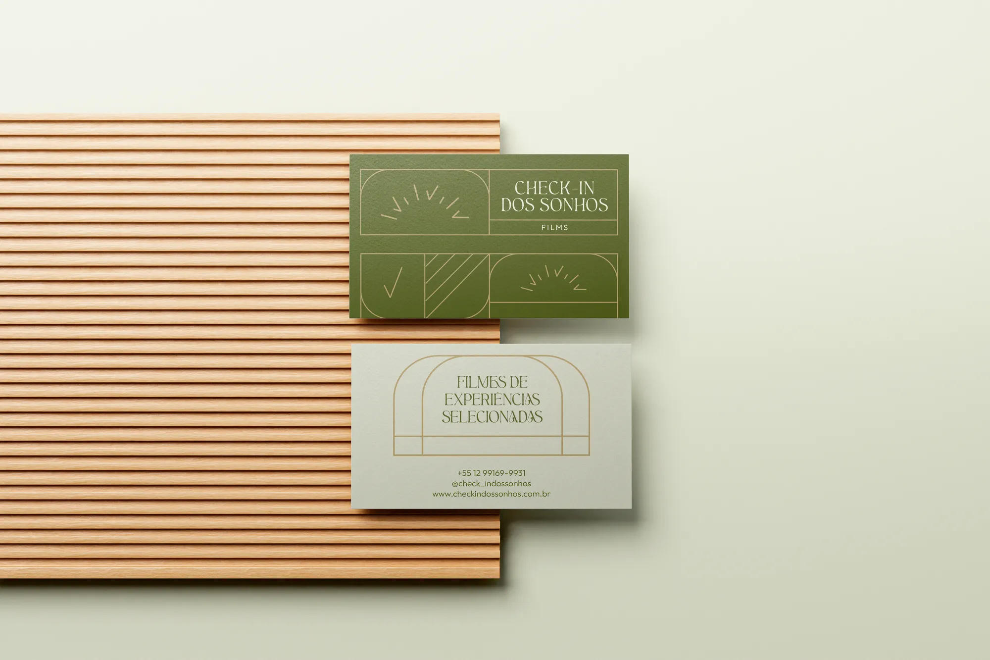
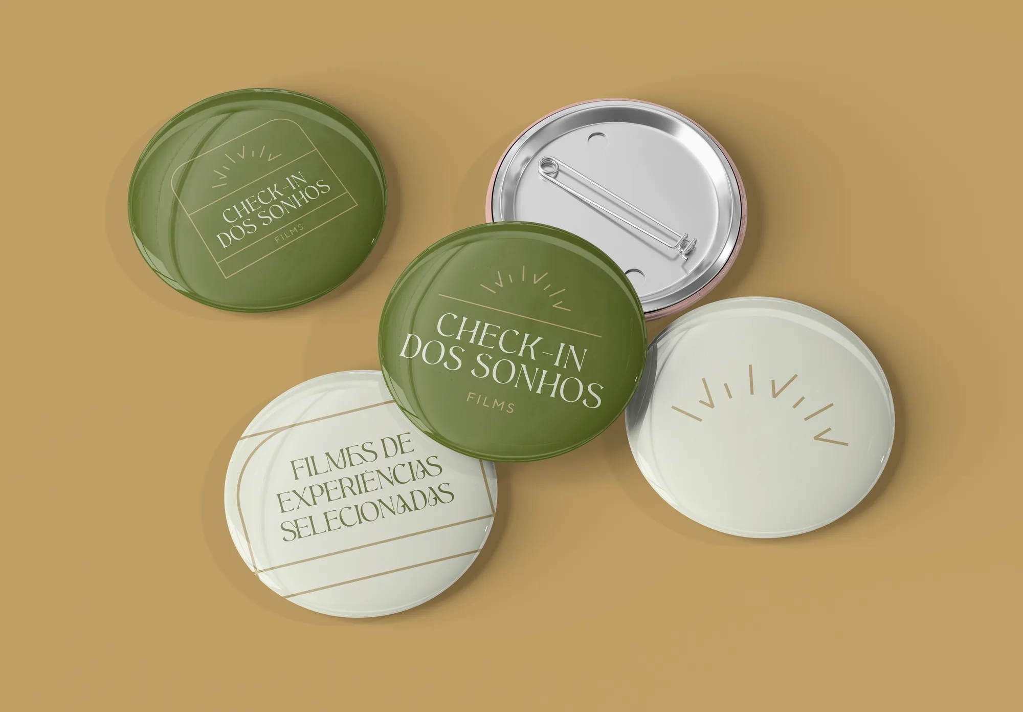
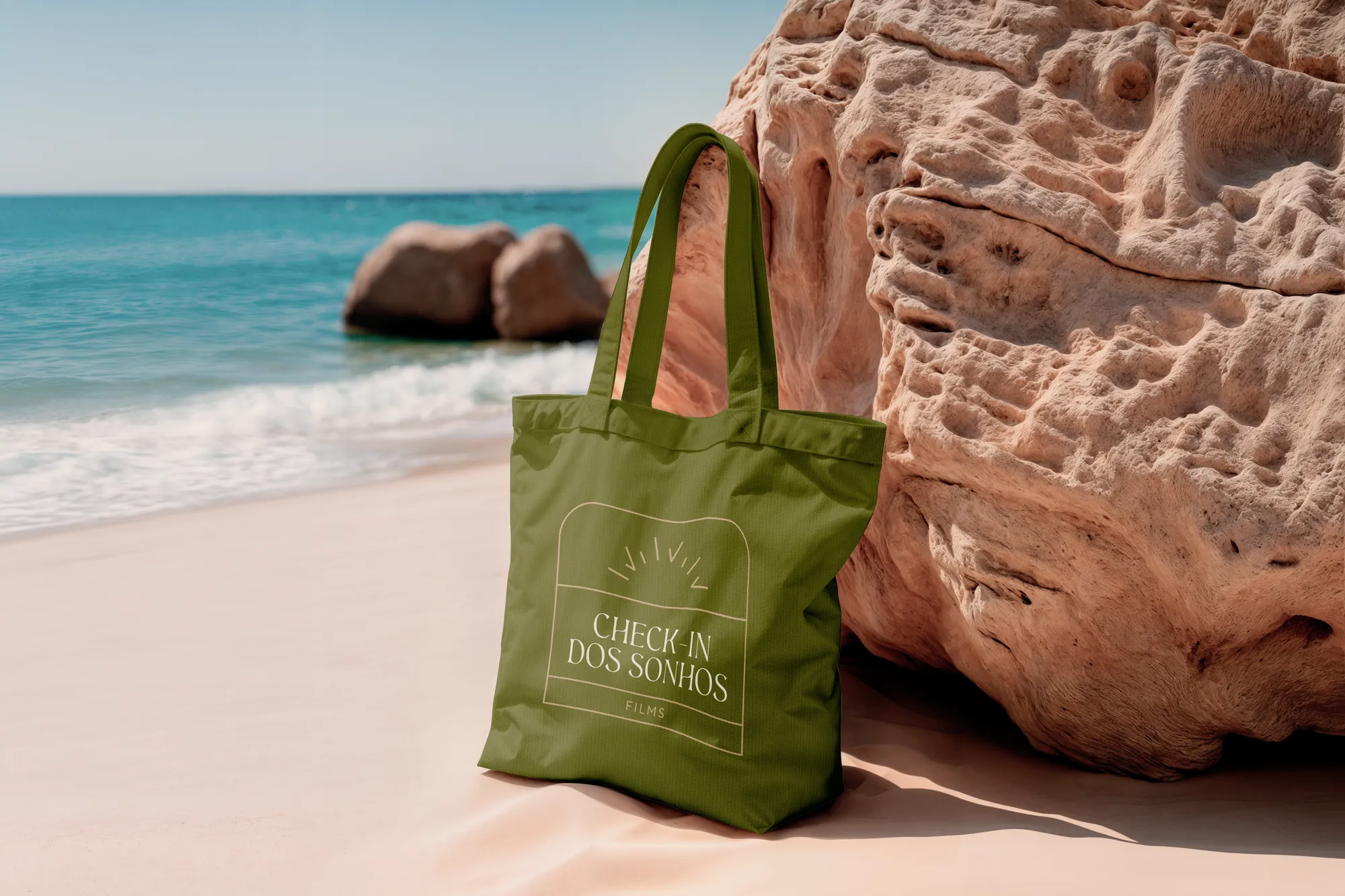
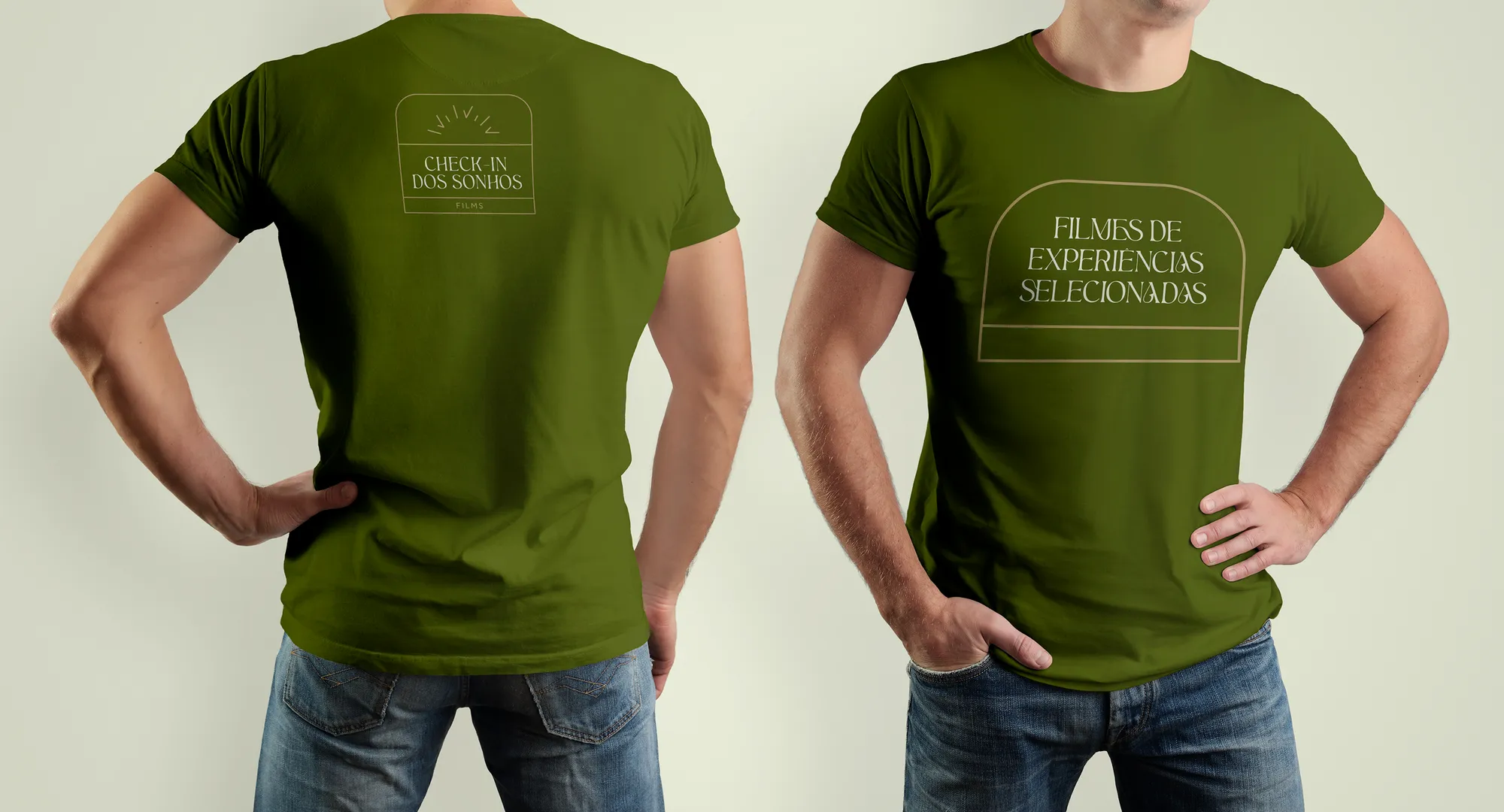
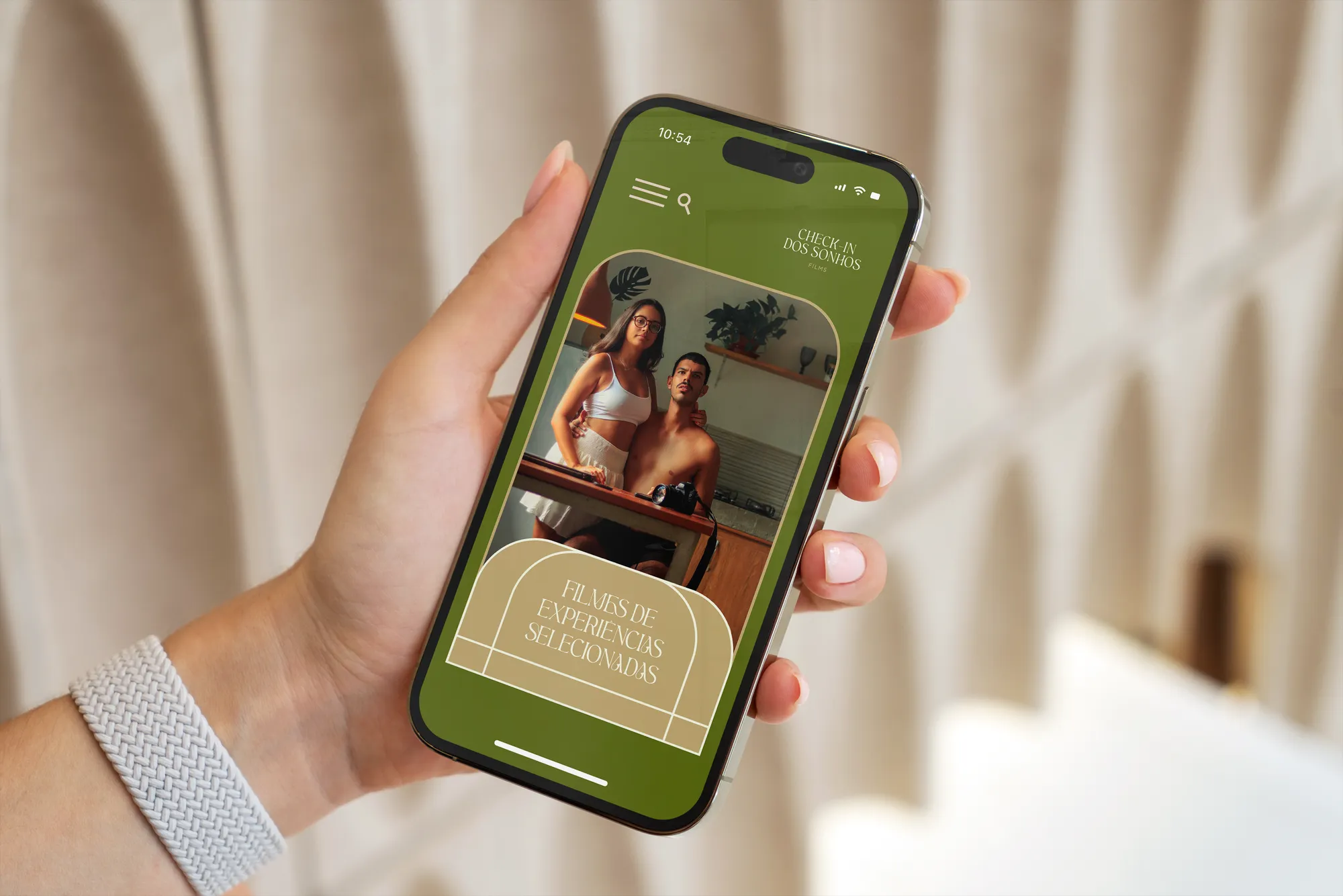
An identity in greens and solar beige, with a modular pattern repeating sun and check on a mesh of fine lines. The descriptor closes the promise — films of selected experiences — and the applications follow the crew on location, from shirt to gear.
Creative decisions
Two audiences, one brand
The direct client is the hotel; the end audience is the traveller. The identity was designed to be recognised as a partner by the first and as a recommendation by the second.
Symbol: sun + check
The sun recalls the awakening of new journeys, the shine of exclusivity and the warmth of hospitality. The check represents the certainty of a choice well made.
Typography
Aesthetic, a modern serif with embracing curves and organic traits, used only in the logo and headlines. Norms Pro Compact, a highly legible sans, for copy, subheads and taglines.
Greens of discreet luxury
Moss Green, deep and earthy, evokes safety and a luxury associated with well-planned natural spaces. Light Green and Green-White bring lightness and legibility. Beige carries light, sun and the feeling of a new beginning.
Modular pattern
Minimalist geometric forms organised on a symmetrical mesh of fine lines, where the two key symbols appear. The pattern reinforces the identity with every application.

Every hotel filmed, a destination approved.