
MA Interiores
From a pretty portfolio to a brand with a point of view: art deco as a signature.
1. Context
The audience is made up largely of women aged 25 to 50 who share a passion for refinement and welcoming luxury. A select group, willing to invest in projects that shape their spaces and reflect style and desires in a unique way.
2. Challenge
In interiors, everyone shows beautiful rooms. The brand had to say more than the photograph: it had to carry exclusivity and the ideal of the hand-made, and still embrace three different fronts — design, décor and Christmas — without becoming three brands.
3. Solution
The Lover archetype and an art deco typeface with organic forms that convey sophistication and personalisation. The palette gathers vibrant and greyed tones found in art deco: the classic architectural style, with modernity, versatility and boldness.
4. Result
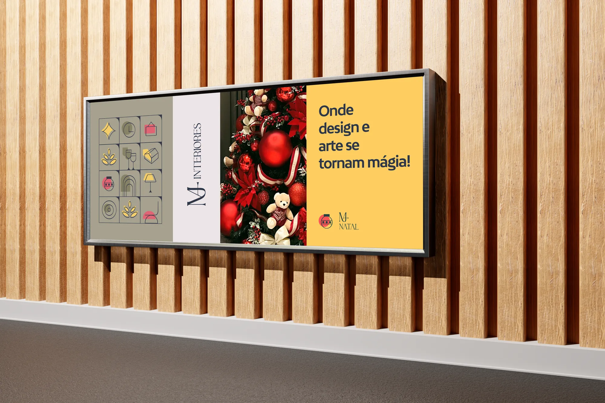
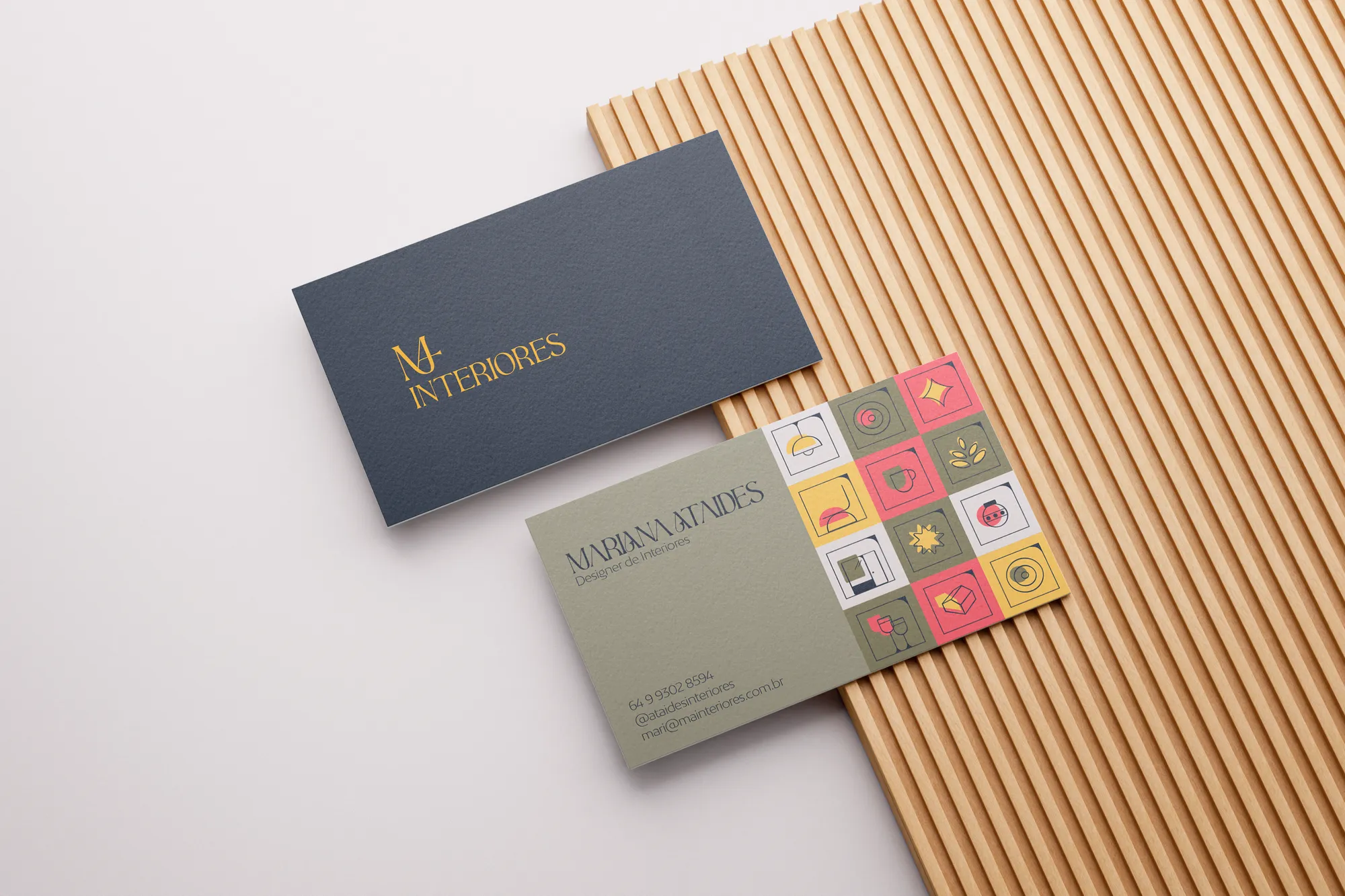
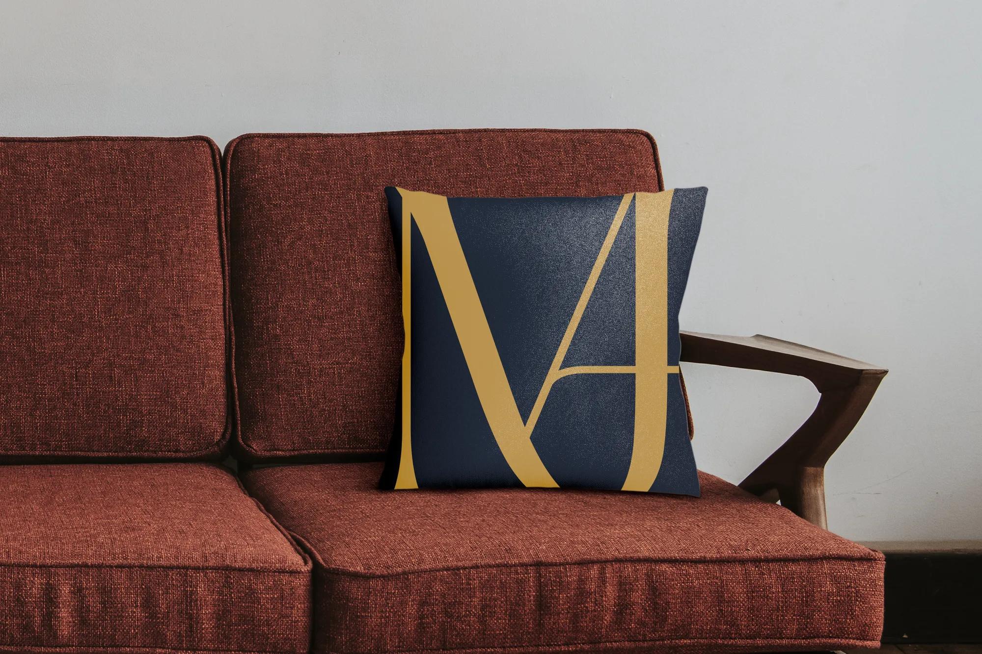
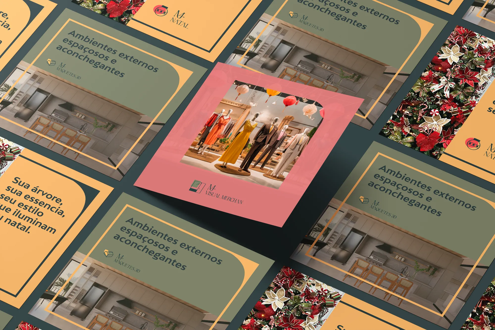
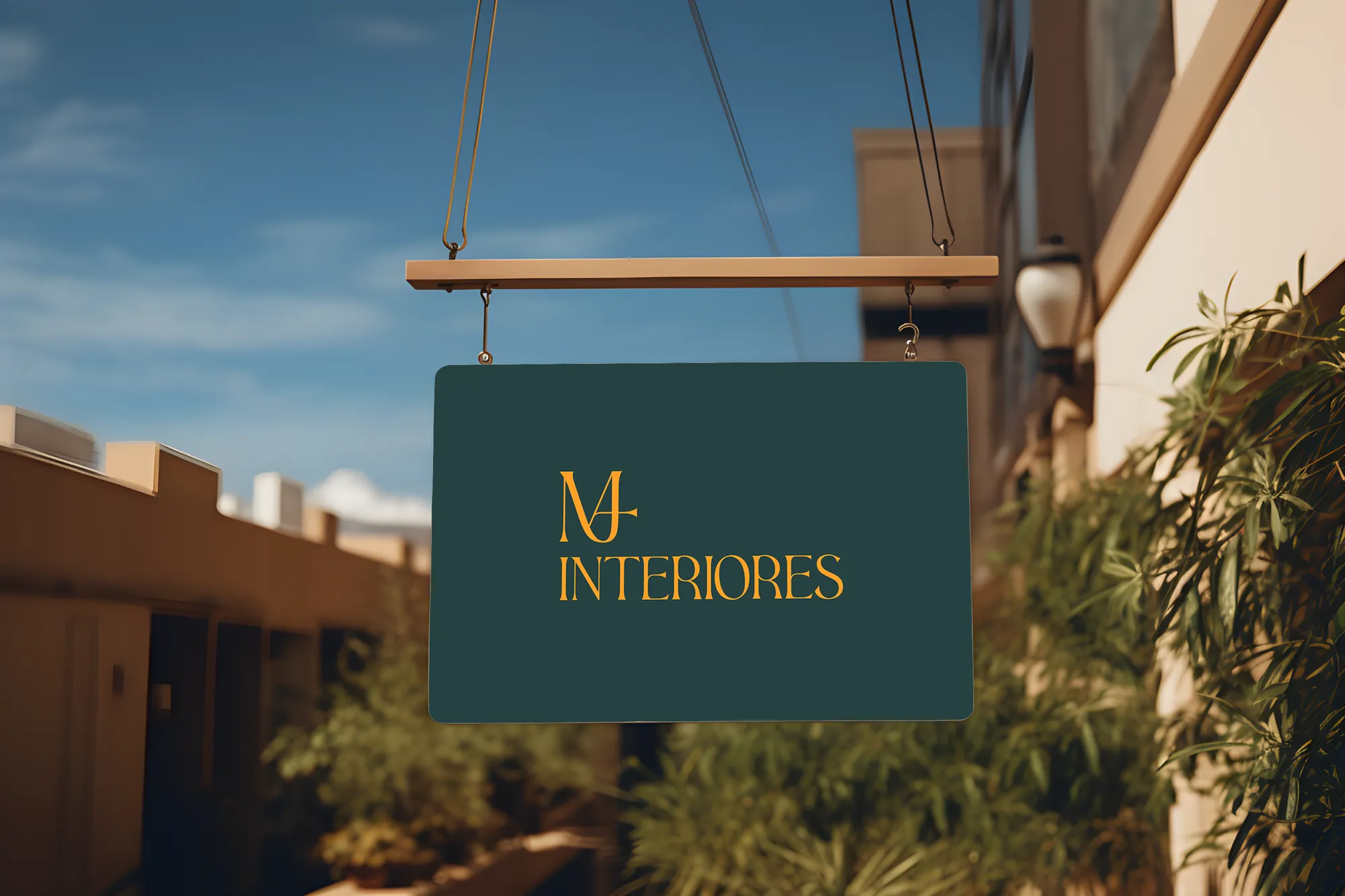
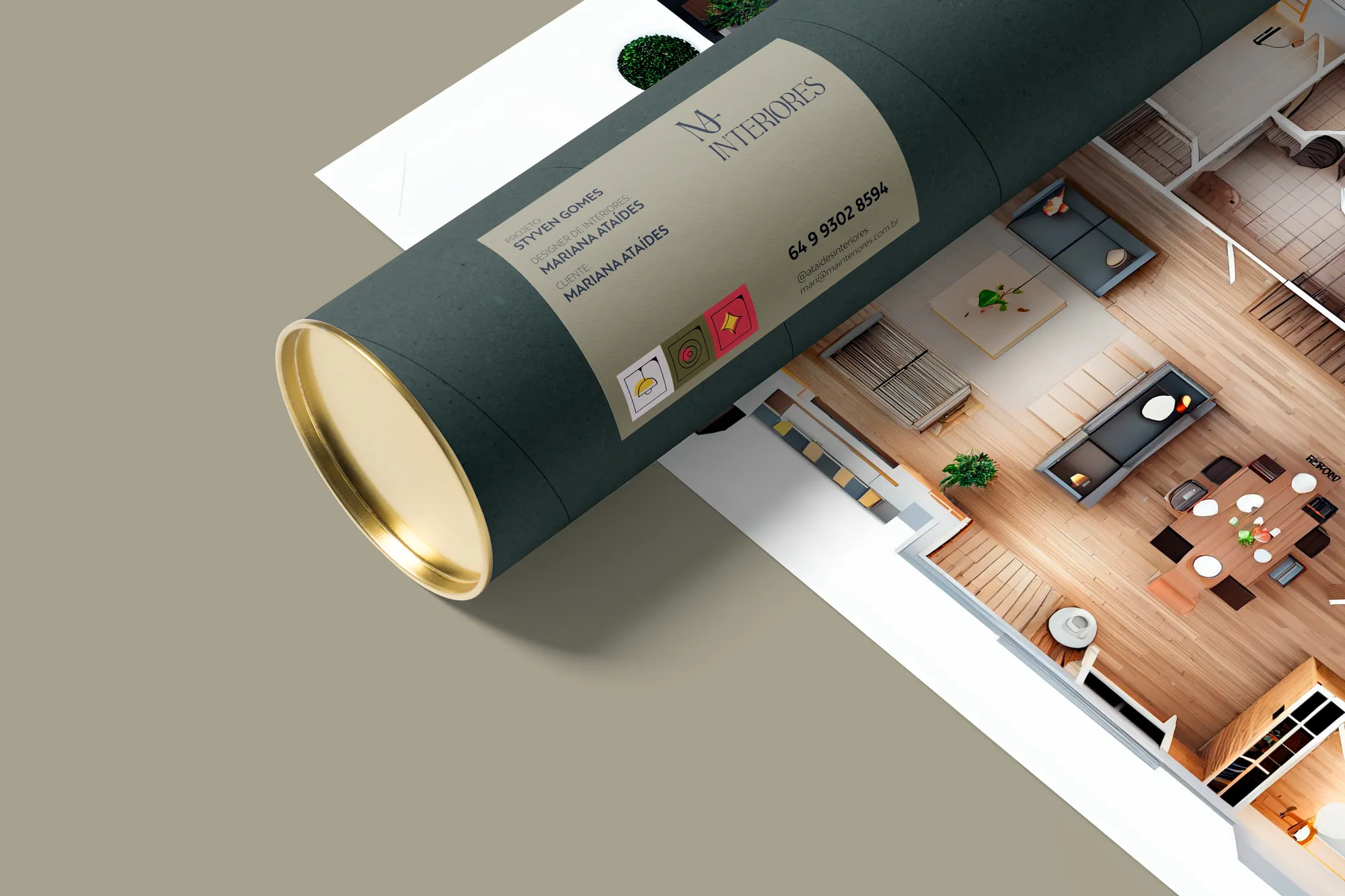
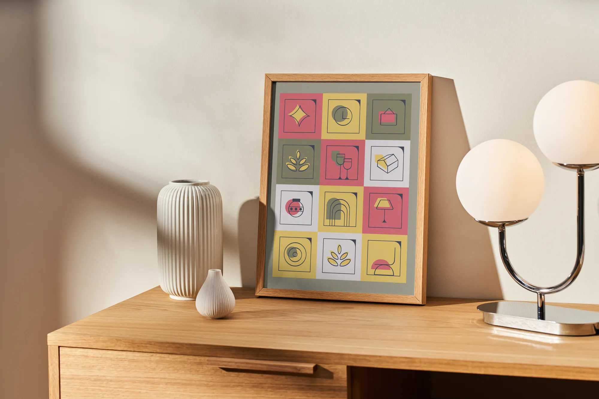
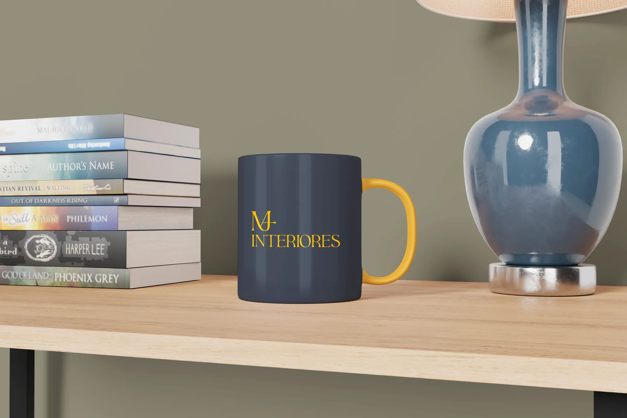
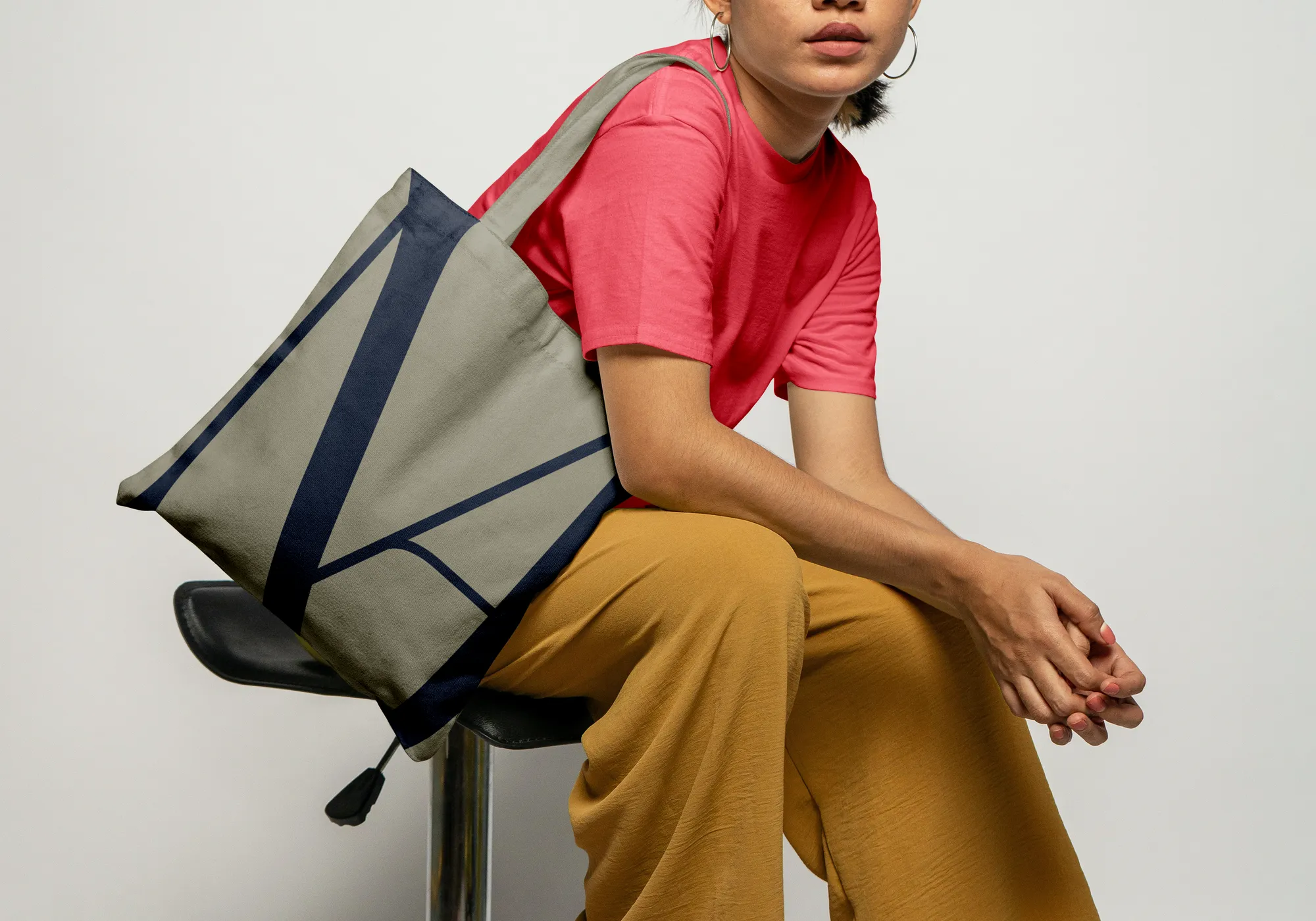
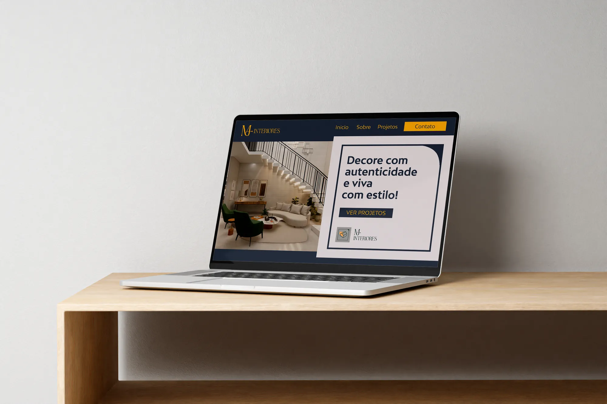
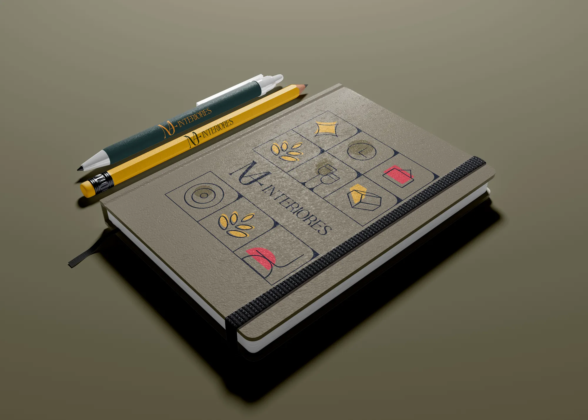
Logo, variations, sub-brands and texture, applied across business cards, storefront sign, framed prints, blueprint tube, social posts and gifts. A system that accommodates the high-end project and the Christmas decoration in the same family.
Creative decisions
Art deco as language
Aesthetic, in art deco style: a unique look, modern and vintage. Its organic forms convey sophistication and the ideal of hand-made personalisation — strengthening the attribute of exclusivity.
Contrast in the supporting type
BW Mitga, a sans with slight rounding in its construction and pointed terminals: softness and strength in the same drawing. Used in copy, taglines and slogans.
A palette named after spaces
Burnt, Navy, Moss, Clay, Summer, Christmas, Warm Light and Soft Sun. Colours that go with each other and with Mariana, preserving luxury, sophistication and warmth.
One brand, three fronts
The company's essence combines interior projects, general décor and Christmas decoration. The sub-brands and the palette itself — which even includes a Christmas colour — give each one its place.
Where design and art become magic.