
Encantalle
From new shop to an address of good taste: a brand born looking like tradition.
1. Context
The audience is aged 25 to 60 and wants to make the home more practical, comfortable, luxurious and modern. Since both men and women seek this investment, the brand was built neutral — without giving up the delicacy furniture and décor call for.
2. Challenge
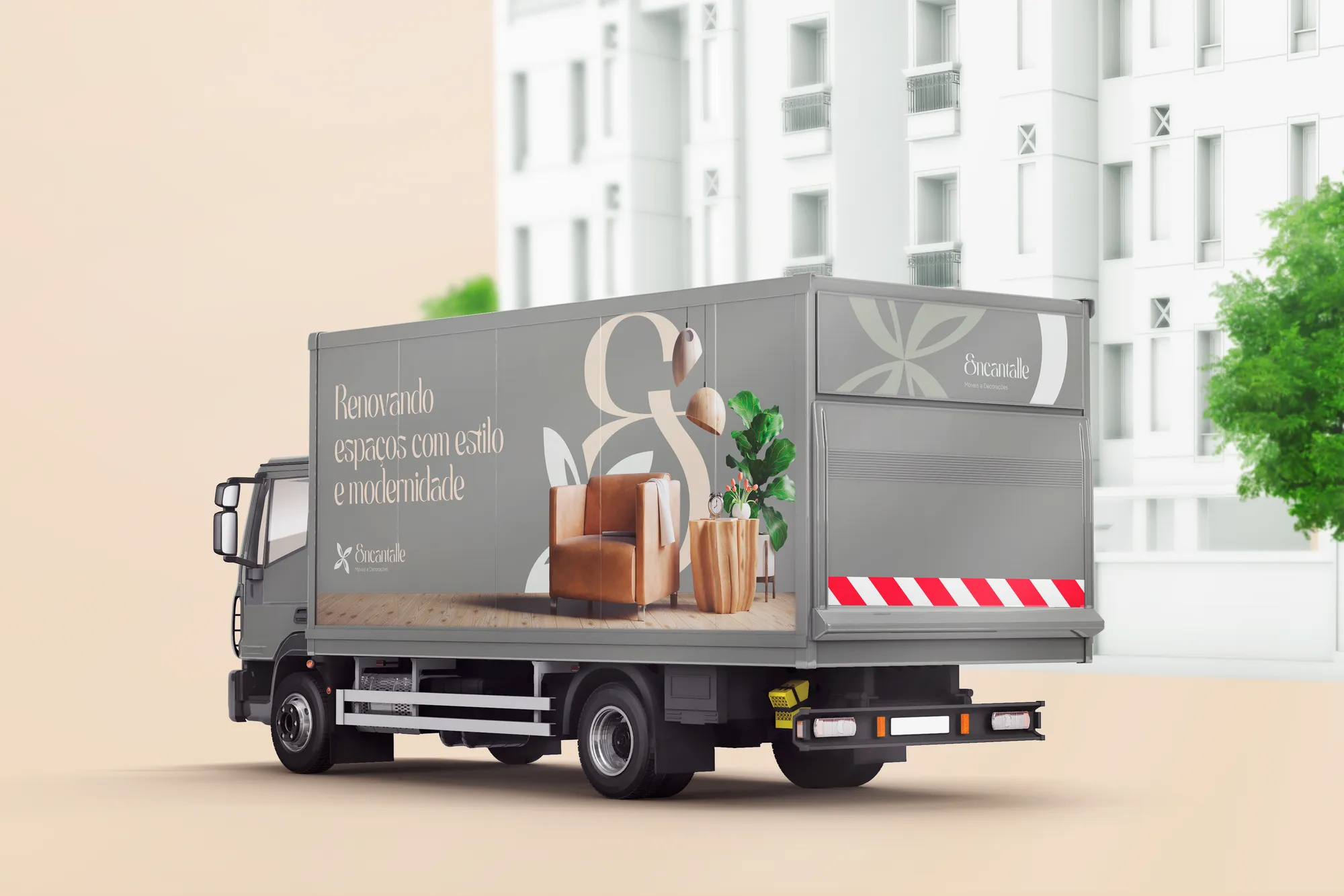
In furniture retail, competitors use saturated colours and speak loudly. Encantalle needed neutrality and luxury to stand apart — and a system that would work from the architects' invitation to the delivery truck.
3. Solution
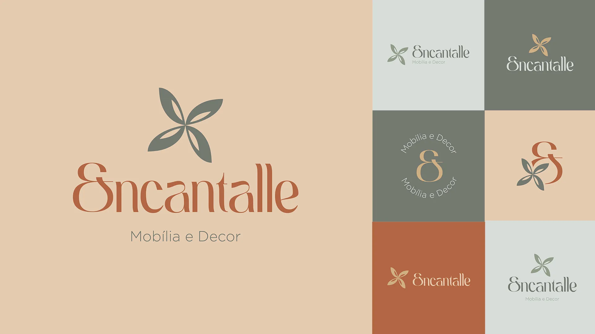
The Lover archetype, for its devotion to beauty. A modern baroque typeface, with pronounced curves and a vintage air, balanced by a straight-lined sans. Two pastel palettes — a warm one of woods and beiges, a cool one of moss greens — that harmonise one over the other.
4. Result
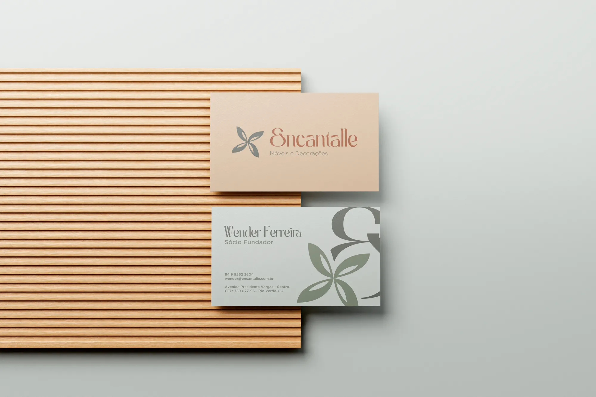
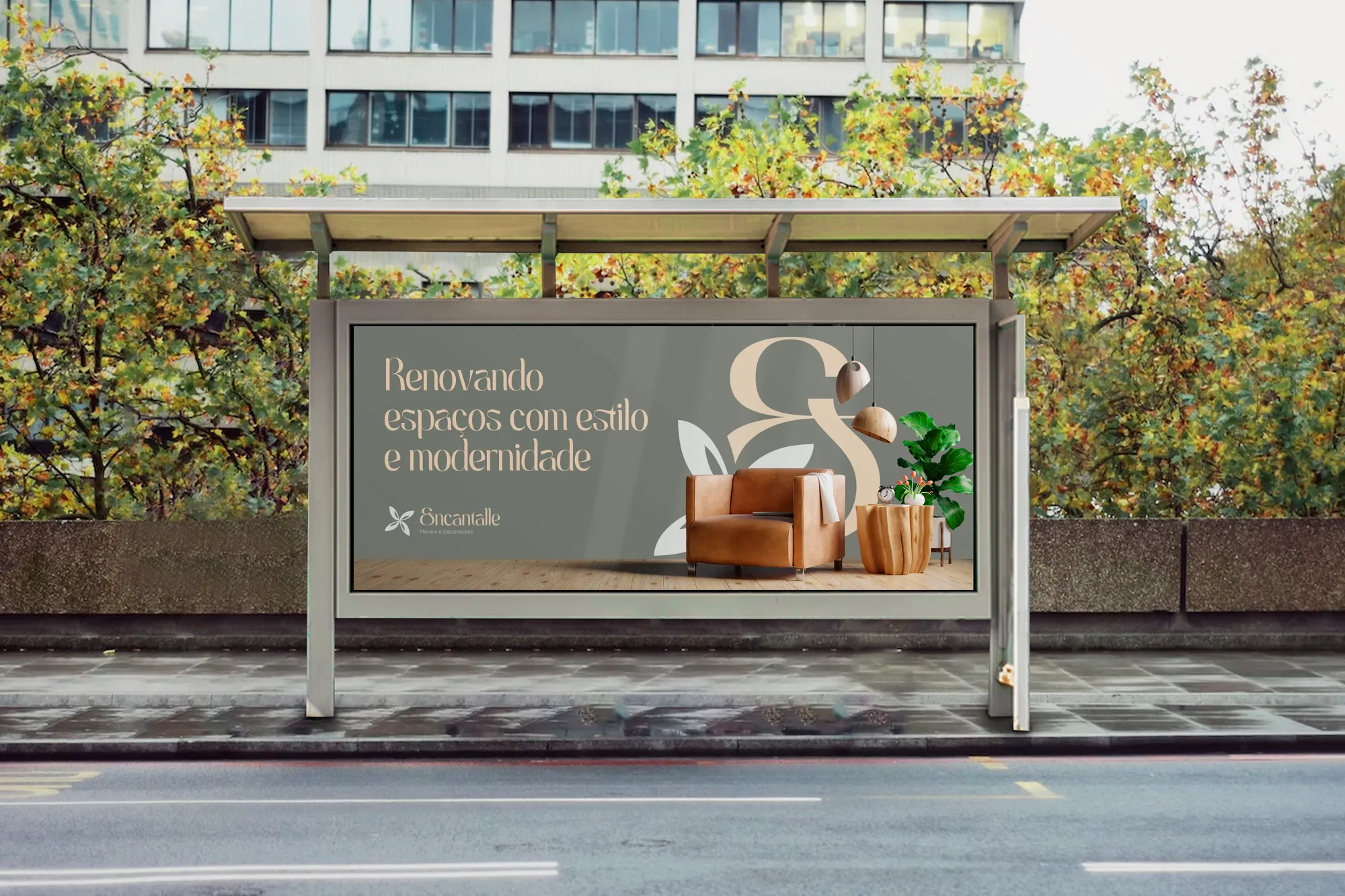
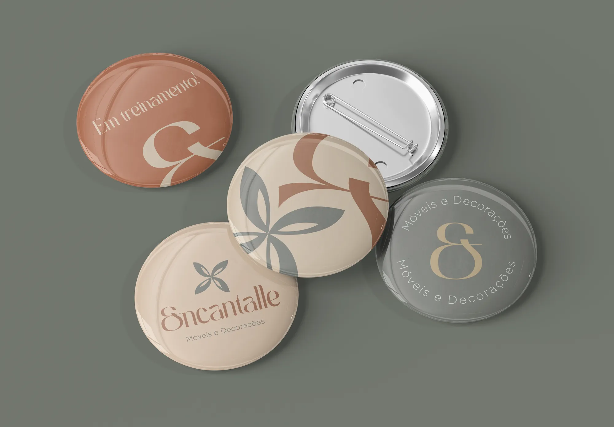
Identity, sub-brands and texture applied to the launch and to daily life: invitations for architects, billboard, truck wrap, site board and stationery. A shop that debuted without looking like a debutant.
Creative decisions
Modern baroque typography
Syage as primary: thick, cursive styles that reference the 1970s and 1980s and bring an innovative touch to lifestyle brands. Gotham, with straight lines and square forms, ensures seriousness and balance.
Two palettes in conversation
The warm one — Wood Brown, Beige and Light Beige — harmonises with wooden furniture and light upholstery. The cool one — Moss Green, Light Green and Grey Green — conveys serenity and comfort. Distant in tone, they ensure good contrast when applied one over the other.
Pastel as a differential
All colours are pastel tones, chosen to convey luxury and neutrality and to differentiate the brand from competitors that use saturated colours.
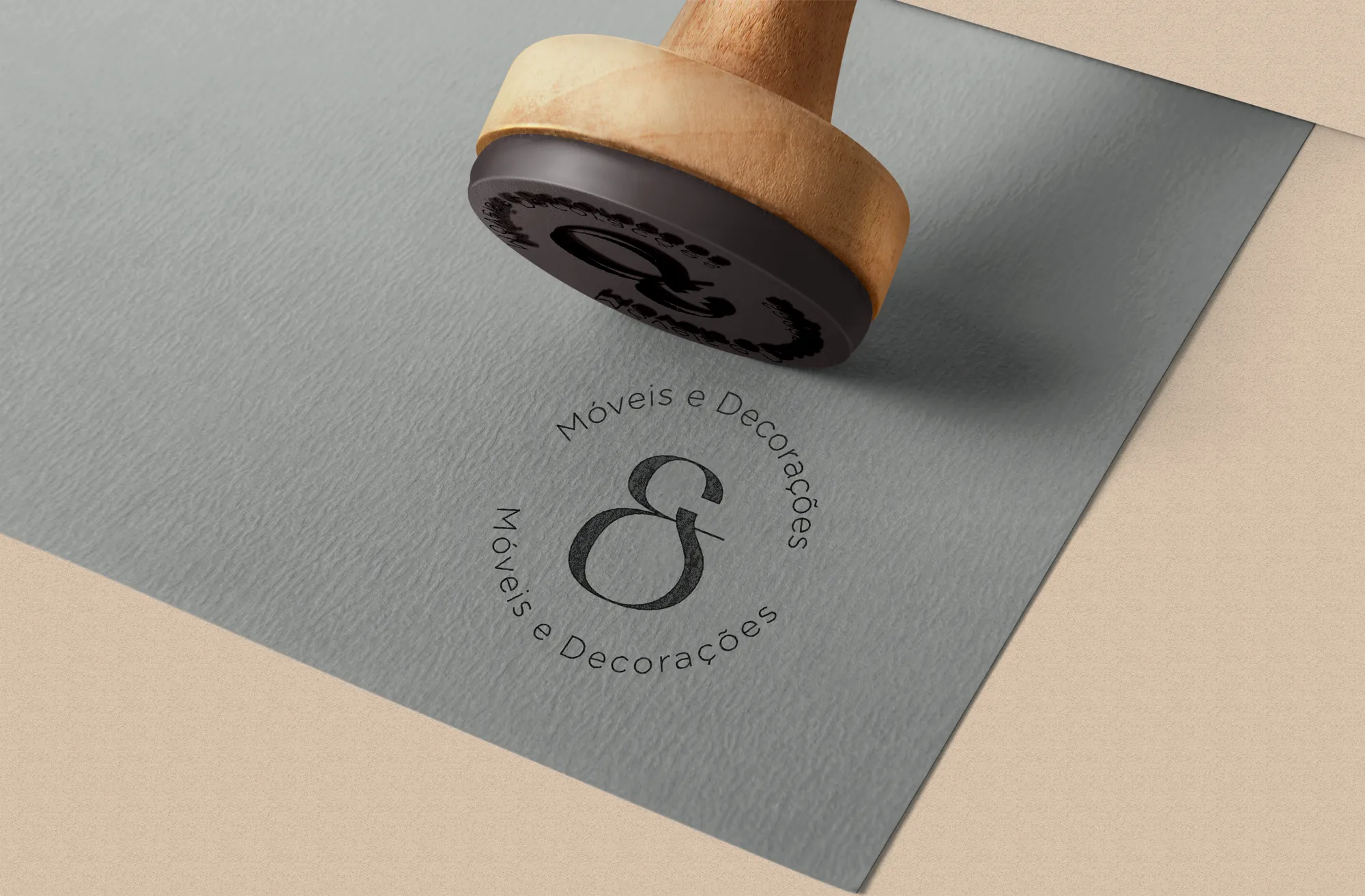
Symbol: flower and letter E
The flower represents beauty, youth, peace and renewal. In the drawing, it lives alongside the brand's initial — the E of Encantalle.
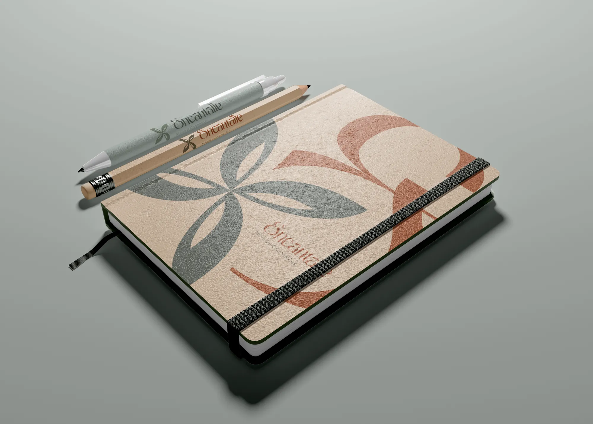
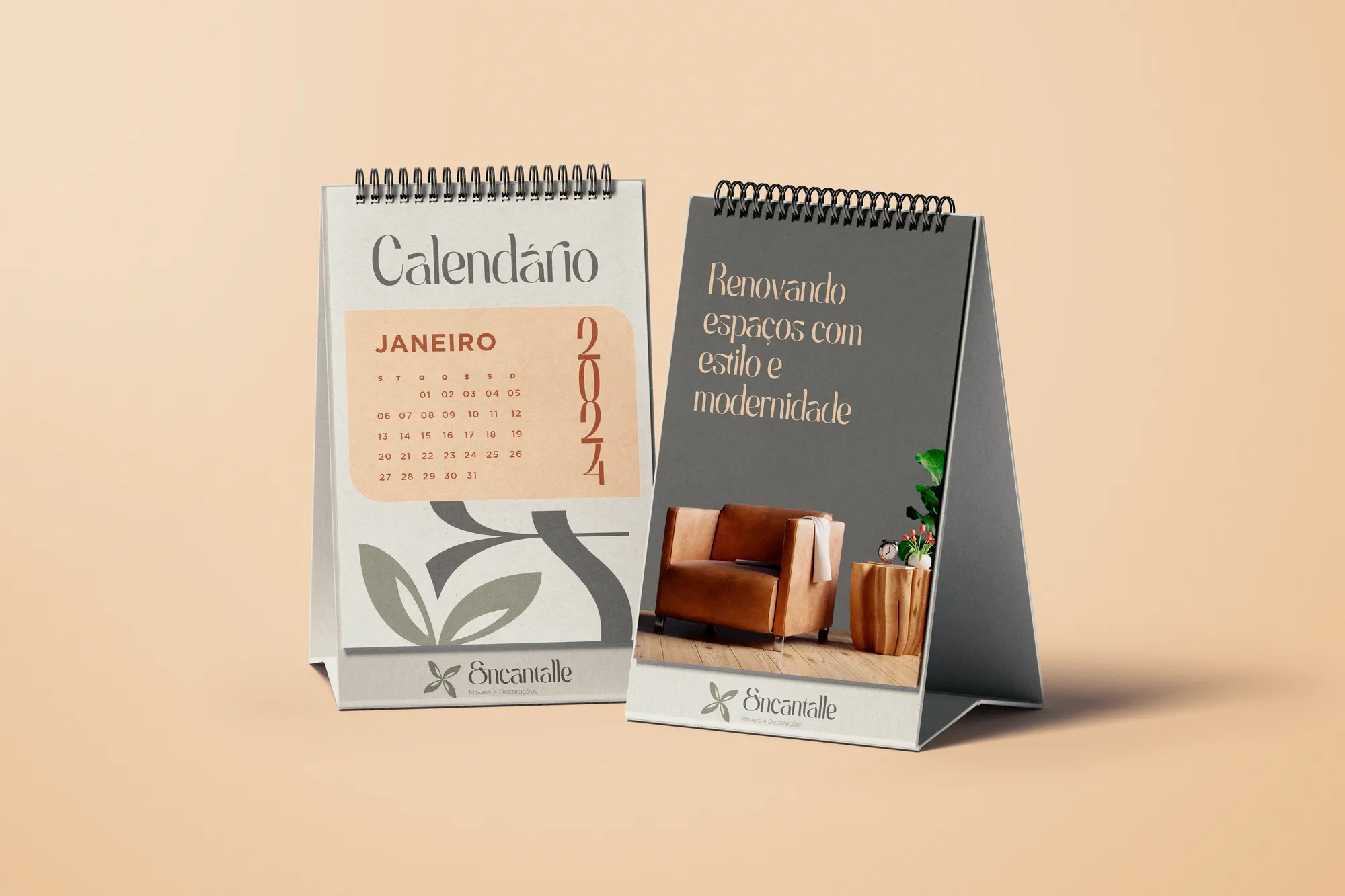
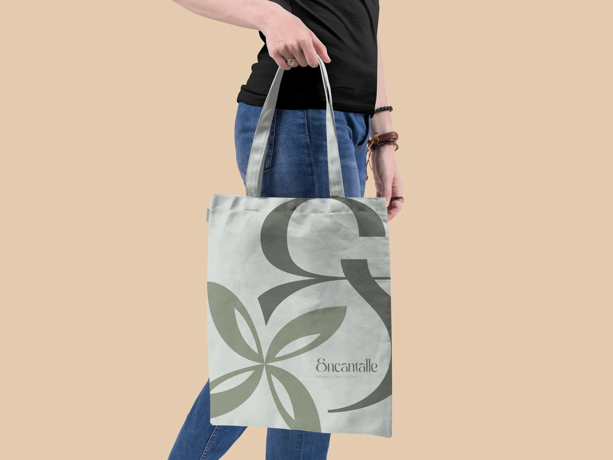
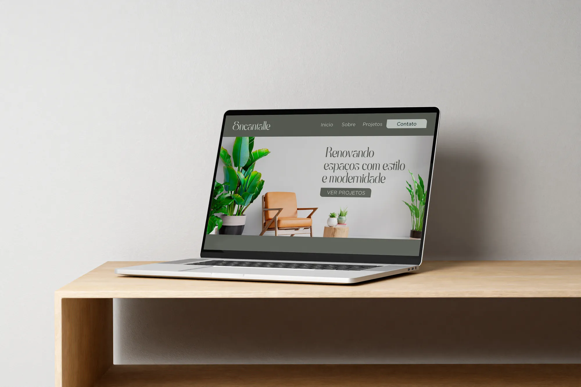
Renewing spaces with style and modernity.