
Stéphane Aguiar
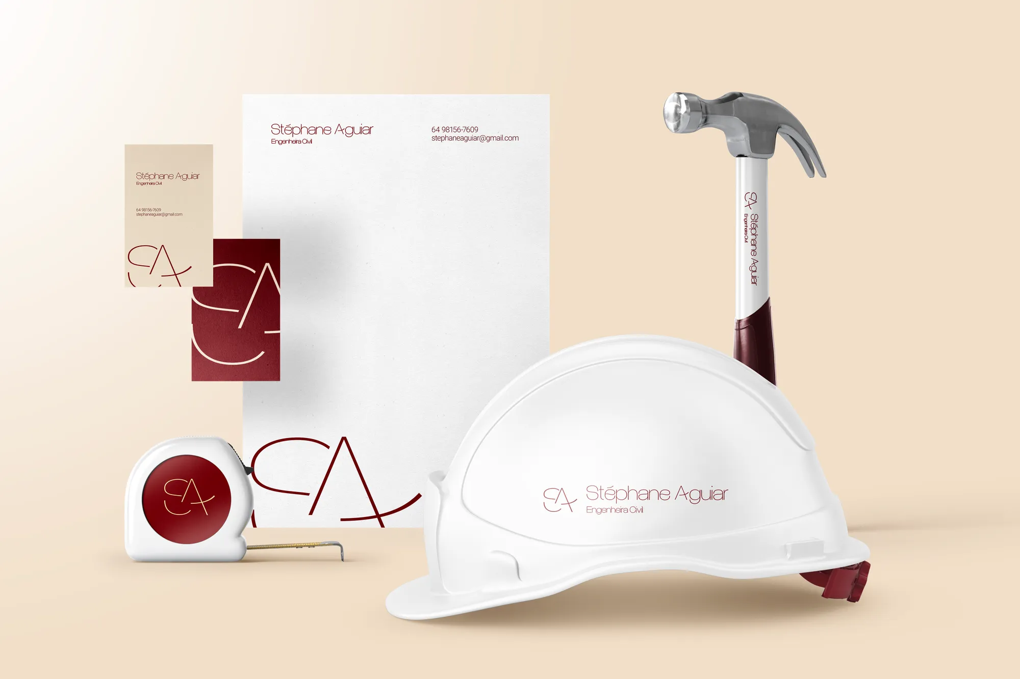
From talented engineer to a name on the project: a signature for large-scale work.
1. Context
The audience is aged 35 to 60 and wants to invest in their own comfort or generate income through large, high-luxury projects, with technology and detailing. They look for references on social media — and need to identify with the professional there.
2. Challenge
The brief carried a direct reading: these people seek to conceive projects alongside someone capable and with a standard of living similar to their own, because that gives them more confidence to pay a premium. The brand had to place the engineer in that position.
3. Solution
The Lover archetype, for its devotion to beauty. A slender, fine-stroked typeface that brings minimalism and luxury. A symbol fusing the initials S and A with a house and a compass. And a palette of wine, beige and black that can be swapped for stone and marble.
4. Result
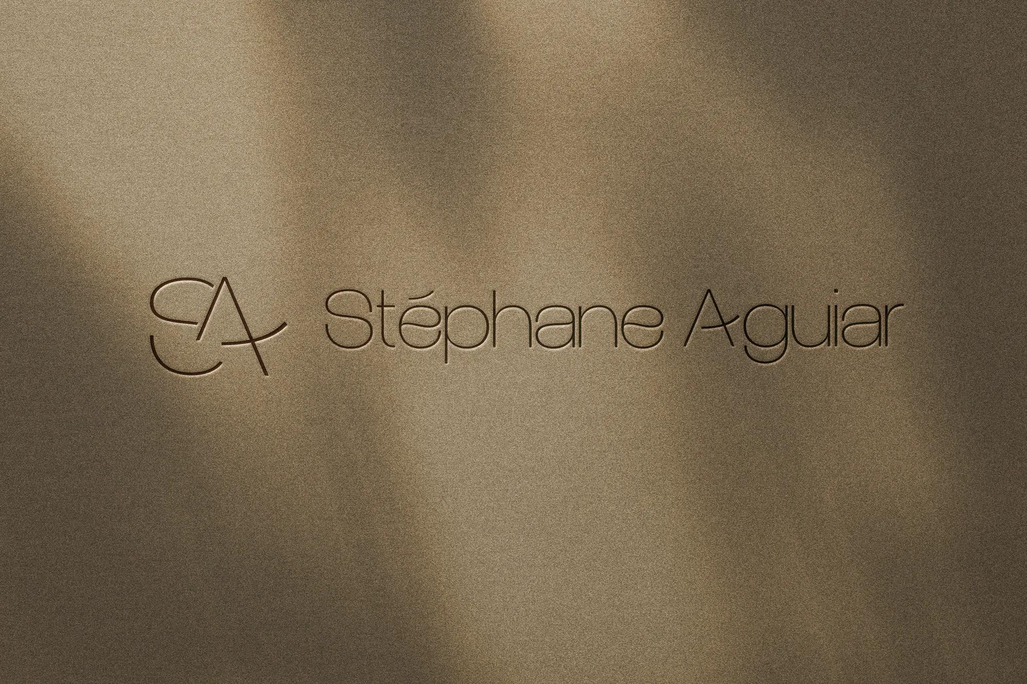
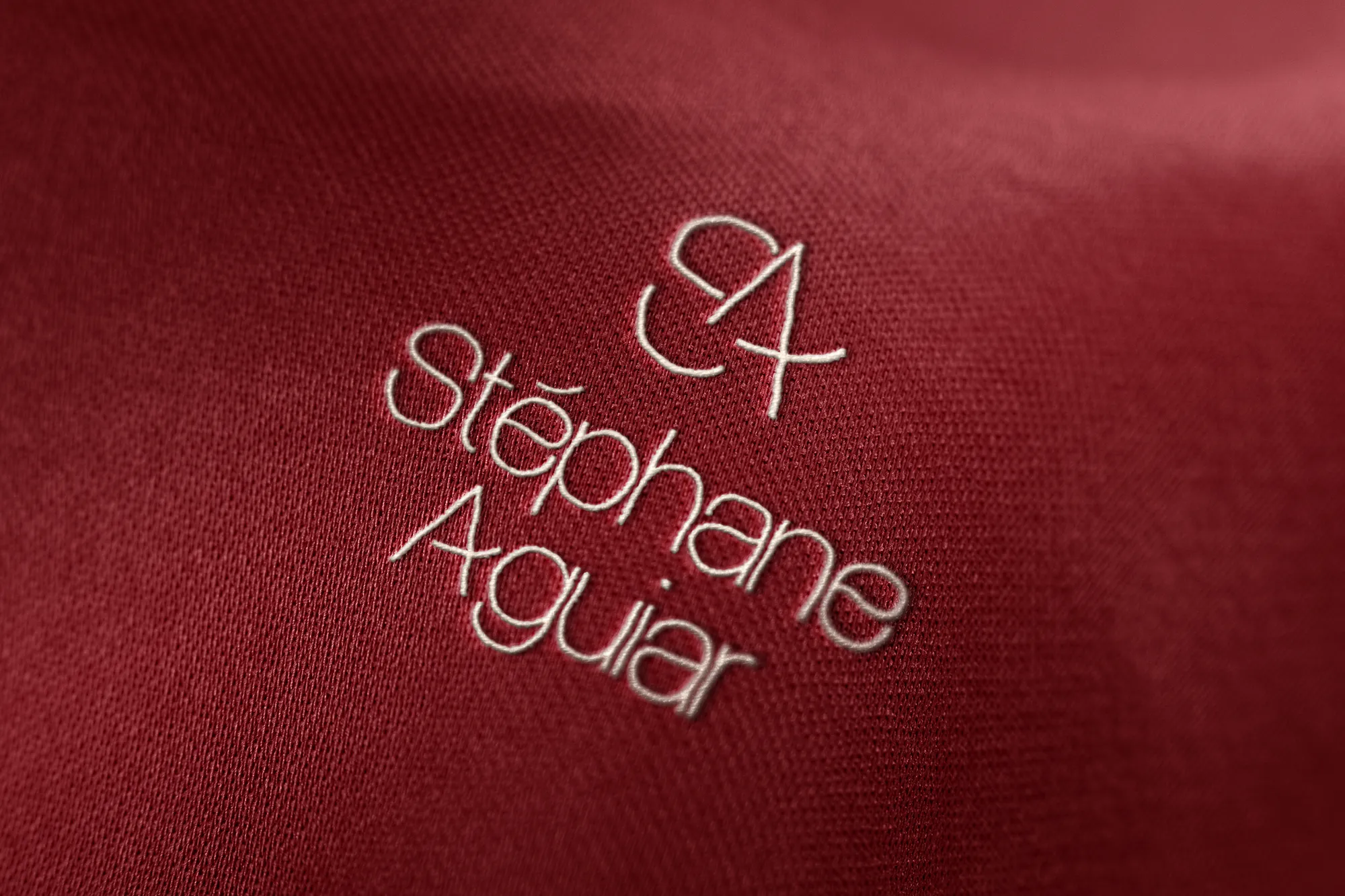
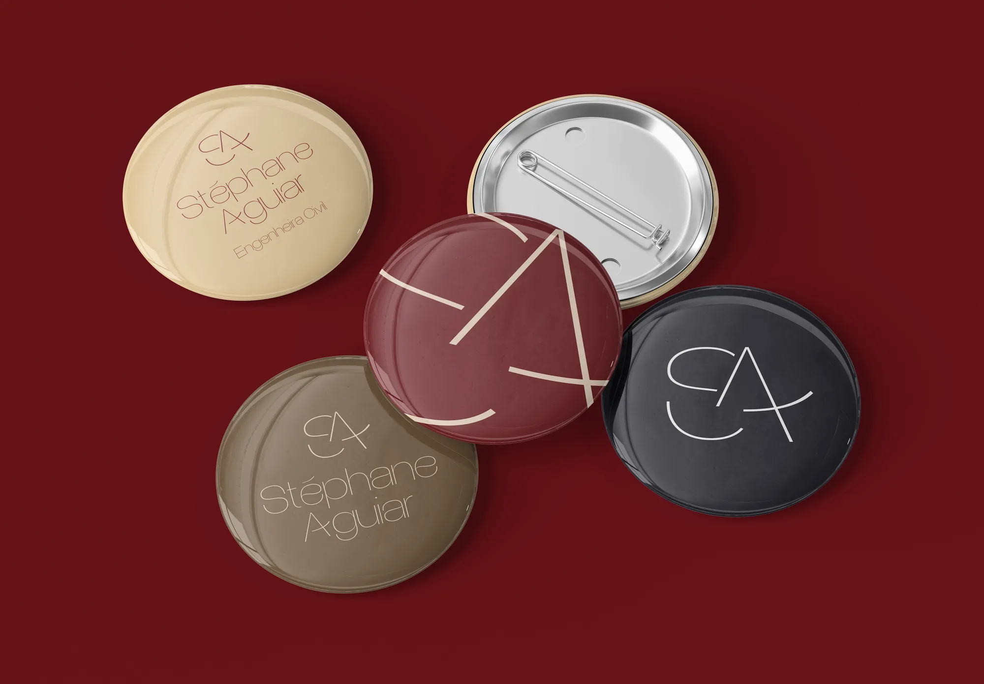
Logo, sub-brands, negative versions and texture, applied across stationery, hard hat, tape measure, blueprint tube and even carved in marble. An identity that behaves like a finishing material.
Creative decisions
Symbol: S + A + house + compass
The representation of the letters S and A, the residence and the designer's instrument gathered in a single form.
Slender typography
Esmeralda Grotesk, a very thin modern sans: minimalism and luxury, with pronounced curves in organic characters that bring fluidity, continuity and femininity. Roboto Light accompanies it, with the same lightness, in copy.
Wine, beige and black
Wine Red contrasts with Beige to represent dynamism and strength balanced with sweetness. Ink Red harmonises with Luxury Black on dark materials. Modest Brown serves the cosier projects.
Colour that becomes stone
Yellowish Beige can be replaced by textures such as stone and marble. In an engineer's brand, the palette speaks the language of finishes.
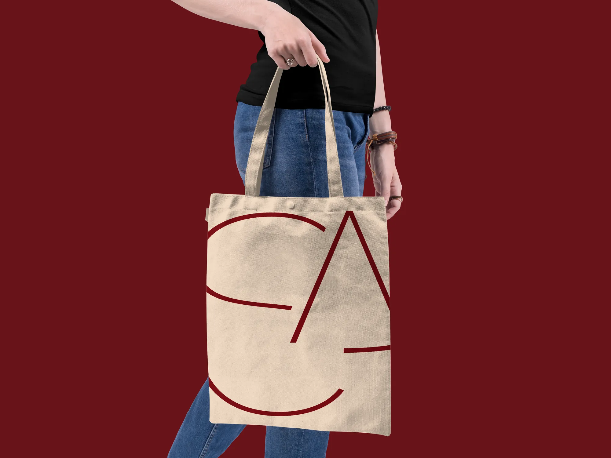
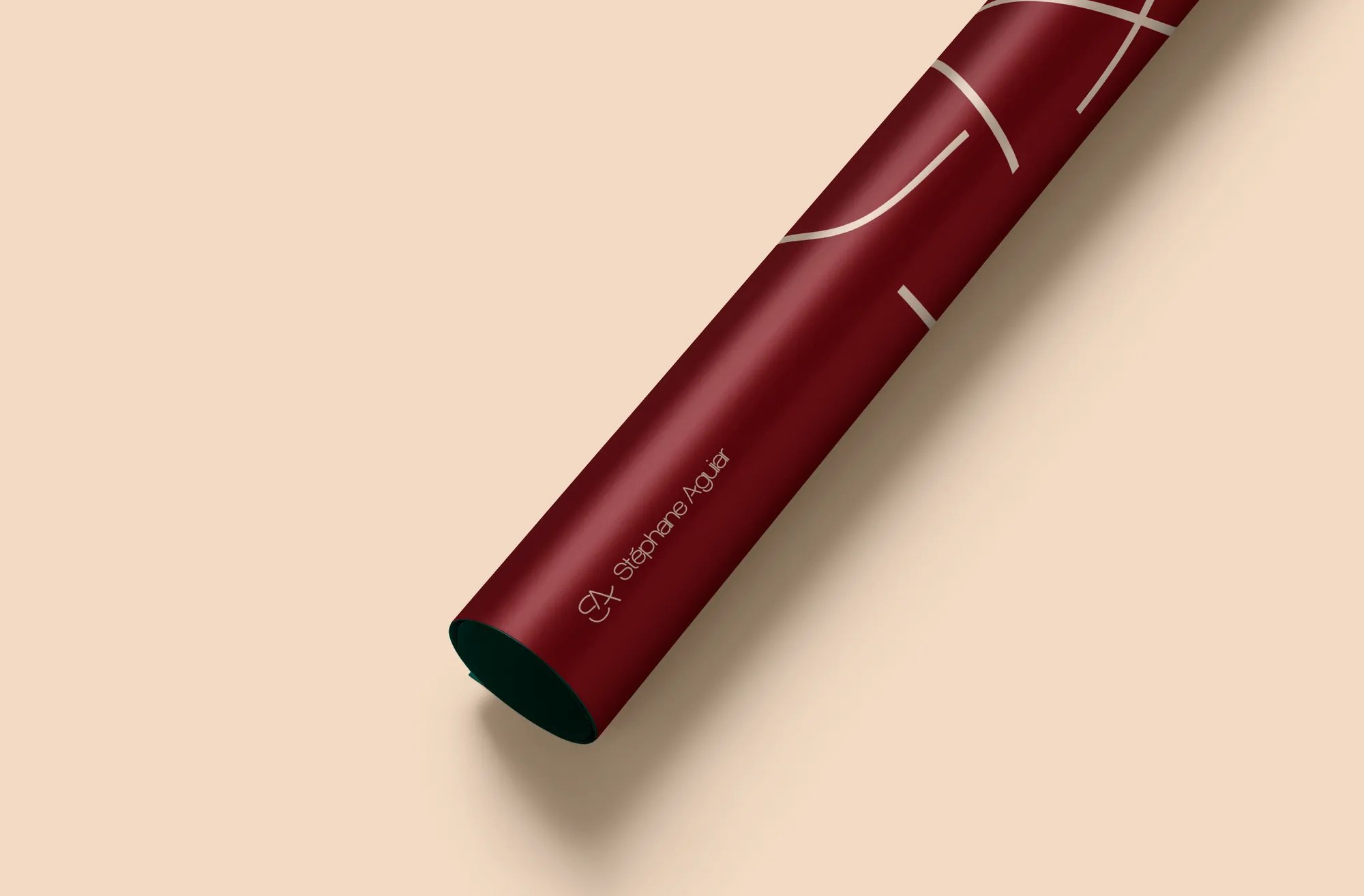
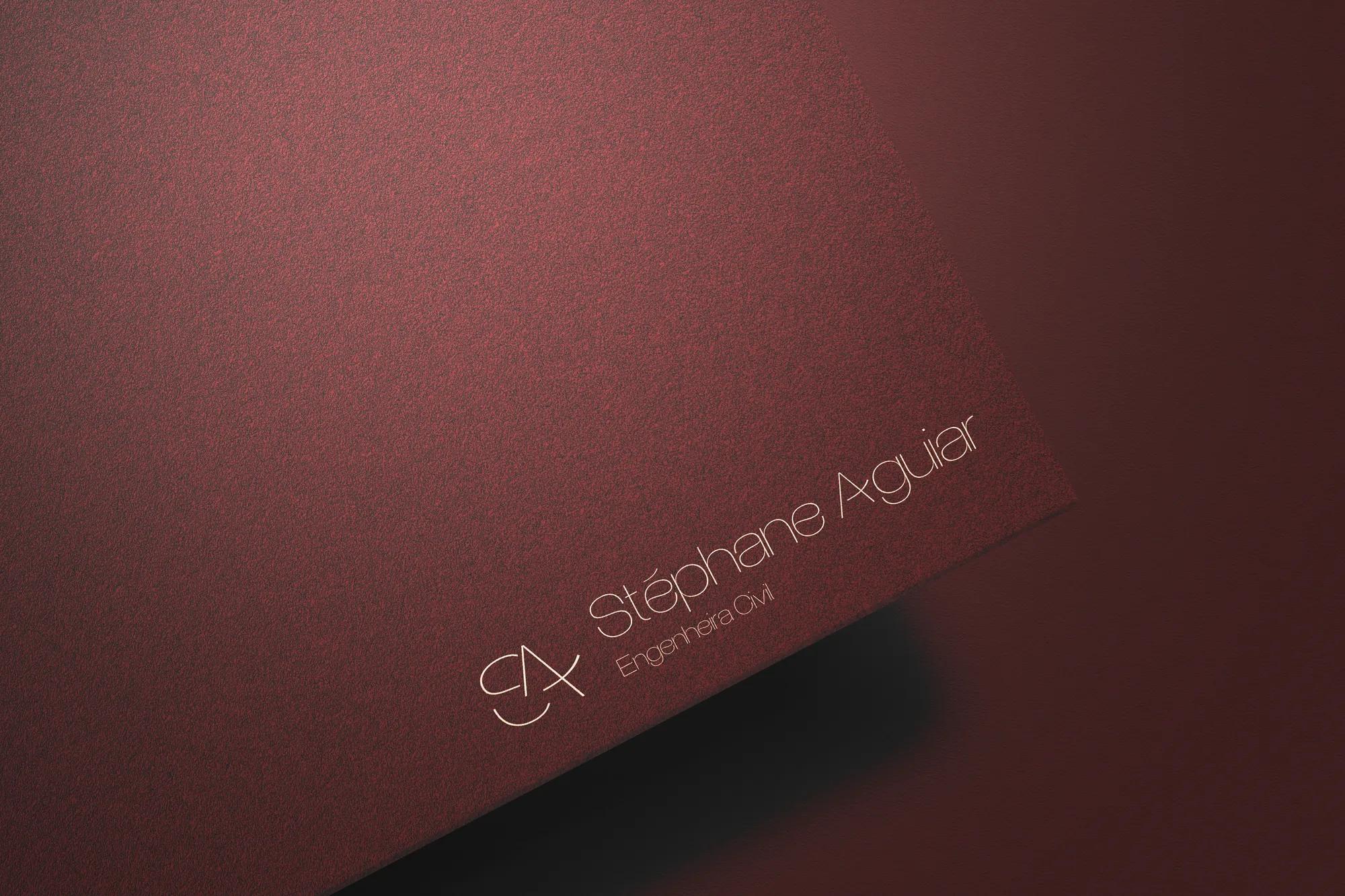
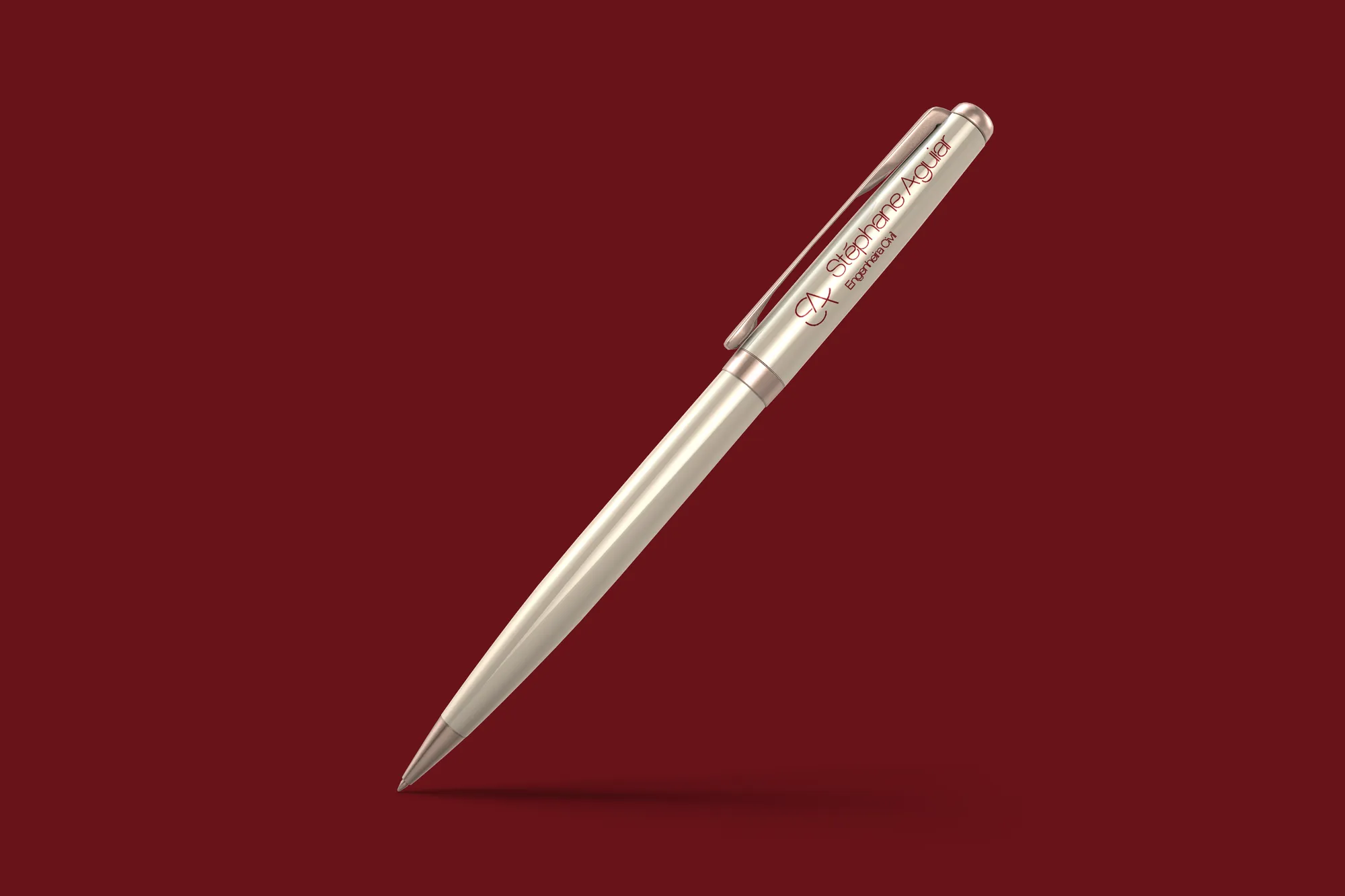
An S, an A, a house and a compass: the whole signature fits in the symbol.